
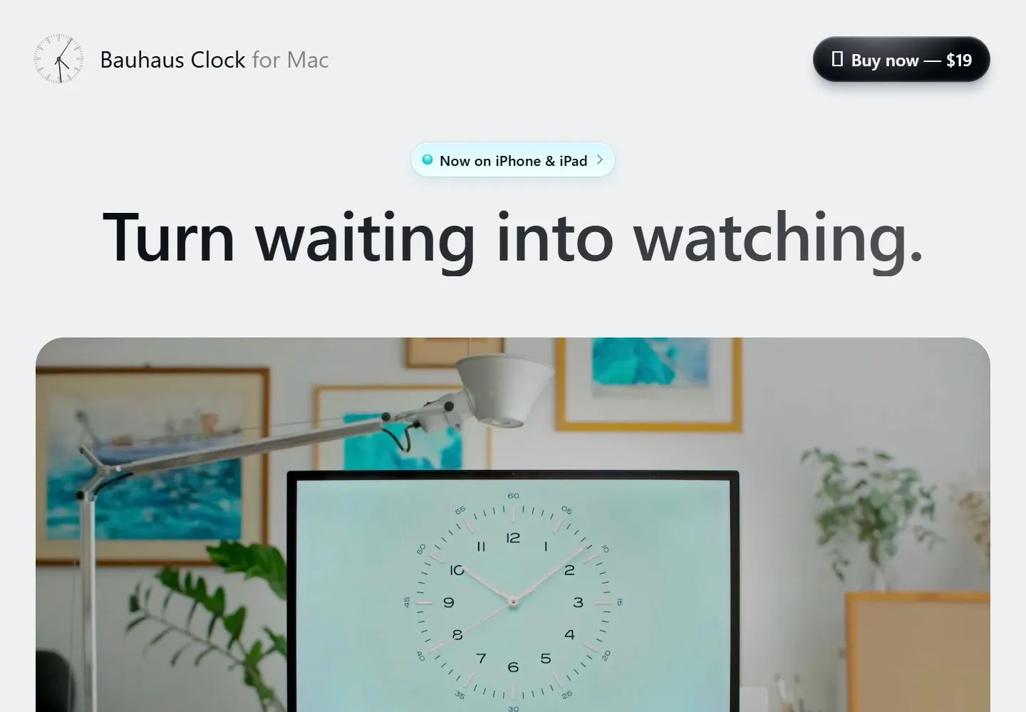
Live capture at 1440px, 2026-10-24
How it’s built
- Layout
- Pale gray hero centers a massive bold black two-line statement above an oversized rounded dark clock close-up; tiny identity and a black pill sit in the top corners.
- Type
- Heavy black sans display type; tiny header text and white button text.
- Color and surface
- Pale gray field, black type and rounded dark image.
- Components
- Centered display headline, sparse corner header and large rounded close-up.
What makes it work
- Heavy centered black display type
- pale field
- oversized rounded dark close-up
- sparse corner header
On a new subjectFor an architectural materials archive, center a heavy black statement above an oversized rounded dark stone close-up on pale gray with tiny corner header elements.
Measured
Fonts loadedInter
H196px / 600 / -1.2px
Body text12px
Page background#eef0f2
Text color#000000
Page height10,396px
Computed CSS at 1440px, 2026-10-24.
Live behavior
- Today
- The Bauhaus Clock page uses a light gray background and a compact header with a clock-face mark, “Bauhaus Clock for Mac” wordmark, and dark pill-shaped “Buy now — $19” control. A pale cyan announcement pill sits above the oversized centered headline “Turn waiting into watching.” A large rounded-corner photograph below shows a desktop monitor displaying an analog clock in a home workspace. The tablet and phone captures keep the same sequence in a narrow single column, with the heading wrapping to two lines and the image scaled to the available width.
- Responsive
- The 1440×1000 desktop headline fits on one line and the hero photo spans nearly the full content width. At 768×1024 and 390×844 the headline wraps to two lines; the hero image remains wide and rounded, with the product clock still legible in the monitor. On tablet and phone, the header wordmark is shortened to “Bauhaus Clock” while the buy control remains visible. These states show adaptation at the sampled widths only.
- Scroll
- The desktop-scroll image shows the hero photo’s lower portion, followed by a row of five stars and centered customer quotation text with reviewer portraits and names. The header appears as a large pill-shaped bar over the upper image in this capture; a single scrolled frame does not establish whether that treatment is sticky or fixed.


