
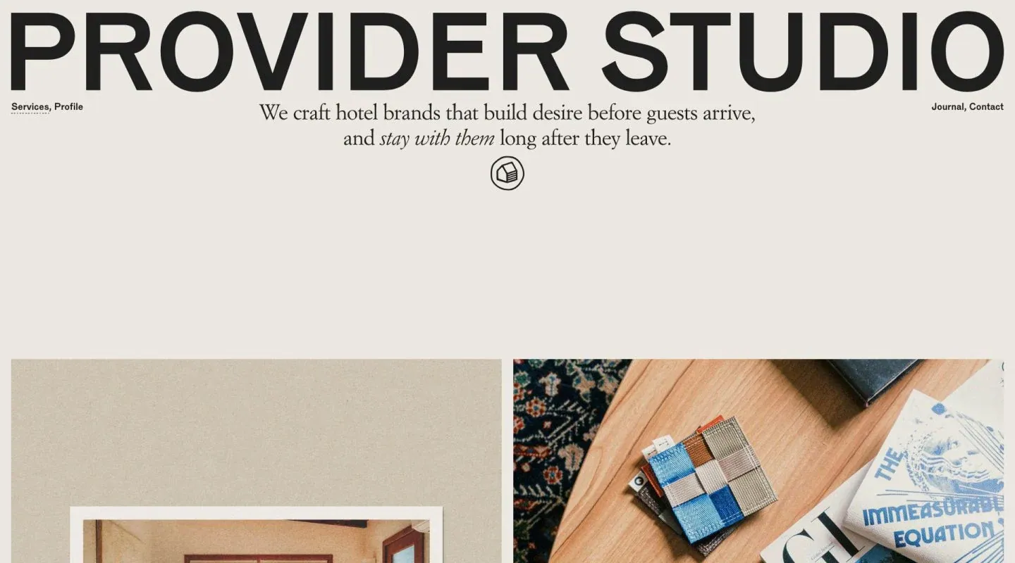
Screenshot from Minimal Gallery, saved 2026-10-24
How it’s built
- Layout
- Warm pale page with an enormous black uppercase identity across the top; a centered two-line serif introduction and small icon sit below, with two image panels starting near the bottom.
- Type
- Giant bold sans identity and smaller refined serif statement with italic emphasis.
- Color and surface
- Warm gray-cream field, black text and warm photographic imagery.
- Components
- Corner navigation, central icon, introduction and paired image panels.
What makes it work
- Giant masthead above centered serif introduction and paired images.
On a new subjectFor a public conservation archive, use a giant masthead and centered serif introduction above paired artifact images.
Live behavior
- Today
- Provider Studio opens on a warm pale field with a huge black uppercase wordmark, small edge navigation and a centered serif statement with italic emphasis and circular icon. Two large images begin below on desktop. The gallery reference shows a similar opening.
- Responsive
- Desktop is 1440×1000 with a 13344px document; tablet 768×1024 with 29410px; phone 390×844 with 21625px. The narrow captures place navigation above a smaller wordmark and show the first large image in a single column; the statement wraps more on phone. These sampled widths do not establish breakpoints. Body background measures rgb(236,232,225).
- Scroll
- At desktop y=750 two adjacent images and corresponding Visual Branding and Scent Branding sections with ruled lists are visible. The single position does not establish full-page behavior.


