
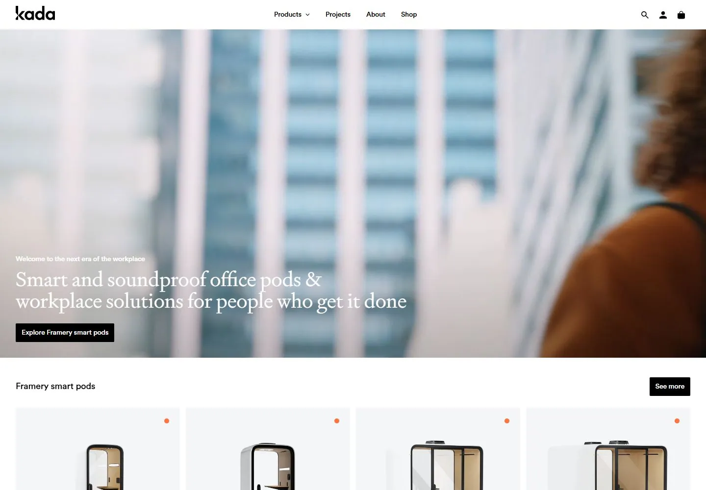
Live capture at 1440px, 2026-10-24
How it’s built
- Layout
- White header above a split composition of ochre and pale blue blocks; large interior images occupy offset areas and oversized serif category names and arrows sit at opposite corners.
- Type
- Large elegant regular serif category labels; small sans header and sale text.
- Color and surface
- Ochre, pale blue, white and natural interior images.
- Components
- Two contrasting color fields, offset images, large serif labels and arrows.
What makes it work
- Ochre and pale blue fields
- offset images
- oversized serif labels and arrows
On a new subjectFor a public garden directory, pair ochre and pale blue fields with offset garden images and large serif category labels and arrows at opposite corners.
Measured
Fonts loadedCircular, Signifier
H114px / 400
Body text14px
Page background#ffffff
Text color#000000
Page height5,031px
Computed CSS at 1440px, 2026-10-24.
Live behavior
- Today
- Kada opens with a 60px white navigation bar over a full-width workplace video. A compact eyebrow, large white two-line serif promise and black rectangular action sit near the lower-left of the hero. A white product section follows, with a left-aligned heading, right-side black action, pale-gray product image panels and small orange corner dots. At desktop scrollY=750 the four Framery pod cards and their captions are followed by a large photographic inspiration row.
- Responsive
- At 1440×1000 the hero media spans 1440×670 below the 60px header and its measured 41px heading occupies an 88px two-line box. At 768×1024 and 390×844 the hero becomes a tall single-image panel with a 27px one-line tablet heading and a 27px two-line phone heading; the CTA stays at lower left. The opening product row remains four cards wide in the phone measurement, so only part of the row is visible at once. Measured document heights are 5031px desktop, 4982px tablet and 3371px phone. These three widths do not establish breakpoints or the full page reflow.
- Scroll
- At actual desktop scrollY=750 in a 1440×5031 document, the white navigation remains at the top; its measured header CSS position is sticky. Four pale product panels with pod images and captions fill the upper view, followed by an inspiration heading and large workplace photographs. The screenshot does not test the header through additional scroll positions or operate its carousel arrows.


