
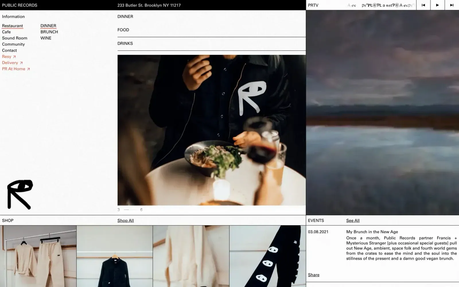
Screenshot from Httpster, saved 2026-10-24
How it’s built
- Layout
- Dense asymmetrical editorial grid with black top rail. Left white column holds stacked location/navigation links and a large hand-drawn mark near bottom. Center combines category labels, a wide food photograph and small pagination. Right column is a tall blurred landscape image beneath a slim media-control strip. Lower row begins a shop/product strip and an event-information block, all divided by thin dark rules.
- Type
- Mostly compact black sans labels and body text; section labels are uppercase. The hand-drawn black logo contrasts with the controlled rules and grid. Type is dense but varied by column and function.
- Color and surface
- White and black structural fields with muted blue-gray landscape, warm food photography and restrained coral link accents. Fine borders create panel divisions; no shadows or rounding.
- Components
- Brand/address rail, left navigation, food/drink headings, media strip with previous/play/next controls, image areas, pagination, shop row, event listing and large drawn monogram.
What makes it work
- Multiple aligned content zones
- Thin structural dividers
- Large media focal area
- Clear small-label hierarchy
On a new subjectOrganize unrelated content into a few clearly bounded editorial zones, anchor the grid with one large media subject, and keep labels compact. Replace restaurant-specific material.
Prompts
Create an original visual direction for {{website_name}} in {{industry}}, for {{audience}}, presenting {{content}} and supporting {{functionality}}. Composition invariant: Use a full-width narrow utility header above three adjacent zones: a compact index rail, a central content/media column, and a tall right feature-image panel. Continue ruled article/product rows below, with metadata and media aligned to the same divisions. Typography: Use a plain compact sans for labels and modest section headings; keep the small index subordinate to the large media field. Palette and contrast: Pair light reading surfaces with a dark header/rules and restrained link accent; imagery supplies the main color and tone. Image and component hierarchy: Use a dominant image or visual related to {{content}}, with secondary records or links below; do not require hospitality, menus or restaurant events. Visual estimate from the supplied reference, not measured CSS: Visual estimate: left/middle/right width roughly 25/45/30%; header around 4% height. Scale the relationships to the target content and viewport. Variables: replace source identity, wording, industry-specific objects, people, imagery, exact colors and controls with original material for {{website_name}}, {{industry}}, {{audience}}, {{content}} and {{functionality}}. Retain only the composition and hierarchy described above. No source logo, product, person, artwork or exact phrase is a required asset. Do not infer typeface, framework, CSS values, motion or tested behavior from a static image. Continue the visual system using relevant content sections, keeping the same relative spacing and contrast without adding generic cards or decoration where none are described. Stack index, main content and featured media in a deliberate order; keep dividers light and labels attached to their section.
Implement a responsive page for {{website_name}} in {{industry}} for {{audience}}, with real {{content}} and working {{functionality}}. Wide-screen structure: Use a full-width narrow utility header above three adjacent zones: a compact index rail, a central content/media column, and a tall right feature-image panel. Continue ruled article/product rows below, with metadata and media aligned to the same divisions. Type hierarchy: Use a plain compact sans for labels and modest section headings; keep the small index subordinate to the large media field. Surface treatment: Pair light reading surfaces with a dark header/rules and restrained link accent; imagery supplies the main color and tone. Component and image roles: Use a dominant image or visual related to {{content}}, with secondary records or links below; do not require hospitality, menus or restaurant events. Visual estimate from the supplied reference, not measured CSS: Visual estimate: left/middle/right width roughly 25/45/30%; header around 4% height. Scale the relationships to the target content and viewport. Variables: replace source identity, wording, industry-specific objects, people, imagery, exact colors and controls with original material for {{website_name}}, {{industry}}, {{audience}}, {{content}} and {{functionality}}. Retain only the composition and hierarchy described above. No source logo, product, person, artwork or exact phrase is a required asset. Do not infer typeface, framework, CSS values, motion or tested behavior from a static image. Continue the visual system using relevant content sections, keeping the same relative spacing and contrast without adding generic cards or decoration where none are described. Stack index, main content and featured media in a deliberate order; keep dividers light and labels attached to their section. Use semantic content and meaningful image descriptions. Keep each label with its image or list item, and make any new controls named, keyboard-operable and visibly focused. Implement requested functionality as new working behavior; the static reference does not verify source controls.


