
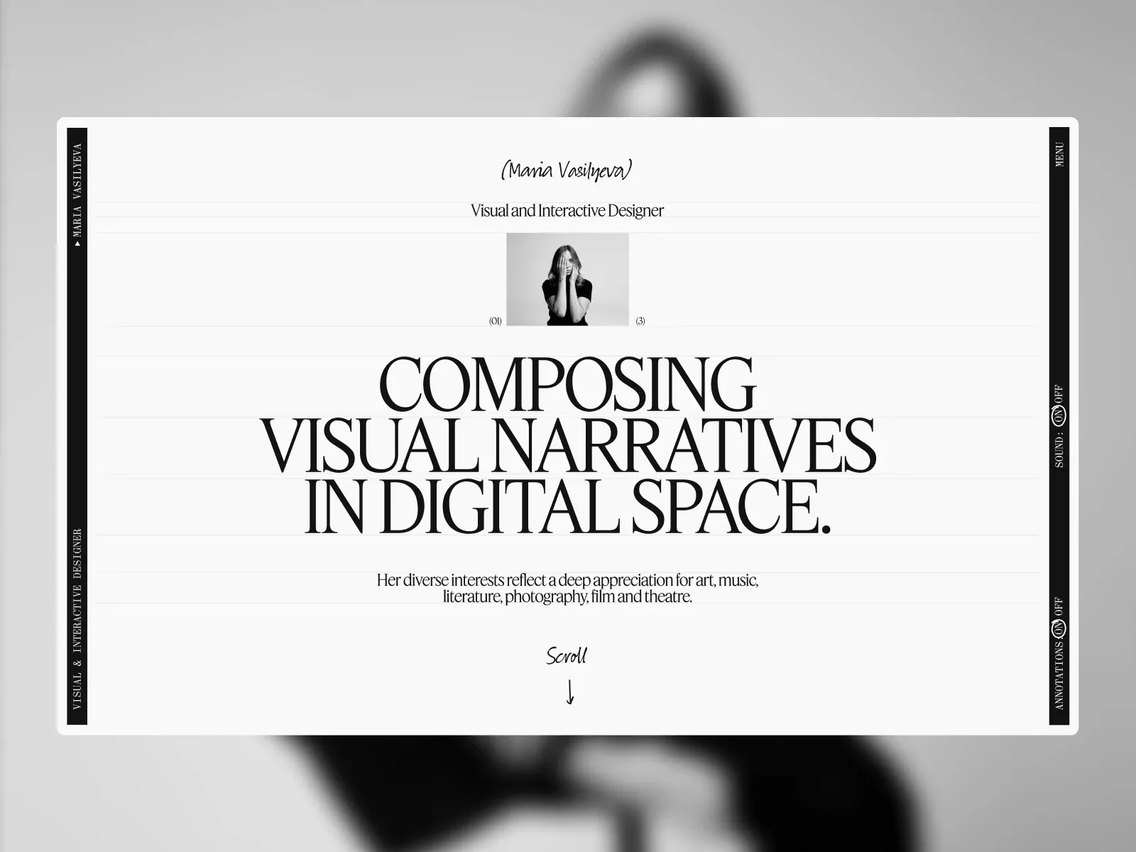
Gallery screenshot, saved 2026-10-24
How it’s built
- Layout
- A large white rectangular page is centered over a softly blurred grayscale portrait-like backdrop. Within it, narrow black vertical rails carry rotated identity/role labels and menu/sound/annotation controls. Fine rules divide a centered handwritten-style name, role, small portrait, monumental three-line serif statement, support sentence and handwritten Scroll cue. Outer portrait backdrop may be gallery framing.
- Type
- Handwritten identity/cue; high-contrast serif role and dominant statement; small condensed uppercase rail labels. Exact typeface and metrics unknown.
- Color and surface
- Pale page, fine gray rules, black edge rails/type, grayscale portrait. Blurred background is separate and uncertain presentation context.
- Components
- Centered page surface, vertical edge rails, identity/role, portrait, large statement, short support and scroll cue.
What makes it work
- Pale central page
- Slim side rails with compact labels
- Dominant editorial statement
- Small identity/support hierarchy
On a new subjectFrame an unrelated editorial statement with slim edge labels and compact identity; keep support subordinate. Use relevant imagery; do not assume the outer backdrop is a page layer.
Live behavior
- Today
- The saved Maria Vasilyeva captures show a pale, nearly white full-screen project canvas divided by fine horizontal rules, framed by narrow black vertical rails. The left rail carries “MARIA VASILYEVA” and “VISUAL & INTERACTIVE DESIGNER”; the right rail contains Menu, Sound and Annotations controls. A handwritten Scroll cue sits near the top, project imagery and interface previews form a thin horizontal strip across the middle, and the lower edge labels the active item (“01” and “Phantom”) with a handwritten More details arrow and View project. Desktop stills show different project preview frames within this composition. The selected gallery reference is a different static intro layout with a centered portrait, “Visual and Interactive Designer” title, large editorial statement, and a blurred background portrait.
- Responsive
- The desktop states measure 1440×1000 with document height 1000 and actual scrollY=0; tablet is 768×1024 with document height 1024; phone is 390×844 with document height 844. All show viewport-sized documents. Tablet and phone retain the dark top/side control bands and project strip, with less of the horizontal project composition fitting within the viewport. These snapshots do not establish breakpoints or a conventional reflow.
- Scroll
- Every saved state, including desktop-scroll, measures actual scrollY=0 with document dimensions equal to the viewport. The desktop-scroll screenshot shows a different project-strip composition, but it is not evidence of a scrolled document or scrolling mechanism.


