
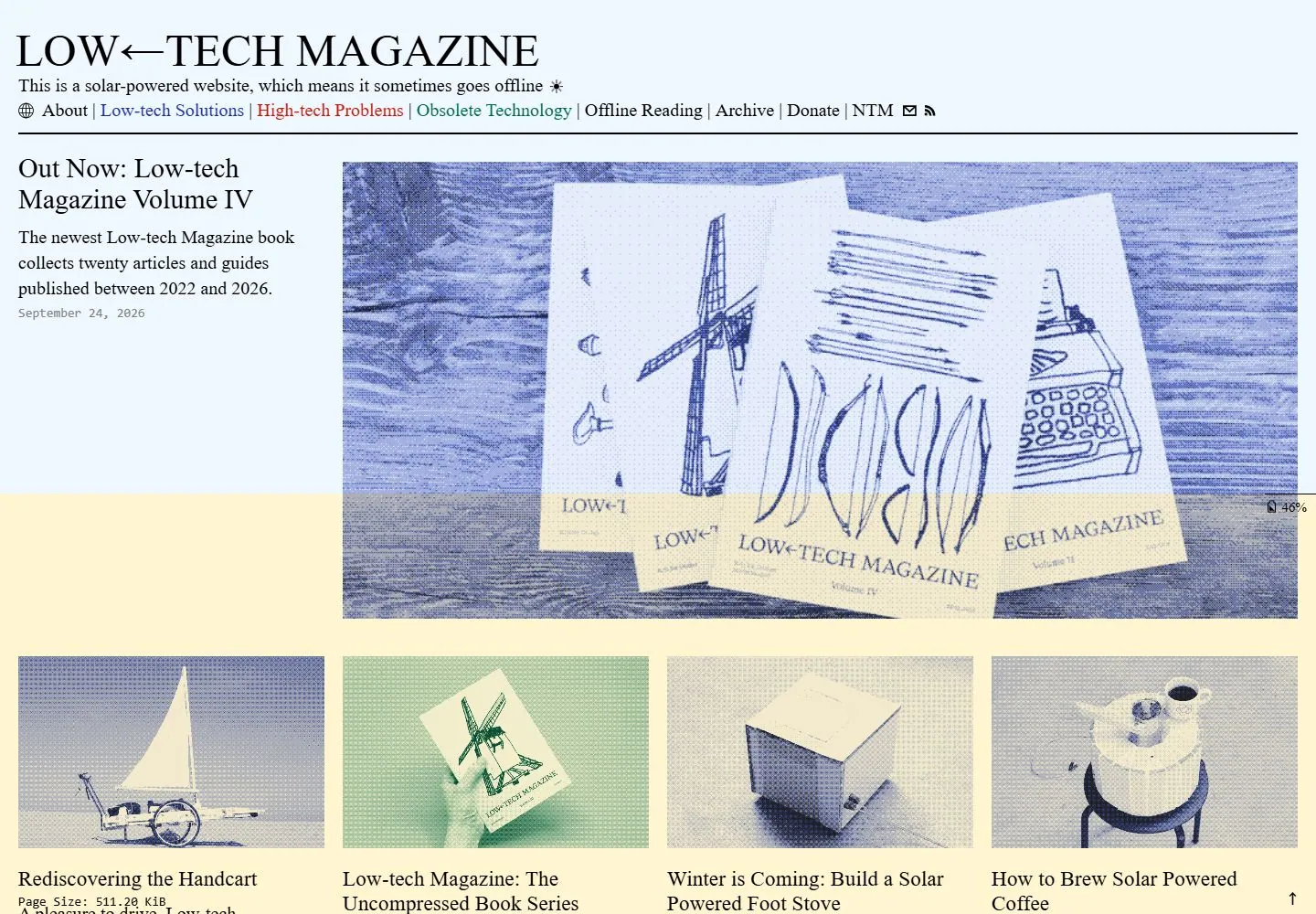
Live capture at 1440px, 2026-10-24
How it’s built
- Layout
- Pale blue and yellow editorial page with large black serif masthead, compact text navigation, left article summary and a large blue halftone-looking image at right; small images begin below.
- Type
- Traditional black serif masthead and body with compact colored text links.
- Color and surface
- Pale blue and yellow fields, dark blue halftone-looking imagery and black text.
- Components
- Masthead and text links, left article summary, large right image and lower thumbnails.
What makes it work
- Pale blue/yellow fields
- traditional serif masthead and body
- compact links
- large blue halftone-looking image
On a new subjectFor a public repair guide, combine a traditional black serif masthead and left article summary with a large blue halftone-looking workshop image on pale blue and yellow.
Measured
H150px / 400
Body text20px
Page background#fff5d1
Text color#000000
Page height2,471px
Computed CSS at 1440px, 2026-10-24.
Live behavior
- Today
- Low-tech Magazine uses a pale blue header with a large black serif title, a short solar-powered-site statement and a row of compact navigation links; the link labels use several colors above a thin black rule. A warm pale-yellow content field begins with a featured article: title, short summary and date on the left, with a large blue-toned halftone image to the right. A four-column grid of article cards follows, each pairing a duotone image with serif title, summary and date.
- Responsive
- At 1440×1000 the header and feature row span the page above a four-column card grid; the document is 2471px high. At 768×1024 (document 3526px), the navigation becomes a vertical list headed by MENU, the feature copy sits above its image, and article cards form two columns. At 390×844 (document 5962px), the masthead wraps to two lines, navigation remains a vertical list and the feature image appears before its title and copy; cards continue in a single column. These sampled widths do not establish breakpoint thresholds.
- Scroll
- At actual desktop scrollY=750 in a 1440×2471 document, the header remains visible and the viewport shows article-card images, titles, summaries and dates. The sample does not establish header behavior across other positions or any article-link destinations.


