
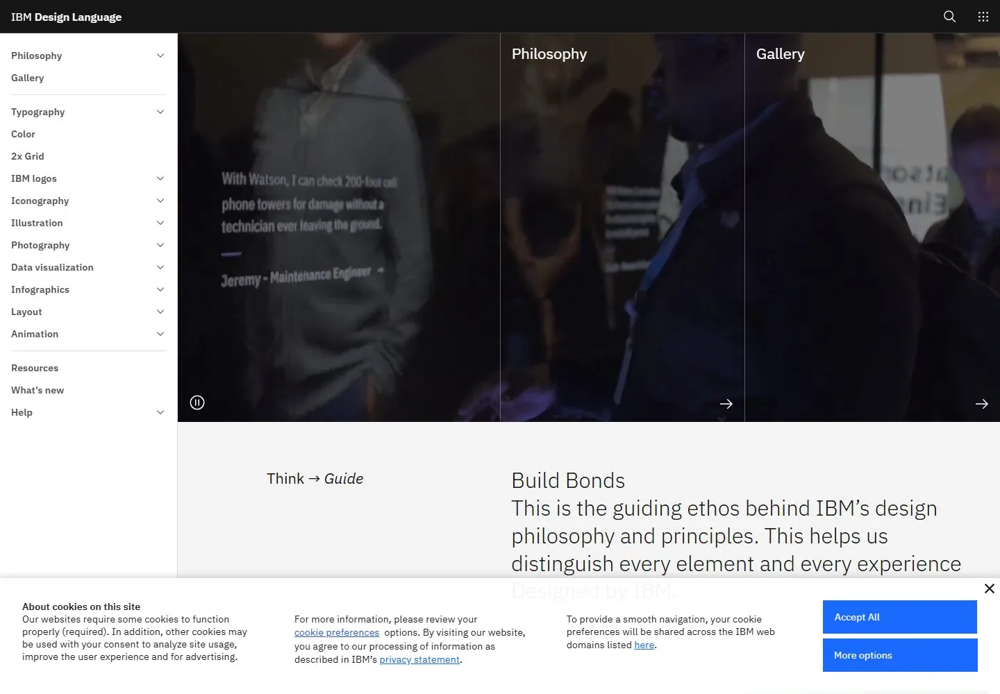
Live capture at 1440px, 2026-10-24
How it’s built
- Layout
- Dark design-system documentation interface. Thin top rail has title left and search/app-grid icons right. Persistent left sidebar lists expandable topic categories. Main area begins with four vertical panels: a nearly black animated-looking visual, then philosophy and gallery columns separated by fine rules. Lower area has a two-column philosophy statement and colorful design-system specimen tiles.
- Type
- White and gray sans hierarchy: compact sidebar links, medium section labels, large light-weight editorial statement. Color tiles use clear labels. Exact font metrics unknown.
- Color and surface
- Near-black and charcoal fields, fine gray rules and white text; lower specimen tiles introduce blue, pink, purple and gray. Dense structured interface rather than card shadows.
- Components
- Top product/search rail, persistent taxonomy sidebar with disclosure chevrons, gallery panels with arrow controls, philosophy text area, design-system specimen tiles.
What makes it work
- Persistent category sidebar
- Rule-separated documentation areas
- Explanatory copy and labeled examples
- High-contrast dark interface
On a new subjectUse a persistent taxonomy for complex reference material, with explanatory text beside grouped examples. Replace IBM-specific categories and examples with the new domain's structure.
Prompts
Create an original visual direction for {{website_name}} in {{industry}}, for {{audience}}, presenting {{content}} and supporting {{functionality}}. Composition invariant: Use a dark editorial canvas with a compact left-side index and broad right content region divided by fine rules. Place one wide lead visual above explanatory text and optional aligned sample panels; avoid turning the entire page into a decorative dashboard. Typography: Use light, spacious sans headings and body text with compact dense navigation; keep type crisp against the dark surface. Palette and contrast: Maintain high-contrast light text on charcoal, with restrained line rules and a few bright accents chosen for the new subject. Image and component hierarchy: Use a wide subject-relevant lead image followed by useful illustrative or information samples; no design-system taxonomy or source graphics are required. Visual estimate from the supplied reference, not measured CSS: Visual estimate: rail about 14% width; banner takes roughly half viewport height; lower columns are broad. Scale the relationships to the target content and viewport. Variables: replace source identity, wording, industry-specific objects, people, imagery, exact colors and controls with original material for {{website_name}}, {{industry}}, {{audience}}, {{content}} and {{functionality}}. Retain only the composition and hierarchy described above. No source logo, product, person, artwork or exact phrase is a required asset. Do not infer typeface, framework, CSS values, motion or tested behavior from a static image. Continue the visual system using relevant content sections, keeping the same relative spacing and contrast without adding generic cards or decoration where none are described. Move the index to a compact top menu/stack, then show lead, explanation and samples in reading order.
Implement a responsive page for {{website_name}} in {{industry}} for {{audience}}, with real {{content}} and working {{functionality}}. Wide-screen structure: Use a dark editorial canvas with a compact left-side index and broad right content region divided by fine rules. Place one wide lead visual above explanatory text and optional aligned sample panels; avoid turning the entire page into a decorative dashboard. Type hierarchy: Use light, spacious sans headings and body text with compact dense navigation; keep type crisp against the dark surface. Surface treatment: Maintain high-contrast light text on charcoal, with restrained line rules and a few bright accents chosen for the new subject. Component and image roles: Use a wide subject-relevant lead image followed by useful illustrative or information samples; no design-system taxonomy or source graphics are required. Visual estimate from the supplied reference, not measured CSS: Visual estimate: rail about 14% width; banner takes roughly half viewport height; lower columns are broad. Scale the relationships to the target content and viewport. Variables: replace source identity, wording, industry-specific objects, people, imagery, exact colors and controls with original material for {{website_name}}, {{industry}}, {{audience}}, {{content}} and {{functionality}}. Retain only the composition and hierarchy described above. No source logo, product, person, artwork or exact phrase is a required asset. Do not infer typeface, framework, CSS values, motion or tested behavior from a static image. Continue the visual system using relevant content sections, keeping the same relative spacing and contrast without adding generic cards or decoration where none are described. Move the index to a compact top menu/stack, then show lead, explanation and samples in reading order. Use semantic content and meaningful image descriptions. Keep each label with its image or list item, and make any new controls named, keyboard-operable and visibly focused. Implement requested functionality as new working behavior; the static reference does not verify source controls.
Live behavior
- Today
- The desktop capture has a black utility header, a white left navigation rail with compact section links, and a broad darkened media field divided by thin vertical rules with white labels and arrows. Beneath it a light content field pairs a short left label with a larger light-weight sans text block. A large cookie panel obscures the lower edge in every saved state.
- Responsive
- Tablet replaces the left rail with a menu icon while keeping the black header and side-by-side media areas. Phone uses stacked labeled media areas and a large cookie panel that covers much of the lower screen. The sampled widths do not establish exact breakpoints or the obscured content.
- Scroll
- At actual desktop scrollY 750 the saved frame shows a grid of large graphic tiles, including a letterform, a pink pictogram and a color matrix. The header, navigation rail and cookie panel remain visible at this sampled position; the lower tile area is partly obscured.


