
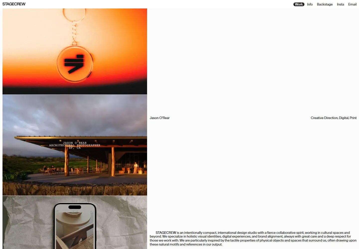
Live capture at 1440px, 2026-10-24
How it’s built
- Layout
- White portfolio page with tiny STAGECREW label upper left and compact link row upper right. Broad two-column opening: left carries a pale gray studio statement and small inset image, right remains mostly blank with project title/discipline labels at mid-height. Lower region shifts to a large grayscale product photograph on left and a long studio description aligned low on the right.
- Type
- Small black sans navigation and labels, a large low-contrast light gray sans mission statement, compact paragraph at bottom. Type scale and contrast vary across large open areas; no exact font metrics.
- Color and surface
- White ground and broad black rectangle behind the large lower-left product image, mostly neutral photo tones; large blank fields are integral. No visible card system.
- Components
- Wordmark, work/info/backstage/insta/email links, muted statement, project title and services, small inset image, large lower image and studio paragraph.
What makes it work
- Open white ground
- Sparse edge navigation
- Images separated by broad whitespace
- Small project metadata
On a new subjectKeep images and metadata widely separated on a pale ground; pair one statement with a few examples. Replace client-specific imagery and text.
Prompts
Measured
Fonts loadedBaikal Book, Baikal Regular
Body text13px
Page background#fbfbfb
Text color#202020
Page height1,000px
Computed CSS at 1440px, 2026-10-24.
Live behavior
- Today
- The current Stagecrew page has a near-white ground and a very thin header: a small STAGECREW wordmark at upper left and compact Work, Info, Backstage, Insta, and Email links at upper right. Desktop shows a narrow, roughly 580px-wide vertical editorial image stream aligned to the left, with small project/person and discipline labels placed in the broad white space to its right. A compact explanatory paragraph sits beneath the stream; most of the right side remains empty. The 13px Baikal Book navigation is measured in the desktop capture. Tablet expands the image stream across most of the width and shows an INNERSTATE project image with large red/green lettering over a monochrome figure. The standard phone frame labels Benjamin Park / Coming Soon, while the fresh reduced-motion phone frame labels ARKEN / Creative Direction / Visual Identity. The selected older reference includes different project imagery and remains separately bound from these current captures.
- Responsive
- Desktop states measure 1440×1000, tablet 768×1024, and phone 390×844; all report actual scrollY 0 and document dimensions equal to the viewport. Desktop media samples are about 580×406px and 586×410px, beginning near x=10; on tablet, loaded image samples are 748×524px; on phone, they are 370×259px with 10px side margins. The header sample is 13px Baikal Book on desktop/tablet and 12px on phone. These captured project samples do not establish breakpoints.
- Scroll
- The state labeled desktop-scroll is measured at actual scrollY 0 and document dimensions 1440×1000. Its image stream sits higher in the viewport and a Craftland label is visible, but this is not a verified scrolled view and does not establish sticky or scroll-triggered behavior.


