
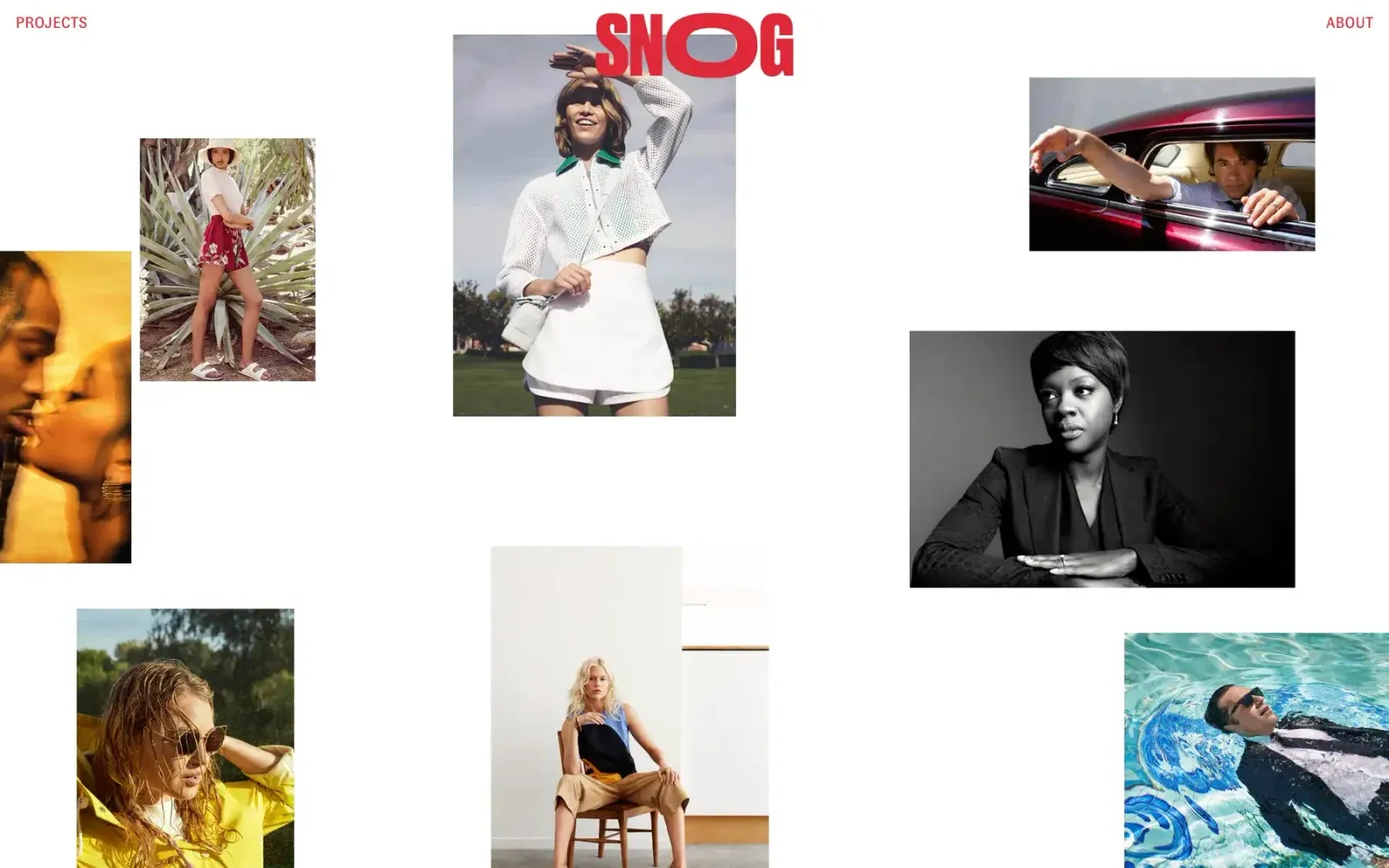
Screenshot from Httpster, saved 2026-10-24
How it’s built
- Layout
- White field with small red PROJECTS and ABOUT labels at top corners. A large red wordmark overlaps the top of a central fashion portrait. Other rectangular photographs are scattered around it in a loose, irregular arrangement, with broad blank areas between; several are cropped at canvas edges. A larger monochrome portrait anchors the right middle.
- Type
- Small red uppercase corner links and an oversized red sans wordmark; almost no other visible page text. Photo content contains its own labels and graphic treatments.
- Color and surface
- White ground, red brand color, and mixed photographic tones including yellow, green, cyan and monochrome. Rectangular photos have no uniform card chrome, shadows or rounded corners.
- Components
- Two corner links, oversized wordmark, loose set of independent portrait/landscape image crops. No visible cards or controls beyond the links.
What makes it work
- Open white ground
- Sparse perimeter links
- Large identity mark
- Independent rectangular image fragments
On a new subjectUse a small set of relevant rectangular examples with varied orientation, generous white space and a clear identity mark. Replace all fashion imagery and exact branding.
Prompts
Create an original visual direction for {{website_name}} in {{industry}}, for {{audience}}, presenting {{content}} and supporting {{functionality}}. Composition invariant: Keep an open pale canvas with several rectangular images staggered at unequal heights and sizes. Allow substantial gaps and a very large saturated identity overlapping one upper image; keep small navigation at separated outer edges. Typography: Give the identity the strongest scale and weight; use tiny restrained uppercase utility labels. Select a suitable display character without prescribing a typeface. Palette and contrast: Use a light uninterrupted ground and dark image boundaries or type; a saturated identity color may occupy a substantial letter area while the pale ground remains dominant. Image and component hierarchy: Use a few subject-appropriate photographs or artwork pieces with varied aspect ratios and crops; vary image positions, not the target subject or source fashion content. Visual estimate from the supplied reference, not measured CSS: Visual estimate: image coverage about one third; white negative space dominates; identity overlaps an upper central image; its tall narrow letterforms remain prominent. Adjust this relationship to content and screen size; do not copy pixels. Variables: replace the source name, writing, industry-specific objects, people, images, colors and controls with original material for {{website_name}}, {{industry}}, {{audience}}, {{content}} and {{functionality}}. Keep the composition rule, not the source's identity or subject matter. Never make a source logo, product, person, artwork or exact text essential to either the image or page. Do not infer a font family, software framework, CSS value, motion or tested control behavior from a still. Continue the system into appropriate sections using the new content's real hierarchy rather than adding unrelated decoration. Stack images in an intentional stagger, preserve white-space pauses, and place navigation in a compact reachable row.
Implement a responsive page for {{website_name}} in {{industry}} for {{audience}}, with real {{content}} and working {{functionality}}. Wide-screen structure: Keep an open pale canvas with several rectangular images staggered at unequal heights and sizes. Allow substantial gaps and a very large saturated identity overlapping one upper image; keep small navigation at separated outer edges. Type hierarchy: Give the identity the strongest scale and weight; use tiny restrained uppercase utility labels. Select a suitable display character without prescribing a typeface. Surface treatment: Use a light uninterrupted ground and dark image boundaries or type; a saturated identity color may occupy a substantial letter area while the pale ground remains dominant. Component and image roles: Use a few subject-appropriate photographs or artwork pieces with varied aspect ratios and crops; vary image positions, not the target subject or source fashion content. Visual estimate from the supplied reference, not measured CSS: Visual estimate: image coverage about one third; white negative space dominates; identity overlaps an upper central image; its tall narrow letterforms remain prominent. Adjust this relationship to content and screen size; do not copy pixels. Variables: replace the source name, writing, industry-specific objects, people, images, colors and controls with original material for {{website_name}}, {{industry}}, {{audience}}, {{content}} and {{functionality}}. Keep the composition rule, not the source's identity or subject matter. Never make a source logo, product, person, artwork or exact text essential to either the image or page. Do not infer a font family, software framework, CSS value, motion or tested control behavior from a still. Continue the system into appropriate sections using the new content's real hierarchy rather than adding unrelated decoration. Stack images in an intentional stagger, preserve white-space pauses, and place navigation in a compact reachable row. Use semantic text and meaningful image descriptions. Keep each item label with its item, and give interactive controls clear accessible names, keyboard operation and visible focus. Build the requested functionality as working new behavior; static reference controls remain unverified.


