
Gallery screenshot, saved 2026-10-24
How it’s built
- Layout
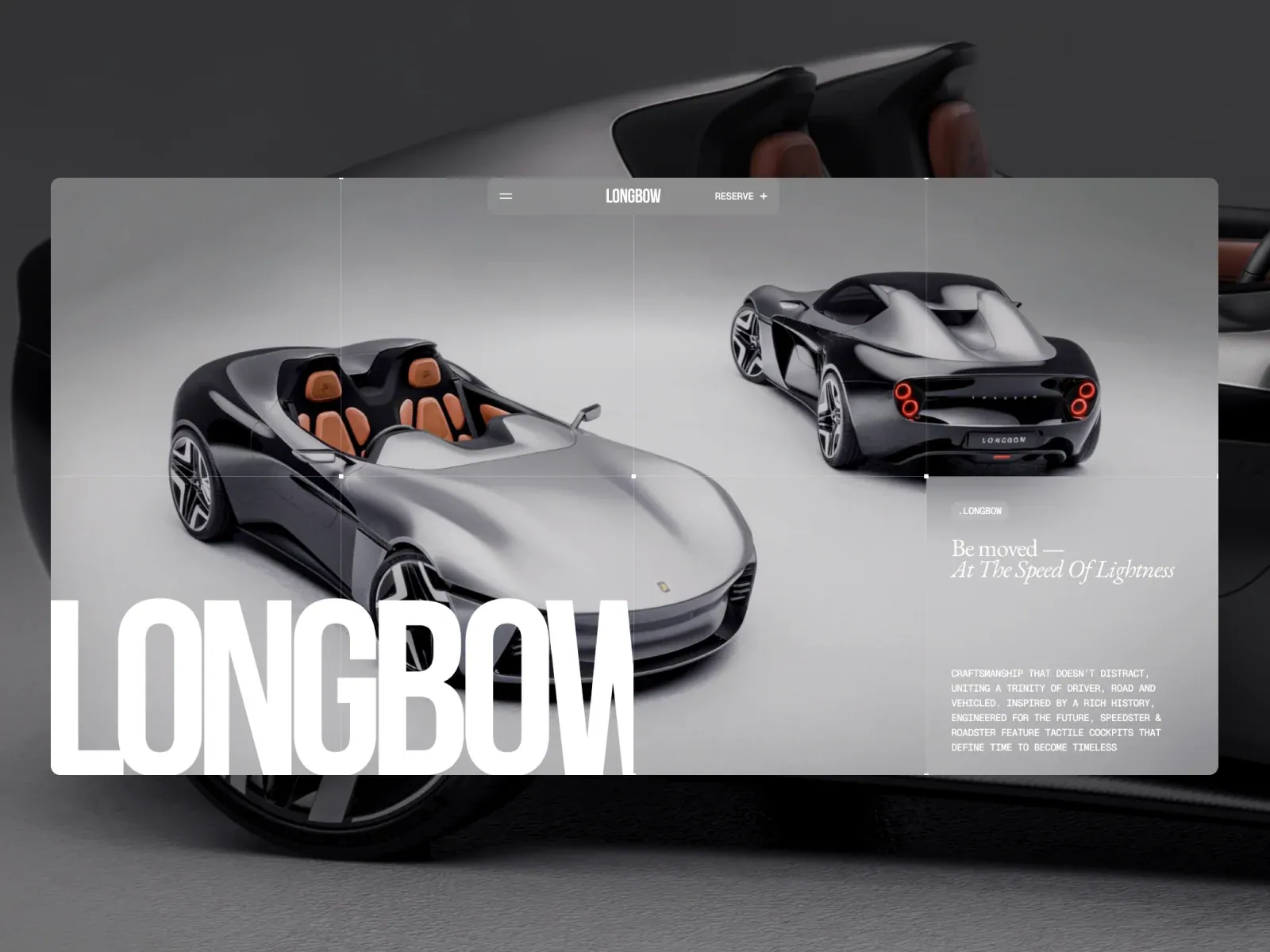
- A broad translucent gray inset page shows two complementary product views: large at left and smaller at upper right. A floating rounded navigation capsule sits near top center. Huge condensed white LONG BOW lettering is cropped along lower left; a delicate italic tagline and compact copy occupy a narrow right column. A much larger car image extends outside the panel and may be gallery framing.
- Type
- Heavy uppercase wordmark, refined italic serif tagline, compact technical-looking copy; exact faces unknown.
- Color and surface
- Silver/grayscale cars on charcoal image, translucent gray panel, white type and tan cockpit accents.
- Components
- Translucent inset page, large-left/small-upper-right product views, floating nav capsule, giant cropped condensed identity, narrow italic-tagline/editorial column; outer car image may be gallery framing.
What makes it work
- Broad inset page panel
- Complementary product views in large-left/small-upper-right relation
- Giant condensed identity cropped lower left
- Italic tagline and narrow right-side copy
On a new subjectFor a natural-history museum, show a large artifact view at left and a smaller detail view at upper right within a broad inset panel, crop a condensed exhibit title at lower left, and balance it with an italic subtitle and concise right-column facts. Omit automotive imagery.
Live behavior
- Today
- The Longbow capture presents two low-slung sports-car renderings on a pale gray, subtly gridded field. A translucent rounded capsule near the top center holds a menu icon, LONGbow wordmark and “MODELS +”; a large white LONGbow word is cropped along the lower-left edge. At right, a compact pill label and the serif statement “Be moved — At The Speed Of Lightness” sit above a small monospaced all-caps description. The selected gallery image is a staged monitor composition of similar two-car imagery and copy, with a wider studio framing and a different header label.
- Responsive
- The desktop captures are 1440×1000 with a 1440×18362 document; tablet is 768×1024 with a 768×15700 document; phone states are 390×844 with 390×13182 documents. Desktop t0 and t2 are at y=0; desktop-scroll records y=750. The tablet places the LONGbow header above the right-aligned statement and description, with the car image below; phone orders header, oversized wordmark and copy above the car image. Body CSS records rgb(136,140,143) background and white text. These captures establish only the sampled widths.
- Scroll
- The desktop-scroll state records actual scrollY=750 in a 1440×18362 document. It shows a close green-car image, a very large cropped LONGbow word above it, and the continuing small right-side craftsmanship text. This describes that saved position only.


