
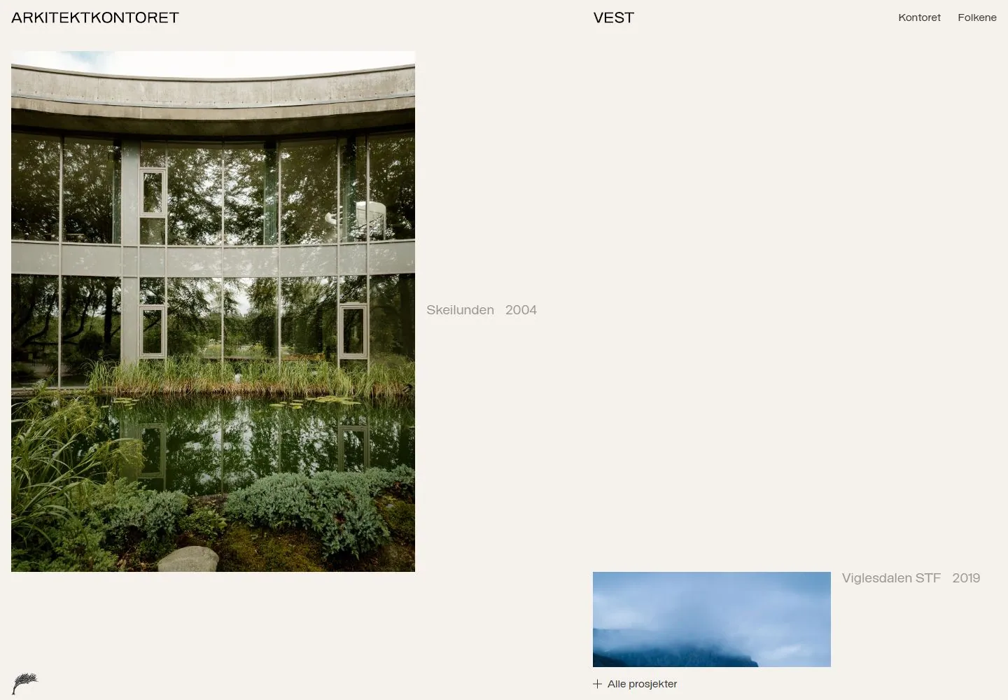
Live capture at 1440px, 2026-10-24
How it’s built
- Layout
- Cream page with three-part top identity/navigation: studio name left, VEST centered, two links right. Large square-ish architectural photograph occupies upper-left quadrant. Spacious blank field dominates center/right, with faint project title/year at mid-right. Bottom edge has a small botanical mark, short blue horizontal project bar, project/year label and plus-led all-projects link.
- Type
- Small clean sans labels, project metadata low contrast, no large headline. Size hierarchy is subdued and whitespace carries weight.
- Color and surface
- Warm off-white ground and dark green reflected landscape image; a muted blue project strip supplies a small color accent. No cards, shadows or heavy rules.
- Components
- Three-part header, large architecture photo, project title/year, small symbol, progress-like blue bar and all-projects link.
What makes it work
- Large project image
- Substantial open field
- Small detached project label
- Sparse identity/navigation
On a new subjectFeature one relevant work image with compact metadata placed apart from the picture, leaving broad open space. Replace architecture and local details.
Prompts
Create an original visual direction for {{website_name}} in {{industry}}, for {{audience}}, presenting {{content}} and supporting {{functionality}}. Composition invariant: Balance one large near-square or portrait-oriented feature image on the left against a quiet open information field on the right. Keep the top labels sparse and the bottom project-navigation strip shallow. Typography: Use small quiet sans labels and lower-contrast metadata; keep the feature caption much smaller than the image. Palette and contrast: Use a warm light ground, dark primary text, and muted secondary labels; let the target's own imagery supply most color. Image and component hierarchy: Choose a single relevant photograph or visual artifact for {{content}}; preserve natural image scale and avoid adding decorative cards. Visual estimate from the supplied reference, not measured CSS: Visual estimate: photo about 41% viewport width and 88% content height; open field counterbalances; header/footer shallow. Adjust this relationship to content and screen size; do not copy pixels. Variables: replace the source name, writing, industry-specific objects, people, images, colors and controls with original material for {{website_name}}, {{industry}}, {{audience}}, {{content}} and {{functionality}}. Keep the composition rule, not the source's identity or subject matter. Never make a source logo, product, person, artwork or exact text essential to either the image or page. Do not infer a font family, software framework, CSS value, motion or tested control behavior from a still. Continue the system into appropriate sections using the new content's real hierarchy rather than adding unrelated decoration. Place the feature image first, then its caption and next action; retain open margins and readable navigation.
Implement a responsive page for {{website_name}} in {{industry}} for {{audience}}, with real {{content}} and working {{functionality}}. Wide-screen structure: Balance one large near-square or portrait-oriented feature image on the left against a quiet open information field on the right. Keep the top labels sparse and the bottom project-navigation strip shallow. Type hierarchy: Use small quiet sans labels and lower-contrast metadata; keep the feature caption much smaller than the image. Surface treatment: Use a warm light ground, dark primary text, and muted secondary labels; let the target's own imagery supply most color. Component and image roles: Choose a single relevant photograph or visual artifact for {{content}}; preserve natural image scale and avoid adding decorative cards. Visual estimate from the supplied reference, not measured CSS: Visual estimate: photo about 41% viewport width and 88% content height; open field counterbalances; header/footer shallow. Adjust this relationship to content and screen size; do not copy pixels. Variables: replace the source name, writing, industry-specific objects, people, images, colors and controls with original material for {{website_name}}, {{industry}}, {{audience}}, {{content}} and {{functionality}}. Keep the composition rule, not the source's identity or subject matter. Never make a source logo, product, person, artwork or exact text essential to either the image or page. Do not infer a font family, software framework, CSS value, motion or tested control behavior from a still. Continue the system into appropriate sections using the new content's real hierarchy rather than adding unrelated decoration. Place the feature image first, then its caption and next action; retain open margins and readable navigation. Use semantic text and meaningful image descriptions. Keep each item label with its item, and give interactive controls clear accessible names, keyboard operation and visible focus. Build the requested functionality as working new behavior; static reference controls remain unverified.
Measured
Fonts loadedbastardo
Body text16px
Page backgroundtransparent
Text color#343434
Page height7,820px
Computed CSS at 1440px, 2026-10-24.
Live behavior
- Today
- Arkitektkontoret Vest presents an airy, off-white architecture portfolio with a slim header: ARKITEKTKONTORET at left, VEST near center, and Kontoret/Folkene links at right. A large landscape photograph of a glazed building and garden occupies the left side; project names and years sit in open space to the right, with a smaller cabin image lower down. “Alle prosjekter” anchors a pale footer strip. The selected live-website and gallery screenshots show this same asymmetrical project layout.
- Responsive
- The desktop document measures 1440×7820; tablet is 768×4864; phone is 390×4525. The desktop screenshots are recorded at y=184, 269, 291 and 783 for t0, t2, hover and scroll respectively; tablet and ordinary phone are at y=43, and the reduced-motion fresh load is at y=84. At narrow widths the main building image and cabin preview form a sparse vertical composition under the two-part wordmark, with the nav condensed to a menu icon on phone. These samples establish only the recorded widths and positions. The body background is transparent and the declared font stack is “bastardo, sans-serif.”
- Scroll
- The desktop-scroll-labeled frame records y=783 in a 1440×1000 viewport and 7820px document. It shows a later project image and the fixed-looking “Alle prosjekter” strip at the bottom. The saved measurements give the position; no control behavior is inferred.


