
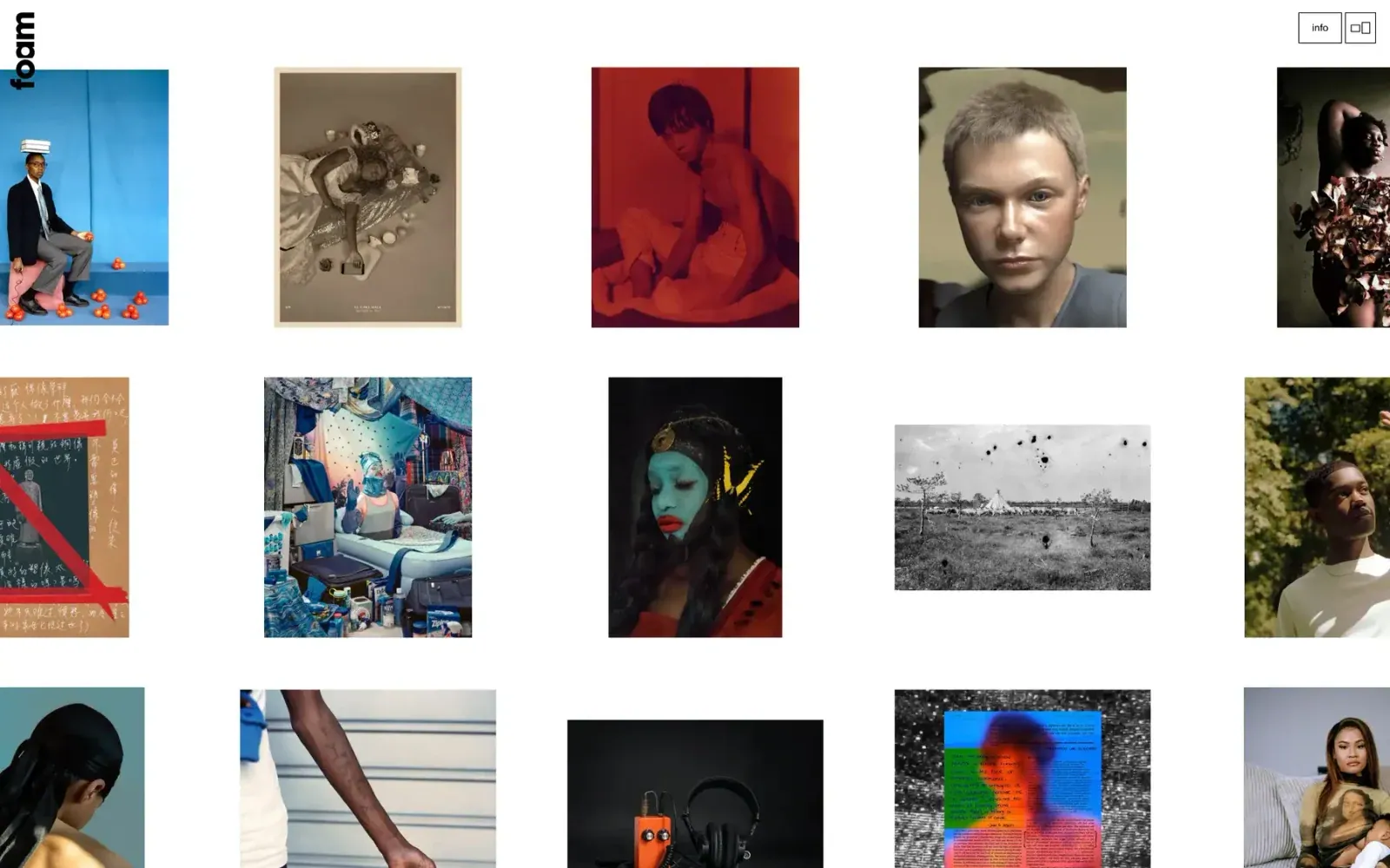
Screenshot from Httpster, saved 2026-10-24
How it’s built
- Layout
- White archive page filled with portrait and landscape artworks in varied sizes. Wide gutters separate pieces without uniform frames. Vertical foam mark anchors upper-left; outlined info/layout controls sit upper-right. Colorful portraiture, monochrome and documentary work fill the page: dense archive, not one hero.
- Type
- Bold black vertical identity is largest site type; tiny outlined utilities use simple sans. Artwork text is not site typography. Metrics unknown.
- Color and surface
- White ground/gutters separate colorful and monochrome images. No card border or shadow visible.
- Components
- Vertical identity, outlined utilities, dense irregular archive of mixed proportions; no captions in crop.
What makes it work
- Keep works distinct at high density
- Use gutters rather than repeated frames
- Keep identity compact
On a new subjectFor a community health service directory, arrange original service photographs, diagrams and illustrations at varied aspect ratios with broad consistent gutters. Use a compact edge identity and small utility controls so the collection, rather than a large promotional headline, carries the opening. Retain the visual browsing rhythm while replacing artist names and portfolio works.
Prompts
Create an original website image for {{website_name}} in {{industry}}, serving {{audience}}, presenting {{content}} and making {{functionality}} apparent.
INVARIANTS: Arrange varied image sizes in staggered columns on an open white field, with broad breathing room; use a narrow vertical identity at the far edge and two small outlined utilities opposite.
TYPOGRAPHY: Bold compact identity contrasts with tiny outlined control labels; keep captions secondary.
COLORS AND SURFACES: White ground, black labels and image-supplied color, with almost no surface decoration.
IMAGERY: Use a fresh coherent image collection with portrait and landscape crops; avoid forcing every item into a uniform card.
VARIABLES: Supply original identity, writing, imagery, accent hues and tasks for {{website_name}}, {{industry}}, {{audience}}, {{content}} and {{functionality}}.
PROHIBITIONS: Do not copy source branding, wording, photographs or signature artwork. Do not turn privacy notices, submission frames or cut-off essential text into style rules. Avoid generic card stacks, extra decorative panels or an unrelated large hero heading when they erase the specified hierarchy.
CONTINUATION: Translate the same relative type scale, alignment and image treatment into the next real content section; give that section a clear purpose rather than duplicating the hero.
RESPONSIVE PROPOSAL: Move the vertical identity into a compact top rail and use one or two intentionally staggered image columns with continued white-space pauses. Render clear, readable original text and subject-appropriate controls with consistent spacing. These proportions are visual reproduction targets, not common measured CSS. The selected still does not establish source fonts, technology, motion, hover or responsive behavior. Preserve those evidence limits; this prompt remains unvalidated.
Build a functioning responsive website for {{website_name}} in {{industry}} for {{audience}}, using {{content}} and working {{functionality}}.
INVARIANTS: Arrange varied image sizes in staggered columns on an open white field, with broad breathing room; use a narrow vertical identity at the far edge and two small outlined utilities opposite.
TYPOGRAPHY: Bold compact identity contrasts with tiny outlined control labels; keep captions secondary.
COLORS AND SURFACES: White ground, black labels and image-supplied color, with almost no surface decoration.
IMAGERY: Use a fresh coherent image collection with portrait and landscape crops; avoid forcing every item into a uniform card.
VARIABLES: Supply original identity, writing, imagery, accent hues and tasks for {{website_name}}, {{industry}}, {{audience}}, {{content}} and {{functionality}}.
PROHIBITIONS: Do not copy source branding, wording, photographs or signature artwork. Do not turn privacy notices, submission frames or cut-off essential text into style rules. Avoid generic card stacks, extra decorative panels or an unrelated large hero heading when they erase the specified hierarchy.
CONTINUATION: Carry the relative type scale, alignment and image treatment into appropriate content sections without repeating the hero or inventing irrelevant features.
RESPONSIVE PROPOSAL: Move the vertical identity into a compact top rail and use one or two intentionally staggered image columns with continued white-space pauses. Use semantic reading order, meaningful image descriptions, keyboard-operable controls and visible focus. Check display text bounds after the chosen fonts load at desktop and phone widths; keep complete essential text inside its container. Verify the actual requested actions rather than styling inert controls. Respect reduced-motion preferences if new motion is added. These proportions are visual reproduction targets, not common measured CSS. The selected still does not establish source fonts, technology, motion, hover or responsive behavior. Preserve those evidence limits; this prompt remains unvalidated.


