
Gallery screenshot, saved 2026-10-24
How it’s built
- Layout
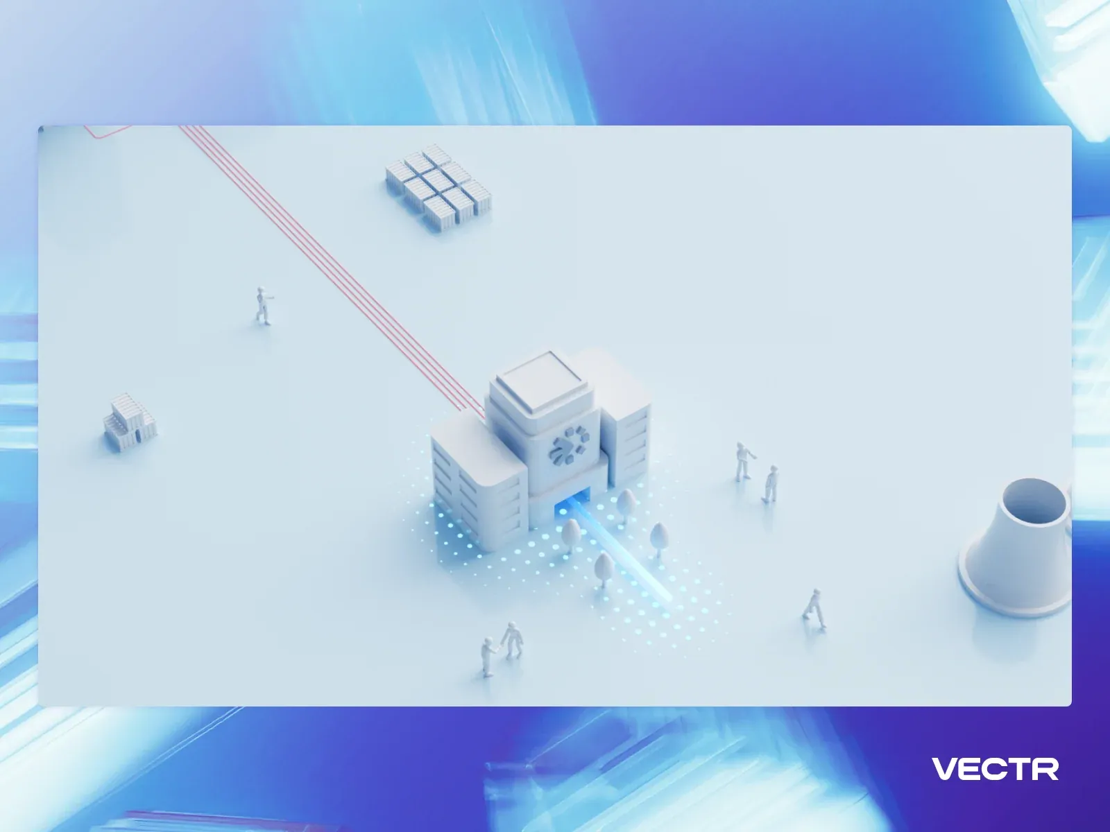
- A compact site composition sits inside a luminous blue-cyan field with a pale inset landscape. A small architectural facility and tiny people are arranged along red route lines; the VECTR mark sits low at right. This is a sparse illustrated environment rather than a readable text-led page.
- Type
- Small neutral labels and a compact geometric logo are subordinate to the illustration; no legible headline or font metrics can be established.
- Color and surface
- Electric cyan and blue surround, pale gray-white inset, restrained red route lines, and small dark building figures.
- Components
- Luminous bounded field, pale inset scene, miniature built form and figures, directional red paths, and corner logo.
What makes it work
- Bounded saturated field around a pale illustrated scene
- Small built forms and figures
- Directional route marks
- Discreet corner identity
On a new subjectFor a municipal park visitor guide, show a small illustrated park with miniature visitors and paths inside a bounded pale scene, surrounded by a saturated field and identified by a discreet corner mark. Replace the facility imagery and VECTR identity with park landmarks and visitor information.
Live behavior
- Today
- The Vectr opening centers the two-line headline “The New Standard in Staffing” above “AI driven speed. Expert curation.” and a short crew-mobilization statement. The centered VECTR mark and compact OUR INDUSTRIES / OUR MISSION navigation sit at the top, with APPLY and REQUEST CREWS pills at upper right. A pale blue-white isometric city scene with small figures and thin coral route lines fills the background; “SCROLL TO DISCOVER OUR PROCESS” is near the bottom. At desktop-scroll y=750, the page shows the “Activation, simplified” process text over the city scene. The selected gallery reference is a separate presentation of the same pale isometric environment in a blue-purple frame, without the opening headline.
- Responsive
- Desktop measures 1440×1000 with a 1440×11752 document; tablet is 768×1024 with a 768×10079 document; phone is 390×844 with a 390×9357 document. Desktop-scroll records actual y=750. The phone keeps the headline and short statement centered above the illustration, with a compact VECTR mark and menu icon in the header; at desktop the two navigation links and two action pills are visible. Body CSS records rgb(208,225,235) background and rgb(5,4,25) text. These samples document only the three captured widths.
- Scroll
- The desktop-scroll state records actual scrollY=750 in a 1440×11752 document. It shows an isometric operations scene and the “Activation, simplified” heading, followed by “One call triggers mobilization” copy and a numbered list of further process steps. This records only the saved position.


