
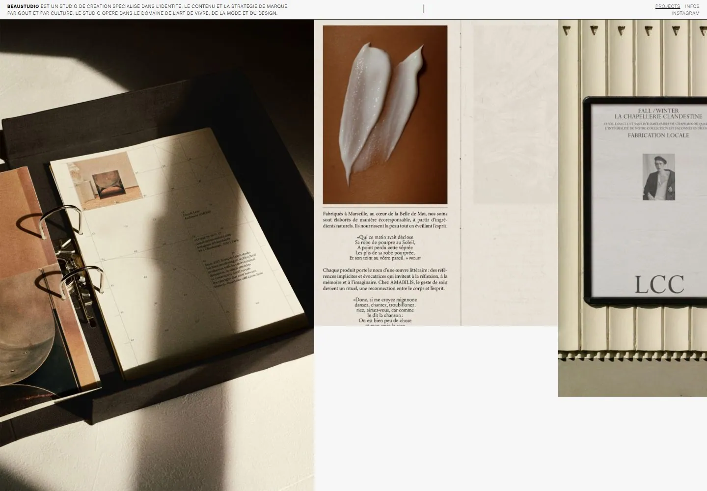
Live capture at 1440px, 2026-10-24
How it’s built
- Layout
- Tiny ruled header sits above split editorial imagery: a publication at left, close portrait at right, and huge black identity crossing both.
- Type
- Very large heavy spaced uppercase sans identity and tiny uppercase header.
- Color and surface
- Off-white, black and muted warm portrait colors.
- Components
- Narrow header, two image panels and oversized overlaid wordmark.
What makes it work
- Giant black spaced wordmark crosses split publication and portrait imagery.
On a new subjectFor an editorial archive, cross a publication and portrait with one oversized black title.
Measured
Fonts loadedBig Caslon, SuisseIntl-Light, SuisseIntl-Book
Body text16px
Page background#f8f7f7
Text color#000000
Page height1,000px
Computed CSS at 1440px, 2026-10-24.
Live behavior
- Today
- The current live homepage presents a French studio portfolio as a restrained editorial rail: a very small description and compact navigation sit above large project photographs and adjacent white/cream margins. The visual balance is photographic, airy, and magazine-like. Direct screenshot review supports a warm near-white ground with dark text, fine rules/small navigation, and project images that dominate the frame. The older live desktop screenshot in selected references is supporting historical context; the Nov 2 bound captures are the current-state observations. The Httpster gallery reference is a separate archive presentation with oversized Beaustudio branding and must not be treated as the live homepage.
- Responsive
- At 1440×1000 desktop and 768×1024 tablet, the project rail remains broad and image-led, with more compressed spacing at tablet. At 390×844 phone, the compact header and French introduction lead into vertically arranged project imagery. The page-down, middle, and bottom captures show distinct later project sections. The separately captured Infos route is a black page with white serif text: two columns and a thin divider on desktop, with a narrow phone layout that visibly extends beyond the viewport.
- Scroll
- Phone captures include initial, page-down, middle (recorded scroll target 5200), and bottom views; these show later project imagery and lower editorial sections. Exact page scroll positions follow the bound measurements; the screenshot is the evidence for visible content.


