
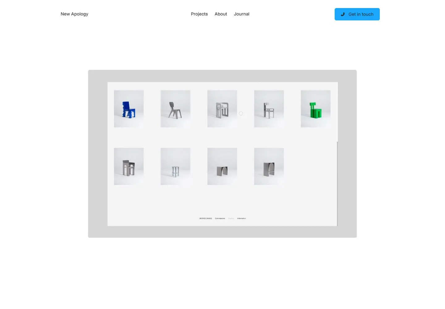
Live capture at 1440px, 2026-10-24
How it’s built
- Layout
- Large empty white upper field gives way to a small horizontal identity/link row and two side-by-side project images below.
- Type
- Small regular sans navigation; lettering within previews is depicted content.
- Color and surface
- White and light gray field with green and monochrome project imagery.
- Components
- Small identity and links, paired project previews.
What makes it work
- A low small identity row above two large project images, leaving unusually broad white space above.
On a new subjectFor a community art history archive, use a low small index row above two large artifact images and a broad white upper field.
Measured
Fonts loadedNAP Sorry Rounded
H170px / 400 / 0.7px
Body text14px
Page backgroundtransparent
Text coloroklch(0.313167 0 0)
Page height4,885px
Computed CSS at 1440px, 2026-10-24.
Live behavior
- Today
- The captured New Apology site uses a white canvas, a small left-aligned New Apology wordmark, centered Projects/About/Journal links and a blue rounded Get in touch button. Saved states vary materially: desktop t0 shows a centered warm-gray typography panel with an oversized “Poetry” specimen and a compact type note; desktop t2 shows four orange-toned phone interface previews on a pale panel; desktop-hover shows a full-width lifestyle photo with a person carrying a child; the desktop-scroll frame shows a centered positioning statement above three project images. Tablet and phone show an image block and a large, friendly rounded sans-serif studio statement. The gallery screenshot contains product/interface studies and a separate “pinto” graphic, not the same opening frame.
- Responsive
- Desktop measures viewport 1440×1000 and document 1425×4885; tablet is 768×1024 with document 753×3640; ordinary phone is 390×844 with document 375×3427; fresh reduced-motion phone is 390×844 with document 375×3691. Desktop-scroll measures actual y=750. The desktop/tablet/phone frames show changing content and narrower stacking, but do not establish a continuous breakpoint range. Sampled animation counts are 4 in desktop t0/t2/hover, 6 in desktop-scroll, tablet and ordinary phone, and 0 in reduced-motion phone.
- Scroll
- The desktop-scroll state records actual scrollY=750 in a 1425×4885 document. It shows the centered introductory statement (“New Apology is a design studio for companies in existential crisis…”) with a small circular plus control, followed by a row of three project thumbnails and captions. No project control was activated.


