
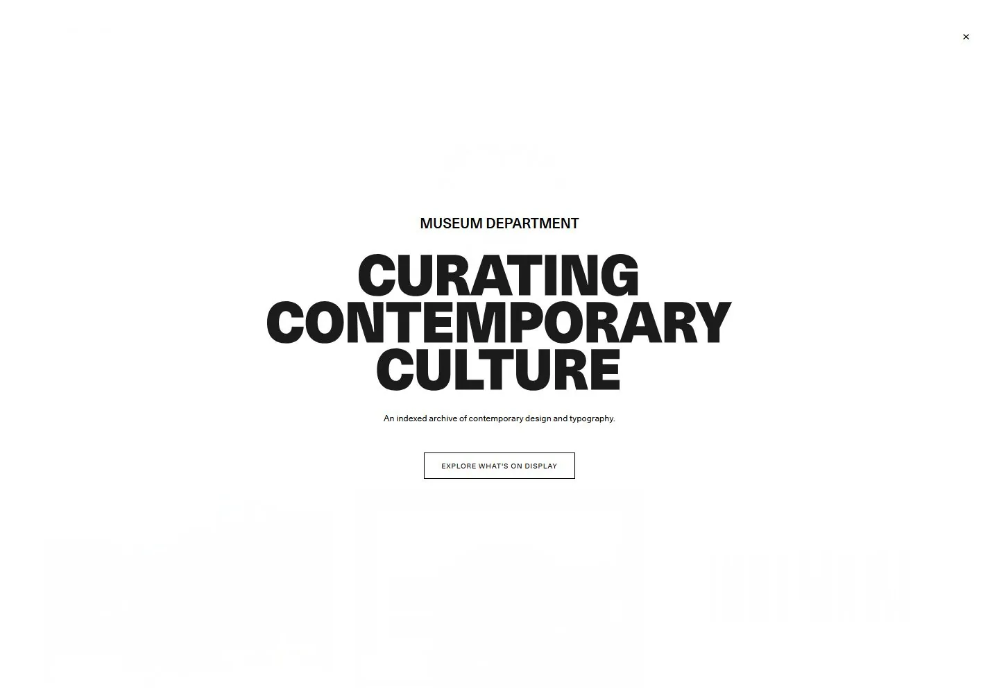
Live capture at 1440px, 2026-10-24
How it’s built
- Layout
- White page with three image tiles in a row, centered category tabs and a wide ruled table beneath.
- Type
- Small regular gray sans labels and table text, slightly larger category tabs.
- Color and surface
- White, light gray rules and varied thumbnail imagery.
- Components
- Image tiles, category filters and multi-column directory table.
What makes it work
- Three featured images above centered category tabs and a ruled directory table.
On a new subjectFor a community garden directory, place garden previews above category tabs and a ruled index.
Live behavior
- Today
- Every captured state shows a white full-screen overlay with a centered stack: small uppercase kicker, very large heavy three-line uppercase statement, one short explanatory line and a thin black outlined rectangular action. A small close mark sits at the upper right. The underlying index is not visible through the overlay; the separate gallery reference shows an image grid and list but cannot establish current browser behavior.
- Responsive
- At all three sampled widths the content stays centered with broad white margins and the close mark near the upper-right corner. The headline shrinks markedly at phone width while keeping three lines; the outlined action and small description remain below it. These are sampled states, not an inferred breakpoint.
- Scroll
- The desktop measurement reports actual scrollY 750, but the screenshot remains covered by the same overlay. Underlying content movement and its appearance are not visually established.


