
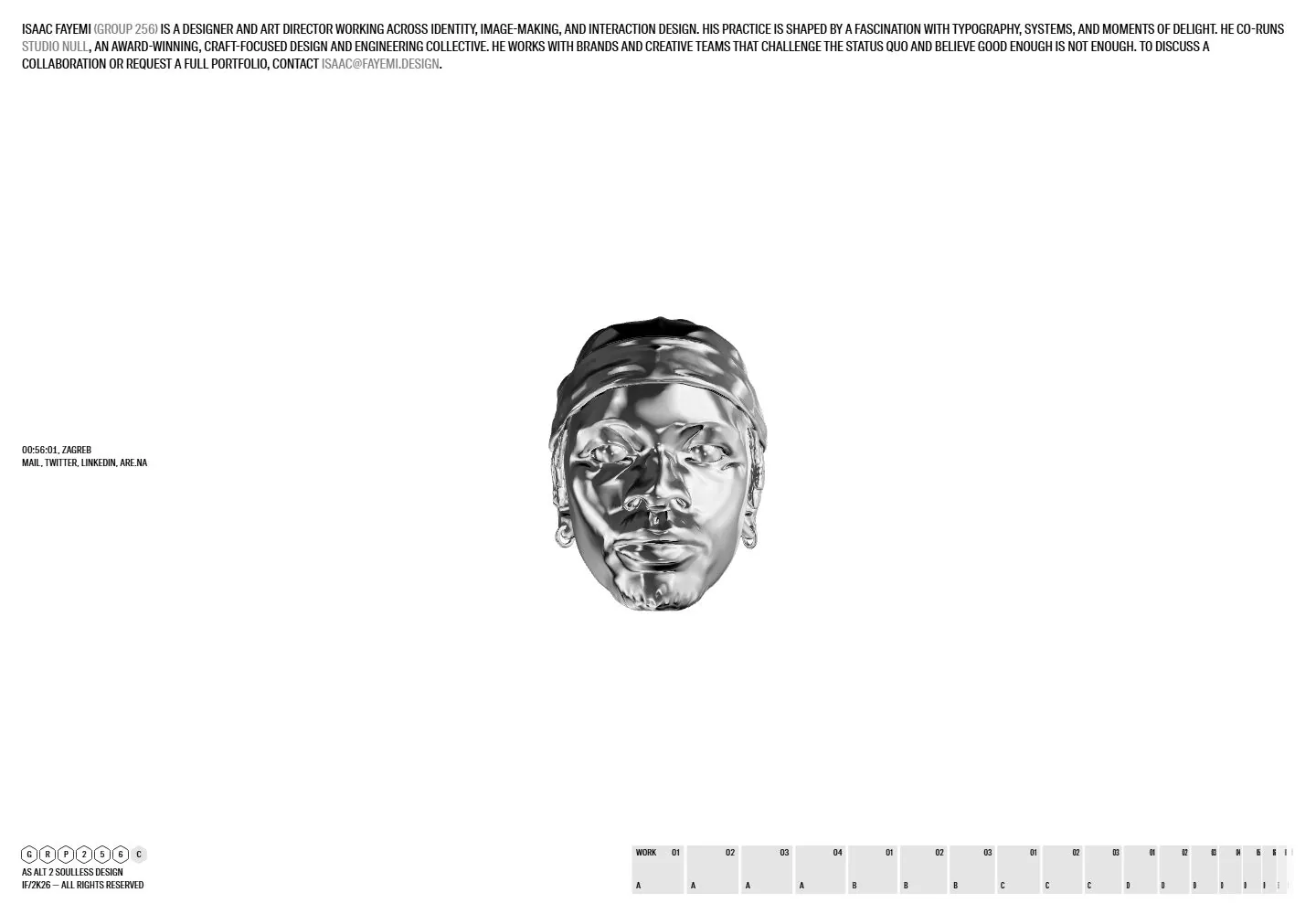
Live capture at 1440px, 2026-10-24
How it’s built
- Layout
- White page with dense narrow uppercase introduction along top, small metallic-looking head centered in large whitespace, micro labels at left and small grid at bottom right.
- Type
- Tiny condensed uppercase black type and small technical labels.
- Color and surface
- White, black, gray and reflective metallic image.
- Components
- Top introduction, centered object, small labels and lower grid.
What makes it work
- Small reflective object centered in white space beneath dense micro typography.
On a new subjectFor a sculpture archive, center a reflective object beneath a small uppercase introduction.
Live behavior
- Today
- Desktop shows a stark white field with a compact condensed uppercase introduction across the top, a reflective monochrome sculptural head centered in ample whitespace, tiny contact details at left, and a row of small gray index cells at bottom right. The selected live and gallery references show substantially the same composition.
- Responsive
- Tablet keeps the viewport-based composition with a larger wrapped introduction and centered head. Phone shortens the introduction with a read-more label, centers the head and small identity mark above a vertically continuing project image; the measured phone document is much taller than the viewport. Exact breakpoints and hidden content behavior are not established.
- Scroll
- The desktop scroll-labeled frame remains at scrollY 0 with a viewport-height document; it does not establish scrolling behavior. The central head orientation changes, but time or pointer position could explain that change.


