
Live capture at 1440px, 2026-10-25
How it’s built
- Layout
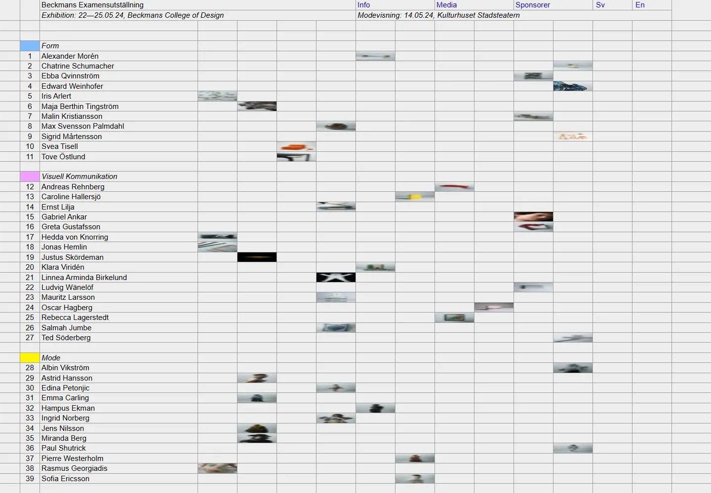
- A pale gray page resembles a dense ruled spreadsheet with numbered names at left and tiny image fragments scattered across columns.
- Type
- Tiny compact sans labels and numbered entries.
- Color and surface
- Pale gray, fine gray grid, black text and tiny images.
- Components
- A dense ruled grid organizes numbered names and small image fragments across a pale field.
What makes it work
- Pale gray ruled grid
- Numbered names at left
- Small image fragments distributed in cells
On a new subjectFor a public science archive, distribute numbered specimen names and small image fragments in a pale gray spreadsheet-like ruled grid.
Prompts
Create an exhibition index for {{website_name}} in {{industry}} for {{audience}}, organizing {{content}} and exposing {{functionality}}. Invariants: Preserve the selected screenshot’s spreadsheet-like full-page composition: fine gray cell rules over almost the whole viewport; a shallow top band for exhibition identity, dates/venue, media and language links; numbered participant names in a broad left column; category groups with italic labels and small color swatches; tiny work previews scattered in aligned cells on the right. The grid itself is the graphic identity, not a decorative backdrop. Visual estimate: the grid fills nearly the 1440x1000 frame, header is around 4% of its height, names use roughly half the width, and thumbnails are sparse and small. Matching live DOM reports a 42px header and text rows around 20px high with sampled text at 15.2px; see research/evidence/div2-0026/measurements-desktop.json. These are current DOM values, not all-purpose tokens. Palette is muted white/gray/black with occasional swatches and small images; type is plain and compact. Variables: create new participant data, groups, metadata, swatches, language choices, and controls for {{website_name}}, {{industry}}, {{audience}}, {{content}}, and {{functionality}}, retaining row/group/grid hierarchy. Prohibitions: no source identity, names, dates, venue, copy, or art; do not assume hover/filter behavior. Responsive proposal: switch to stacked participant rows or a horizontally navigable table while keeping each person linked to their category and preview.
LATER LIVE EVIDENCE AND PROPOSED ADAPTATION: Later limited live inspection showed the wide desktop grid becoming a single-column participant roster at390×844, under a wrapping header; desktop thumbnails were absent from that visible mobile opening. One title-link hover changed measured black to rgb(20,0,255). Transfer the roster reflow and a restrained link-color response as proposed adaptations; sorting, language switching and thumbnail interactions remain untested.
Implement a responsive exhibition roster for {{website_name}} in {{industry}} for {{audience}}, presenting {{content}} and supporting {{functionality}}. Keep the measured page’s Invariants: visual system: dense table cells and fine gray rules fill the canvas; a narrow metadata/header band sits above rows; numbered participants form a broad name column; category headings and modest swatches identify groups; small preview images align sparsely in other cells. The matching live capture’s DOM measures header height at 42px, row text at about 20px line/box height, and sampled text at 15.2px; see research/evidence/div2-0026/measurements-desktop.json. Those values apply to this screenshot’s current live version. Treat overall width allocation and preview sizes as visual estimates. Use restrained light gray/white surfaces, dark legible text, modest link color, and small images subordinate to names. Replace all source names, date, event, venue, identity, and images with data for {{website_name}}, {{industry}}, {{audience}}, and {{content}}. The source’s hover/filter/language behavior is not tested; build appropriate new {{functionality}} without claiming reference behavior. Variables: replace roster entries, metadata, group labels, swatches, and preview artwork while preserving number/name/category/image alignment. Prohibitions: do not copy source names, date, venue, identity, text, or artwork, and do not claim untested hover or filters. Responsive proposal: on small screens convert cells into accessible grouped rows, or preserve a scrollable table with visible context; maintain participant-to-category association and readable labels. Use semantic table/list markup, keyboard-friendly links, focus indicators, and accessible image text and contrast. Use consistent row baselines, column edges, and visibly nested group labels so dense information remains scannable; align every thumbnail with its participant rather than using it as decoration.
LATER LIVE EVIDENCE AND PROPOSED ADAPTATION: Later limited live inspection showed the wide desktop grid becoming a single-column participant roster at390×844, under a wrapping header; desktop thumbnails were absent from that visible mobile opening. One title-link hover changed measured black to rgb(20,0,255). Transfer the roster reflow and a restrained link-color response as proposed adaptations; sorting, language switching and thumbnail interactions remain untested.
Measured
H115.2px / 400
Body text15.2px
Page background#ededed
Text color#000000
Page height1,001px
Computed CSS at 1440px, 2026-10-25.
Live behavior
- Today
- The captured Beckmans exhibition page is rendered as a pale gray, spreadsheet-like field: fine horizontal and vertical rules form numbered student rows, grouped under Swedish program labels, while small project thumbnails are scattered in distant cells. A compact multi-column header contains the exhibition title and dates plus Info, Media, Sponsorer and language links. Text and rules dominate the screen; the images occupy only a small fraction of the grid.
- Responsive
- At 1440×1000, the header is a 42.36px-high full-width band and the ruled list begins below it. At 768×1024, the header stacks to about 104px and the grid compresses, bringing thumbnails closer to the names. At 390×844, the document measures 375px wide; the visible left side shows only row numbers, names and colored group markers, with the dispersed thumbnails outside the narrow captured area. This is evidence for these three widths only.
- Scroll
- The desktop-scroll measurement records actual scrollY=1 in a 1440×1001 document, so the screenshot is effectively the same top-of-page view and does not establish a scrolled section or scroll behavior.


