
Live capture at 1440px, 2026-10-24
How it’s built
- Layout
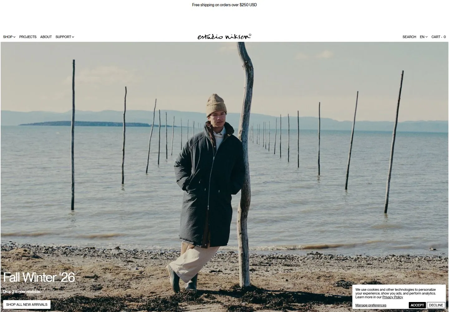
- Wide coastal fashion photograph with centered person and low horizon fills an inset white frame. A narrow shipping strip sits above a white navigation band; small links flank a centered handwritten wordmark. Seasonal title and compact action anchor lower left. Key relationship: quiet utility chrome against expansive editorial image. Transfer image-first hierarchy and modest controls. Person, clothing, coast, title and frame are campaign-specific. Capture does not prove persistent header or responsiveness. The header and image read as separate horizontal zones: small-scale navigation above, then an immersive photograph whose crop carries the visual weight. The center subject is slightly above the image midpoint, leaving lower-left room for the title and action. The frame creates a contained storefront impression, but should not be copied as a border rule without further evidence. Useful adaptations can preserve asymmetric caption placement and a clean header while replacing the setting with relevant campaign imagery. The photo contains many fine textures, so secondary controls remain visually quiet. Color impressions are cool sea and sky balanced by the warm garment. No exact color values, spacing units, responsive rules, or font identities are established by pixels alone.
- Type
- Tiny clean sans utility links sit in the top corners. A thin handwritten identity mark is centered above the image, while the seasonal caption is a much larger light sans line with a small rectangular action below. Font names and metrics are unknown.
- Color and surface
- Pale near-white page rectangle over a dark close-up photographic surround. The main image carries cool blue-gray sea and sky, neutral stone, and rust clothing. A fine white inset line marks the hero boundary; no card shadow is apparent.
- Components
- Narrow shipping notice, split utility navigation, centered wordmark, one wide fashion image, lower-left campaign caption and shop action. The hero is one continuous photographic scene; no card system is demonstrated.
What makes it work
- Keep the main image dominant over interface chrome
- Use a compact header whose identity remains distinct from its utility links
- Place one short supporting message/action away from the visual focal subject
On a new subjectFor a museum exhibition, choose one wide installation photograph with enough quiet area to support a small title and ticket link. Keep those controls subordinate to the art and place them off the center of interest. Use the exhibition’s own colors and identity.
Prompts
Create an original website image for {{website_name}} in {{industry}}, serving {{audience}}, presenting {{content}} and making {{functionality}} apparent.
INVARIANTS: Put a shallow light navigation band above a wide photographic hero; center a small identity in the band and place a short caption/action near the lower-left image edge.
TYPOGRAPHY: Use widely spaced tiny sans navigation and a modest caption; a small handwritten or script identity is optional.
COLORS AND SURFACES: Light neutral navigation over a naturally colored photograph, with high-contrast edge labels.
IMAGERY: Use one new environmental image with useful quiet space for the lower-left caption; clothing and coast are source variables.
VARIABLES: Supply original identity, writing, imagery, accent hues and tasks for {{website_name}}, {{industry}}, {{audience}}, {{content}} and {{functionality}}.
PROHIBITIONS: Do not copy source branding, wording, photographs or signature artwork. Do not turn privacy notices, submission frames or cut-off essential text into style rules. Avoid generic card stacks, extra decorative panels or an unrelated large hero heading when they erase the specified hierarchy.
CONTINUATION: Translate the same relative type scale, alignment and image treatment into the next real content section; give that section a clear purpose rather than duplicating the hero.
RESPONSIVE PROPOSAL: Simplify the navigation rail and preserve the image/caption relationship; place the action just below the image if the safe image crop cannot support readable text. Render clear, readable original text and subject-appropriate controls with consistent spacing. These proportions are visual reproduction targets, not common measured CSS. The selected still does not establish source fonts, technology, motion, hover or responsive behavior. Preserve those evidence limits; this prompt remains unvalidated.
Build a functioning responsive website for {{website_name}} in {{industry}} for {{audience}}, using {{content}} and working {{functionality}}.
INVARIANTS: Put a shallow light navigation band above a wide photographic hero; center a small identity in the band and place a short caption/action near the lower-left image edge.
TYPOGRAPHY: Use widely spaced tiny sans navigation and a modest caption; a small handwritten or script identity is optional.
COLORS AND SURFACES: Light neutral navigation over a naturally colored photograph, with high-contrast edge labels.
IMAGERY: Use one new environmental image with useful quiet space for the lower-left caption; clothing and coast are source variables.
VARIABLES: Supply original identity, writing, imagery, accent hues and tasks for {{website_name}}, {{industry}}, {{audience}}, {{content}} and {{functionality}}.
PROHIBITIONS: Do not copy source branding, wording, photographs or signature artwork. Do not turn privacy notices, submission frames or cut-off essential text into style rules. Avoid generic card stacks, extra decorative panels or an unrelated large hero heading when they erase the specified hierarchy.
CONTINUATION: Carry the relative type scale, alignment and image treatment into appropriate content sections without repeating the hero or inventing irrelevant features.
RESPONSIVE PROPOSAL: Simplify the navigation rail and preserve the image/caption relationship; place the action just below the image if the safe image crop cannot support readable text. Use semantic reading order, meaningful image descriptions, keyboard-operable controls and visible focus. Check display text bounds after the chosen fonts load at desktop and phone widths; keep complete essential text inside its container. Verify the actual requested actions rather than styling inert controls. Respect reduced-motion preferences if new motion is added. These proportions are visual reproduction targets, not common measured CSS. The selected still does not establish source fonts, technology, motion, hover or responsive behavior. Preserve those evidence limits; this prompt remains unvalidated.
Measured
Fonts loadedPP Neue Montreal
H142px / 400 / -1.47px
Body text16px
Page background#ffffff
Text color#000000
Page height12,242px
Computed CSS at 1440px, 2026-10-24.
Live behavior
- Today
- White retail shell with very small black uppercase navigation, a centered handwritten wordmark and a deliberately large blank interval below the shipping line. A nearly edge-to-edge muted outdoor campaign photograph carries a small white lower-left seasonal heading, short line and compact rectangular action. Below, abundant white space precedes a dense run of evenly sized product-photo tiles with tiny uppercase names/prices and almost no card decoration. Consent is a small white lower-right panel.
- Responsive
- Desktop campaign IMG measures1436x954.797px at2,134; tablet764x509.219px at2,94; phone uses a different portrait campaign IMG at2,94 with386x750px bounds. The phone image depicts a different model/setting, not simply a crop of the landscape frame. No asset-selection mechanism is established. Header changes to Menu, centered mark and cart, retaining the shipping line. Seasonal title changes42px to34.8179px tablet and29.0658px phone, with matching single-size line heights. Tablet exposes three253.328px-wide product images and tiny arrows; desktop scroll shows eight177.75px-wide tiles. Carousel behavior and phone product-row layout are untested. Consent obscures most of the phone action.
- Scroll
- Actual scrollY750 reveals the bottom of the campaign plus a large white gap above New Arrivals. Navigation remains near the top; seasonal heading/action move with the photo. Eight closely spaced product images appear with visible names/prices below, followed by the next row beginning at the bottom. Raw View Product labels over the image areas are accessible/hidden text rather than visible overlays and are excluded. Consent covers lower-right content.


