
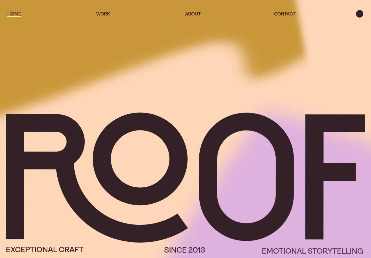
Live capture at 1440px, 2026-10-24
How it’s built
- Layout
- A dark plum rounded page surface is centered in a larger black field. A top row contains a large ROOF wordmark, spaced Home/Work/About/Contact links and a circular control. A large cinematic still of a stylized rendered-looking character standing on a porch or exterior entrance fills most of the center; featured-work title and project label sit at left, a small view-project pill overlays near center-right, and a vertical stack of short marks sits at right. A Sneak Peek pill is at lower right. Outer black field may be gallery framing.
- Type
- White clean sans navigation and project copy at moderate size; small uppercase caption; wordmark uses rounded outlined forms. No exact face/metrics.
- Color and surface
- Dark plum page surface, warm porch/exterior entrance photo, cream/white type and pale pill controls; outer field nearly black.
- Components
- Top navigation, large featured still, left project title/credit, view-project pill, right vertical index and lower-right preview pill.
What makes it work
- Single dominant project image
- Compact edge navigation/index
- Small project title and credit
- Few restrained controls
On a new subjectFeature an unrelated project in one large image with a concise title and minimal navigation or controls at the edges. Replace film content and identity; use a surround only if verified as part of the page.
Measured
Fonts loadedAmbit, GT-Alpina, icomoon
Body text7.5px
Page background#ffd6b8
Text color#332127
Page height11,552px
Computed CSS at 1440px, 2026-10-24.
Live behavior
- Today
- Roof Studio saved desktop view is already at document scroll1000, showing a huge dark mixed-type uppercase statement over soft peach/lilac/ochre blurred color fields. Bold sans phrases alternate with lighter italic high-contrast serif emphasis. A compact dark identity, widely spaced HOME/WORK/ABOUT/CONTACT and circle utility sit along the top; a mixed serif/sans FEATURED WORK line enters below. A small ochre cookie notice appears later at bottom left; it is an overlay, excluded from design DNA.
- Responsive
- Tablet/phone captures start at0, unlike desktop1000, so they do not establish a simple same-section breakpoint comparison. At768px the statement is smaller and a huge cropped identity-like form crosses its lower area; header reduces to menu cue. At390px statement reflows left-aligned into many lines with20px inset. Ordinary phone also has the enormous dark logo-like overlay and cookie notice; fresh preference instead has small upper-left identity and legible statement. Oversized logo overlap is phase/scroll-mismatched, not a settled narrow invariant.
- Scroll
- The desktop-scroll label records actual750 compared with1000 in t0/t2: this is an upward250px change, not a downward750px movement from0. Statement y increases250px as expected, top navigation remains near the top and cookie notice persists. Color-field motion continues and is time-confounded; no full hero-to-work transition inferred.


