
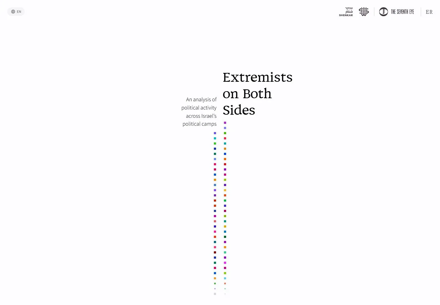
Live capture at 1440px, 2026-10-24
How it’s built
- Layout
- A nearly empty white field places a small language pill at upper left and a compact row of publisher/partner marks at upper right. Near the center, a narrow explanatory paragraph sits left of a much larger three-line black serif title. Two thin vertical columns of small colored squares descend below the text. No photography is visible; the language pill is an untested control.
- Type
- Large black high-contrast serif title; small regular sans explanatory paragraph; tiny partner labels and colored square markers. Exact fonts unknown.
- Color and surface
- Open white field, black/gray typography and two narrow columns of varied saturated square accents.
- Components
- Language selector, partner marks, explanatory blurb, oversized title and two vertical marker columns.
What makes it work
- Expansive white negative space
- Asymmetric small-copy/oversized serif-title pairing
- Narrow vertical columns of colored square marks
- Small peripheral identity/partner row
On a new subjectFor a public epidemiology institute, introduce a disease-surveillance report on a wide white field with concise context beside a large serif report title and two narrow columns of color-coded topic markers. Retain the asymmetrical scale and generous blank space; replace political content and validate any data separately.
Measured
Fonts loadedAssistant, Josefin Slab, Discordia
H224px / 700
Body text16px
Page background#fdfcff
Text color#000000
Page height24,188px
Computed CSS at 1440px, 2026-10-24.
Live behavior
- Today
- Nearly white field with a tiny language capsule upper left and a compact institutional identity row upper right. The central opening balances a black multi-line serif title on the right with a smaller light sans description aligned right on its left. Two slender descending streams of small saturated square marks carry the visual accent. The scroll state replaces the opening composition with a centered serif prose panel bounded by a dotted rounded outline and colored squares beneath.
- Responsive
- Desktop title40px/54px Discordia becomes24px/34.8px phone; description18px/26.64px Assistant at weight300 becomes16px/22.56px. Phone retains the side-by-side title/description relationship rather than a standard single centered column, with fewer visible squares. Header identities compact/reorder and language capsule becomes icon-only. Tablet is not an opening-screen comparison: its actual scrollY766 shows the prose scene, with document817px wide in a768px viewport. Underlying labels peek behind the panel. Horizontal overflow and the retained narrative position prevent treating this as a clean tablet breakpoint demonstration.
- Scroll
- Actual scrollY750 shows a central dotted-outline panel with18.5px/27.75px Discordia prose and a cluster of colored squares below. The fixed canvas remains viewport-sized. The tablet capture retains a related mid-story scene at766, while phone resets to0. These observations establish distinct story states, not a full morphing trajectory, per-square identity mapping or complete narrative.


