
Gallery screenshot, saved 2026-10-24
How it’s built
- Layout
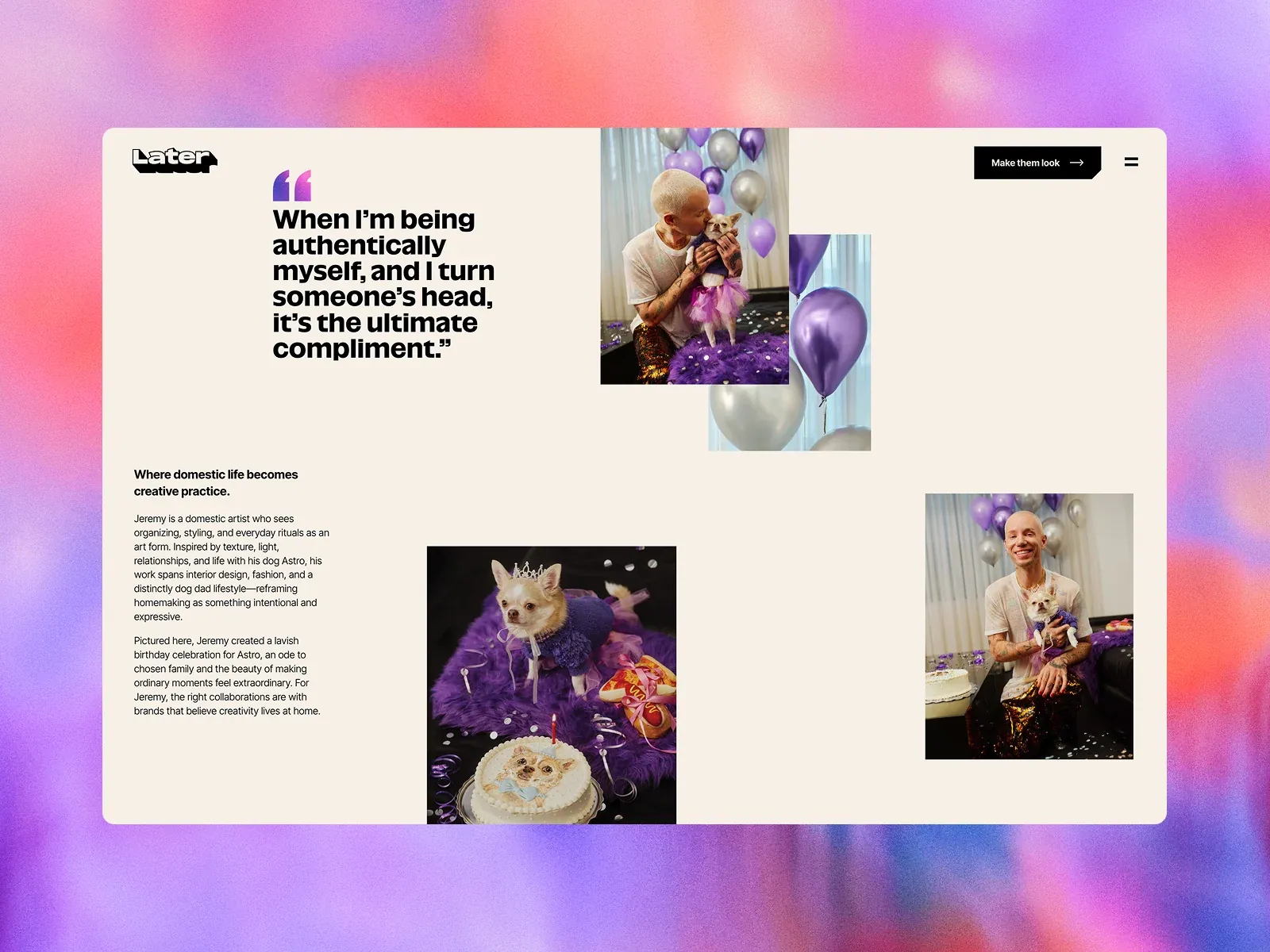
- A large rounded warm-cream page panel sits inside a saturated pink, coral and violet blurred surround. Within it, logo/menu and a black action sit at the top; a bold quote occupies the upper left while overlapping celebration photographs float near top center. Two columns below pair editorial copy at left with separate photos of a person and dog at lower center/right. The outer gradient may be gallery presentation framing.
- Type
- Bold compact sans quotation and headings, with smaller sans body copy; logo uses a custom heavy wordmark. No exact typography metrics.
- Color and surface
- Warm cream page, black copy, rich purple celebration photos and saturated pink-violet outer surround; panel corners are rounded. The role of exterior color field is uncertain.
- Components
- In-panel brand/nav/action, large quote, overlapping photo pair, lower editorial text and separate supporting photos.
What makes it work
- Warm light page field
- One prominent quotation
- Several relevant photos with staggered placement
- Compact supporting story
On a new subjectPair an unrelated human-scale quotation with a small set of relevant photos arranged with deliberate offsets, then give the story a clear supporting column. Do not assume the outer gradient is part of the page.
Live behavior
- Today
- Later’s “Made You Look” capture has a warm cream background and a vivid pink-to-orange-to-purple textured gradient band. Desktop t0 shows the Later wordmark, a black “Make them look” action and menu icon over a large video frame of a person decorating a cabinet; a cookie-consent panel overlays the lower frame. Desktop t2 shows a different video frame of a person sewing, while the same consent panel remains. The hover-labeled frame adds a purple “MADE YOU LOOK” bubble near the upper left. At desktop scrollY=772, the page shows an editorial split section with huge “MADE YOU LOOK” typography, “Where imagination meets influence,” credits and explanatory copy. Tablet and ordinary phone show only the cream page shell and cookie panel, without hero media/content in the sampled frames. The fresh reduced-motion phone instead displays a pink-purple gradient, a thumbs-up mark and “Loading 100%” behind the same consent panel. The selected gallery image depicts a separate editorial story page on the gradient backdrop and is not substituted for the captured states.
- Responsive
- Desktop measures 1440×18496; tablet measures 768×26224; phone and reduced-motion phone measure 390×18421. Desktop captures show the gradient header, video and persistent cookie-consent panel, while tablet and ordinary phone show a mostly blank cream surface with the panel near the bottom. The fresh reduced-motion phone shows a gradient loader and the same consent panel. These different saved frames do not establish responsive breakpoints or explain the missing media/content in tablet and ordinary phone.
- Scroll
- The desktop-scroll state records actual scrollY=772 in a 1440×18496 document. It shows the large “MADE YOU LOOK” heading, the subheading “Where imagination meets influence,” production credits, and explanatory editorial copy to the right, with the gradient header and cookie panel still visible. The capture does not test any links or cookie choices.
More like this