
Live capture at 1440px, 2026-10-24
How it’s built
- Layout
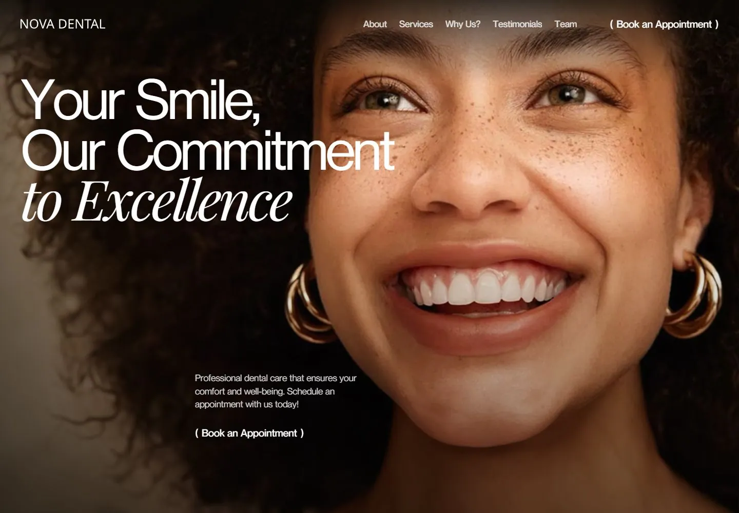
- The screen area shows a close, warmly lit portrait filling the hero, with the smiling subject occupying the right and dark hair/space at left. A large left-aligned three-line promise overlays the darker area: two lines in light sans followed by an italic serif line. Small navigation runs across the top; a short explanatory sentence and appointment link sit near lower left/center. Tablet bezel, pale outer surround and external UI Design/Website labels are gallery presentation framing, not established page content.
- Type
- Large light-weight sans promise with a final italic-serif line; compact light sans navigation and small appointment explanation/link. Exact face and metrics unknown.
- Color and surface
- Pale gray outer field, black device bezel, warm skin/portrait photo, white in-screen type.
- Components
- Close human portrait hero, left-aligned mixed sans/italic-serif proposition, compact top navigation, lower explanatory copy and appointment link; tablet/outside labels are presentation context.
What makes it work
- Close human portrait fills the hero, with face weighted to the right and darker text space at left.
- Large left-aligned light sans promise ends with an italic-serif line.
- Small top navigation and lower explanatory/appointment detail remain secondary.
On a new subjectFor an unrelated marine research institute, use an original close portrait of a field scientist weighted to the right, place a concise light sans mission promise in the darker left area with its final line in italic serif, and keep navigation and a small fieldwork explainer secondary. Present as a direct page rather than copying tablet framing.
Measured
Fonts loadedNeuemontreal English, Ppeditorialnew English, Playfairdisplay English, Neuehaasgroteskdisplaypro 55 Roman English
H1108px / 500 / -5.44px
Body text16px
Page background#ffffff
Text color#222326
Page height10,422px
Computed CSS at 1440px, 2026-10-24.
Live behavior
- Today
- Full-bleed close-up portrait with white left-aligned large sans headline and contrasting italic serif final line; compact white navigation and lower support/action overlay the image.
- Responsive
- Tablet retains desktop navigation and mixed headline over the image; phone crops the portrait tightly, puts copy lower, and replaces links with a menu icon.
- Scroll
- At scroll 750 a dark header remains above a white section containing a huge mixed sans/italic editorial paragraph and small portrait.


