
Live capture at 1440px, 2026-10-24
How it’s built
- Layout
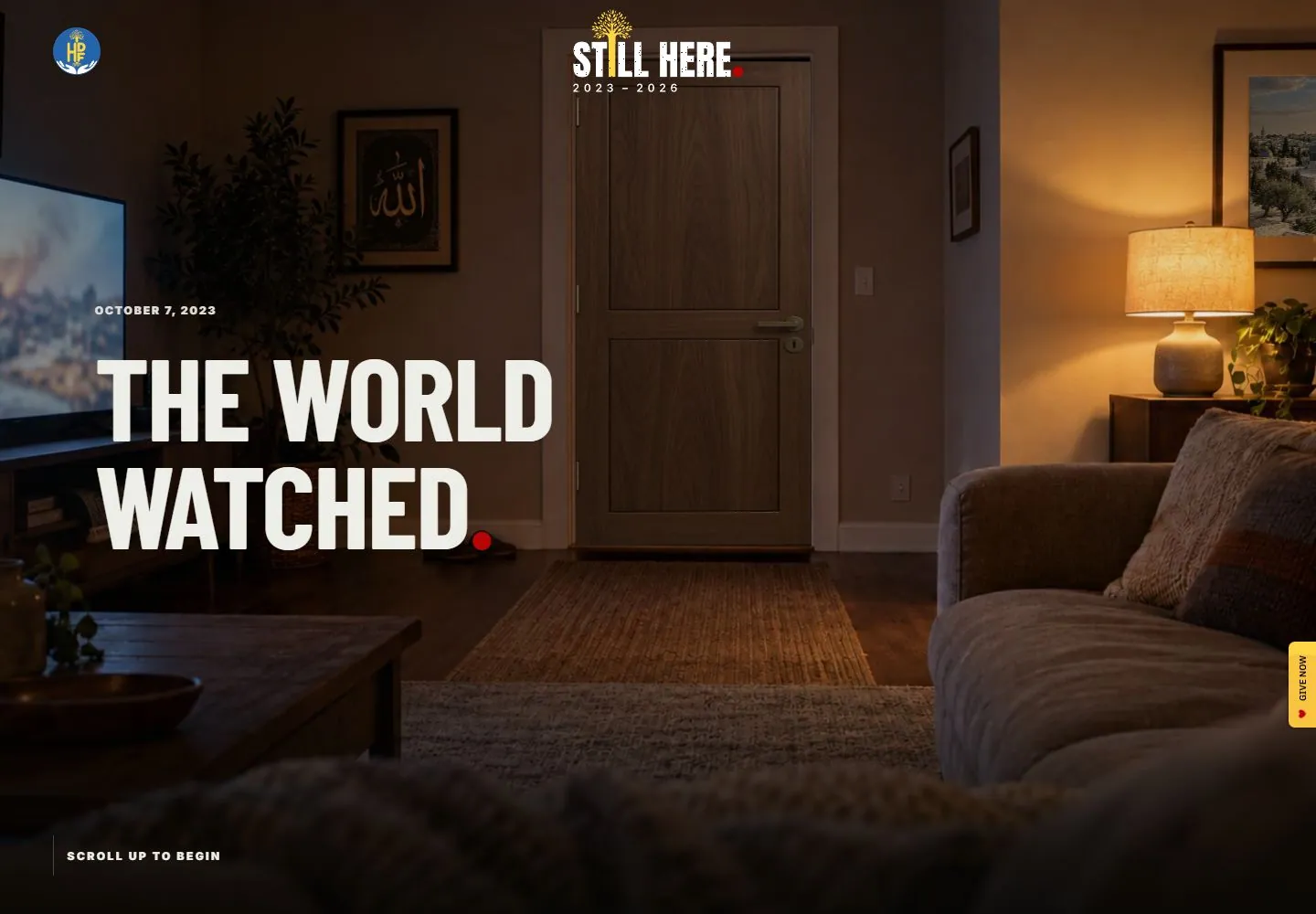
- Darkened full-bleed living-room photograph with a doorway centered in the frame, sofa at right, television and furniture at left. Small organization mark sits upper left; compact “Still Here” identity/date is near top center. Large white two-line headline “THE WORLD WATCHED.” dominates left-center, with date above it. A small vertical give-now control sits on right edge and “scroll up to begin” rests near lower left.
- Type
- Large bold condensed uppercase headline; small tracked uppercase date and identity labels; small navigation/control text. Exact font face and metrics unknown.
- Color and surface
- Warm low-key brown/amber room photo with white/cream type, small red punctuation and blue/yellow mark. No card panels; image is the full field.
- Components
- Full-frame interior photo, organization mark, title/date, vertical give-now tab, scroll cue.
What makes it work
- Full-frame contextual photograph
- Large legible statement
- Small date/identity
- Secondary action and cue at edges
On a new subjectUse a subject-relevant place photograph to ground an unrelated campaign statement, with concise date/identity and a secondary action at the edge. Replace the original campaign facts and imagery.
Measured
Fonts loadedOpening Barlow, Opening Inter, Inter, Barlow, Barlow Black, Story Script
H1126.72px / 700 / -1.9008px
Body text16px
Page background#111111
Text color#eeeee8
Page height53,939px
Computed CSS at 1440px, 2026-10-24.
Live behavior
- Today
- Still Here saved opening fills the viewport with a warmly lit living-room scene: centered closed door, television left and lamp/sofa right, with darkened lower edges. Large cream condensed uppercase two-line text sits at left, a small tracked date above and a red terminal dot. Small source emblem upper left and larger centered identity image sit near top. A yellow vertical GIVE NOW tab with red heart anchors the right edge; a tiny uppercase scroll invitation sits low. No factual claim from the narrative copy is evaluated here.
- Responsive
- Tablet and ordinary phone use a taller cropped room view, smaller top identity images and the title/date near lower left rather than desktop middle-left. At390px the title stays two lines, left24px, with bottom scroll invitation centered and yellow donation tab right. Tablet document width814 exceeds768px viewport; cause is not isolated, while phone document width390 matches viewport. Fresh phone preference uses different type/placement and opened-door narrative phase, so this is not a simple width-only comparison.
- Scroll
- Actual desktop scroll750/document1440x53939 retains the same room, title, identities and right tab near viewport positions. Title y shifts374.1875 to370.1875, while the room IMG expands from1776.828125x1000 to1955.408203125x1100.505; the bottom invitation becomes very faint. This supports a retained opening during an observed scroll with changed imagery, but concurrent animation/time prevents a precise causal motion rule.


