
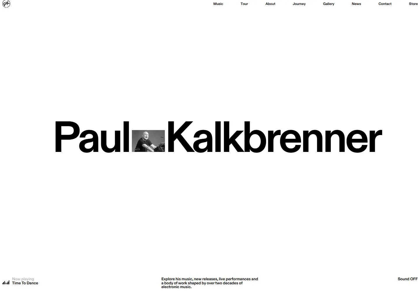
Live capture at 1440px, 2026-10-24
How it’s built
- Layout
- The bright in-screen page has broad whitespace, tiny top navigation, an oversized centered artist name interrupted by a small image, and tiny lower-edge music/context labels. Laptop on rough stone against pale gray is presentation framing.
- Type
- The display lettering is visually dominant; smaller navigation, labels or supporting copy are secondary where legible. Exact typeface, rendered font identity and CSS metrics are unknown.
- Color and surface
- In-screen surface is nearly white with black type and a small muted image. Laptop, dark stone and pale gray background are mockup staging, not page surfaces.
- Components
- In-screen navigation, oversized name interrupted by image, small lower labels. Laptop, stone pedestal and studio are framing.
What makes it work
- Bright whitespace
- Oversized centered identity
- Small image interrupting lettering
- Tiny peripheral nav/labels
On a new subjectFor a classical-music festival, set its large centered name on a bright sparse page and interrupt the lettering with a small performance still; keep nav and metadata minimal. Omit device/stone staging.
Measured
Fonts loadedABC Diatype Plus Variable
H1150px / 700 / -7.5px
Body text12px
Page background#000000
Text color#000000
Page height10,467px
Computed CSS at 1440px, 2026-10-24.
Live behavior
- Today
- White field, small upper navigation, enormous centered black artist name interrupted by a small monochrome image; small audio and description labels anchor bottom.
- Responsive
- Tablet maintains centered name and full navigation; phone shows compact circular menu, top description and bottom audio labels, with name partially cropped in ordinary frame.
- Scroll
- At scroll 750 a ruled grid with oversized cropped words and black circles appears above a row of music-service marks.


