
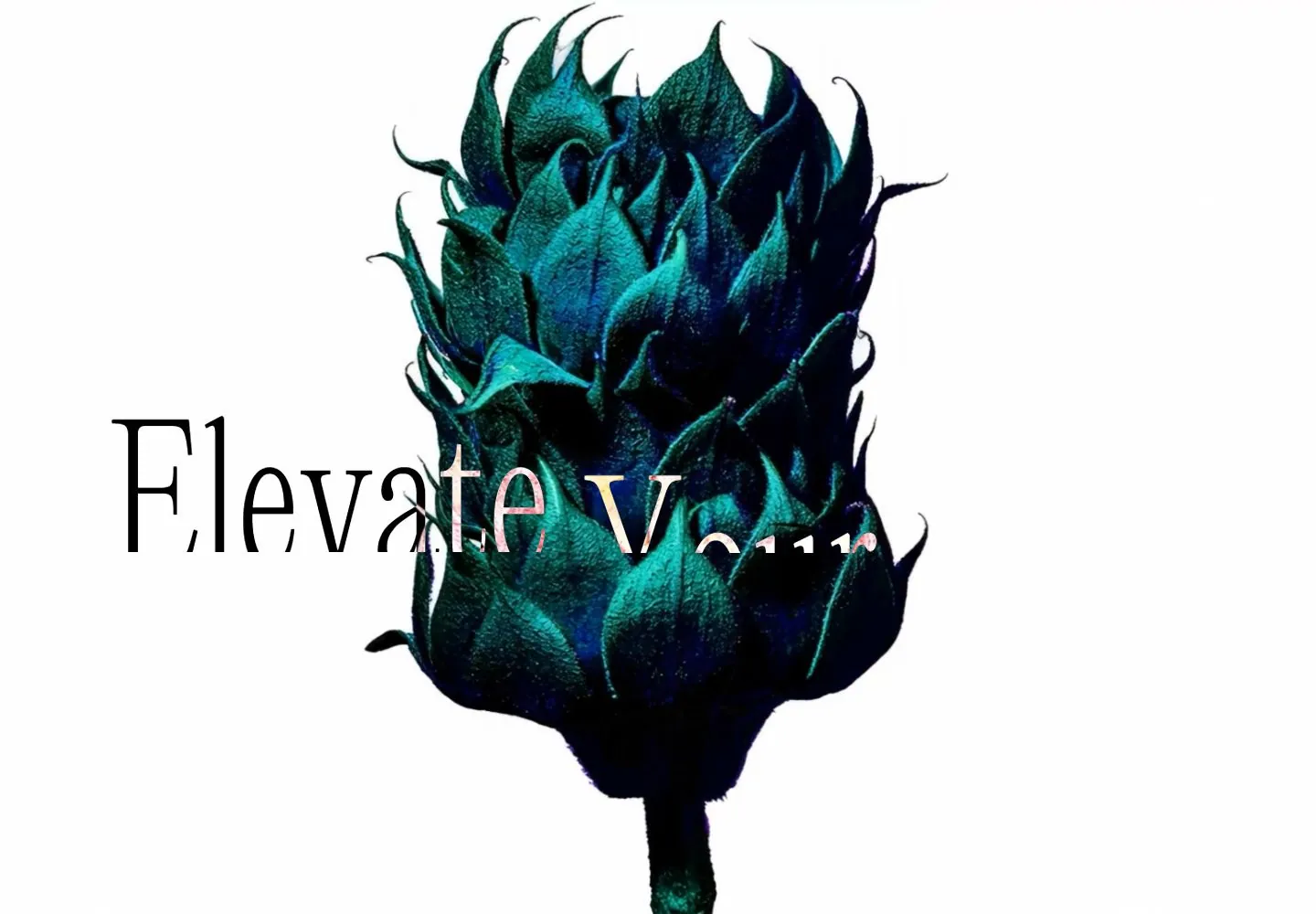
Live capture at 1440px, 2026-10-24
How it’s built
- Layout
- Nearly all white: a monumental dark teal/green sculptural flower rises through the center and overlaps a very large thin black serif “Elevate Your Sales” title, partly hiding it. No navigation or supporting content is visible in this selected desktop capture.
- Type
- Extremely large high-contrast serif headline with fine strokes. Matching desktop DOM reports h1 alias Font2 at 172.8px/207.36px, weight 400; alias is not mapped to a painted font.
- Color and surface
- Open white field, black title and deeply shaded teal/green botanical form with small blue highlights; sculptural texture and overlap carry contrast.
- Components
- Oversized overlapping hero title and central botanical artwork; no other controls visible.
What makes it work
- Large high-contrast serif statement on an open light field
- One monumental sculptural image overlapping and partly masking the type
On a new subjectFor a public library literary festival, pair a large serif invitation with an oversized sculptural book-form crossing and partly obscuring the letters on an open white field. Replace sales-agency copy and source flower; preserve the image/type overlap instead of separating image and heading.
Measured
Fonts loadedicomoon, Font1, Font2
H1172.8px / 400
Body text20px
Page background#ffffff
Text color#000000
Page height1,000px
Computed CSS at 1440px, 2026-10-24.
Live behavior
- Today
- A nearly empty white field holds one enormous vertically cropped teal/black botanical form with streaked upper portion. A thin high-contrast serif sentence crosses its center, visually black on white and pale/pink over the image. Tiny blue identity sits upper left; an uppercase sans Menu and three vertical strokes sit upper right. Later sections are not visible in this sequence.
- Responsive
- Desktop and tablet keep the serif sentence on one line; phone wraps Sales to a centered second line while Elevate Your nearly touches the viewport edges. Sampled letter sizes are172.8px/207.36px desktop,92.16px/110.592px tablet and78.15px/93.78px phone. The central image fills more of the narrow viewport and crops tightly at its sides. The same top-corner navigation concept remains. These three widths do not establish all breakpoint rules.
- Scroll
- The saved desktop-scroll label still records actual scrollY0 and document height1000. Body position is fixed, and the raw MAIN element is much taller, but that does not demonstrate accessible lower-page scrolling or its mechanism. The screenshot remains the hero; lower content and scroll transitions are unobserved.


