
Live capture at 1440px, 2026-10-24
How it’s built
- Layout
- A white bounded page centers a colorful botanical illustration with an explore circle, small side illustration fragments and a large navy serif title below. Tiny controls sit at corners.
- Type
- Large elegant navy uppercase high-contrast serif title; tiny uppercase labels.
- Color and surface
- White, mint, navy and red/yellow/green botanical illustration.
- Components
- A central colorful botanical illustration and small action sit above a large navy serif title on white.
What makes it work
- White field
- Central colorful botanical illustration and circular action
- Large navy uppercase serif title
- Sparse controls
On a new subjectFor a public marine exhibit, center a colorful detailed marine illustration and circular action above a large navy uppercase serif title on white with sparse controls.
Live behavior
- Today
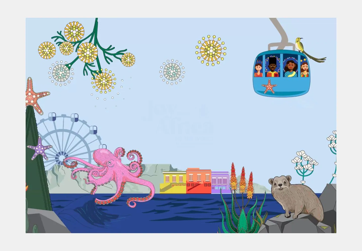
- The saved states include a pale-gray loading screen with a large soft blue rounded diamond clipped at the upper right, an oversized dark-blue percentage near the lower left, and a small LOADING label at lower right. Other captures show an illustrated Cape Town marine scene: a centered Joy from Africa wordmark surrounded by flowers, sea life, a ferris wheel, buildings and water, with an ENTER SITE control at the bottom.
- Responsive
- The illustrated state is a broad landscape scene at desktop, a tall framed crop at tablet, and a narrow portrait crop at phone. The centered mark remains the focal point; different parts of the artwork are cropped at each width. The phone ENTER SITE button is nearly full-width. The reduced-motion phone capture instead shows the loading screen, so it is not a comparable responsive frame.
- Scroll
- Despite its desktop-scroll label, the matching measurement records actual scrollY 0 with a 1000px document height. Its screenshot shows the illustrated entry composition and ENTER SITE control, not a scrolled section. No actual scroll transition is established.


