
Live capture at 1440px, 2026-10-24
How it’s built
- Layout
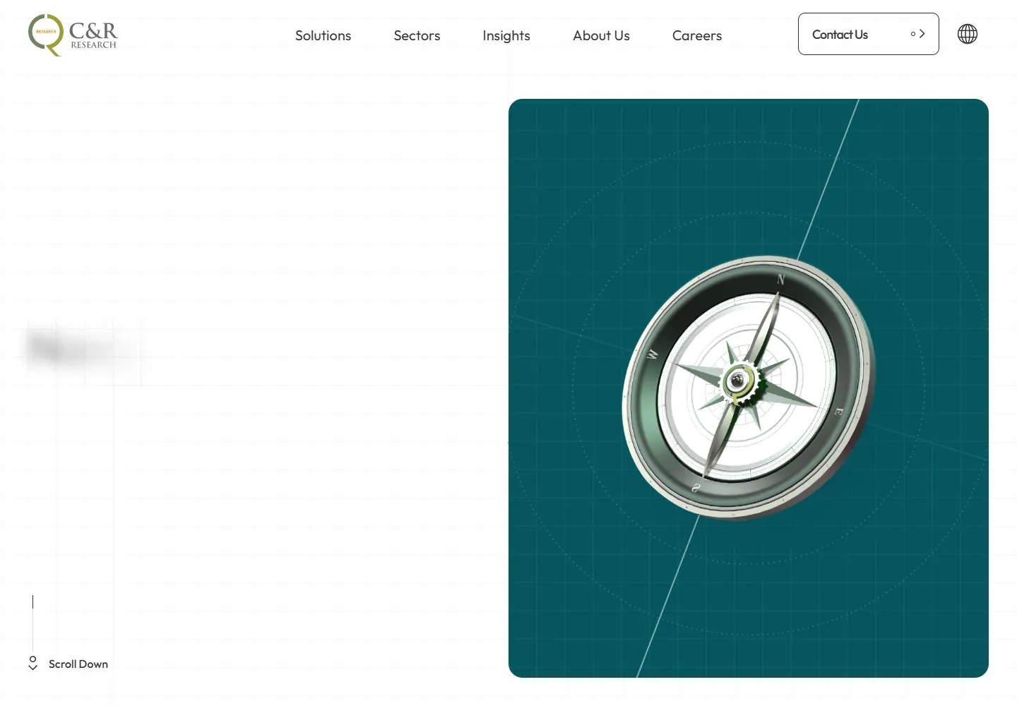
- A white bounded page has a faint square grid, compact navigation at top and a large two-line headline beginning at left and crossing into a rounded teal instrument panel at right. Headline letters are dark on white and become white over teal. The panel contains a metallic compass with fine circular guides; small scroll cue low left. Exterior teal is gallery staging; the mechanism producing text-color contrast is unknown.
- Type
- Large medium-weight geometric sans heading with close leading, dark on white and white over teal; tiny sans utilities. Exact font and metrics unknown.
- Color and surface
- White faint grid, deep teal instrument panel, dark and white contrast-adapted headline, silver instrument; colors visually estimated.
- Components
- Overlap a large left-origin headline across a faint white grid and rounded teal panel containing a metallic circular navigational instrument; use dark letters on white and white letters where the headline overlaps teal.
What makes it work
- Faint white grid and rounded teal instrument panel
- Large boundary-crossing headline with dark-on-white and white-on-teal lettering
- Metallic circular navigational instrument with fine guides
- Compact top navigation
On a new subjectFor a public career-guidance service, overlap a large headline across a faint white grid and rounded teal panel containing an original metallic circular navigational instrument and concentric guides; use dark letters on white and white letters over teal.
Measured
Fonts loadedPretendard, Outfit
H116px / 700
Body text16px
Page backgroundtransparent
Text color#000000
Page height14,997px
Computed CSS at 1440px, 2026-10-24.
Live behavior
- Today
- On a faint white grid, a large dark sans statement sits left of a rounded teal panel containing a compass image and delicate circular and diagonal lines. A white navigation spans the top. The original desktop reference shows the statement blurred, while the gallery reference shows it legibly; these are separate capture phases.
- Responsive
- Tablet and ordinary phone retain a left text area and tall narrow teal panel, cropping the compass at its left edge; navigation becomes contact, globe and menu controls. The fresh phone frame instead places a complete compass panel below the statement. Its different loading phase is not a reliable breakpoint comparison.
- Scroll
- At actual scrollY 750 the teal panel spans most of the width, the statement appears white over it, and a large compass overlaps its lower edge. This one frame does not establish a complete transition.


