
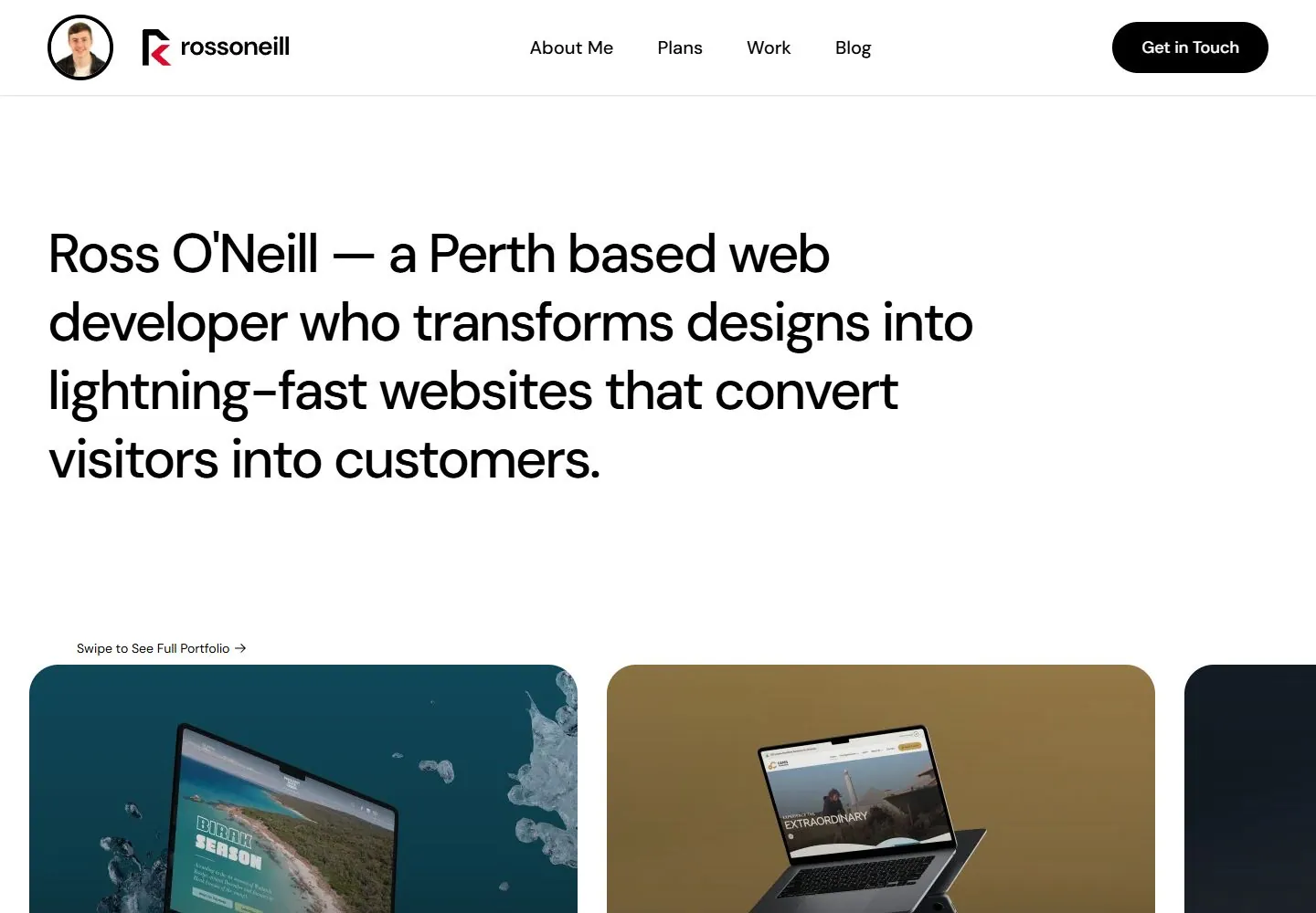
Live capture at 1440px, 2026-10-24
How it’s built
- Layout
- Within an angled laptop screen, a white portfolio page has compact top identity/navigation, a large multiline introduction at upper left and a black Get in Touch action at upper right. Rounded project images begin below with small titles/labels; the still does not establish deliberately unequal tile dimensions or the offscreen continuation. Laptop, browser frame, keyboard, red backdrop and patterned platform are gallery staging.
- Type
- Clean black sans introduction with compact sans navigation and tiny project labels; exact face/metrics unknown.
- Color and surface
- White page, black type and varied project thumbnails; vivid red field and dark geometric laptop platform are staging.
- Components
- Header links/contact action, large introductory statement, small swipe cue and uneven project-thumbnail row with labels.
What makes it work
- Open white page field
- Compact top navigation with a clear contact action
- Large left-aligned multiline introduction
- Rounded project imagery beginning below with compact labels
On a new subjectFor a public museum collection portal, place a concise left-aligned multiline collection statement beneath compact navigation and a visit action, then begin a row of rounded collection images with short labels. Use card dimensions supported by the actual collection layout rather than imposing unequal geometry. Replace agency claims and client work; omit device framing/browser chrome.
Measured
Fonts loadedDM Sans
H116px / 400
Body text16px
Page backgroundtransparent
Text color#000000
Page height3,718px
Computed CSS at 1440px, 2026-10-24.
Live behavior
- Today
- White portfolio with large left-aligned black sans statement and generous whitespace; top logo, navigation and black pill action; rounded image cards begin below.
- Responsive
- Tablet wraps the heading more and simplifies navigation; phone uses menu and a single visible card.


