
Gallery screenshot, saved 2026-10-24
How it’s built
- Layout
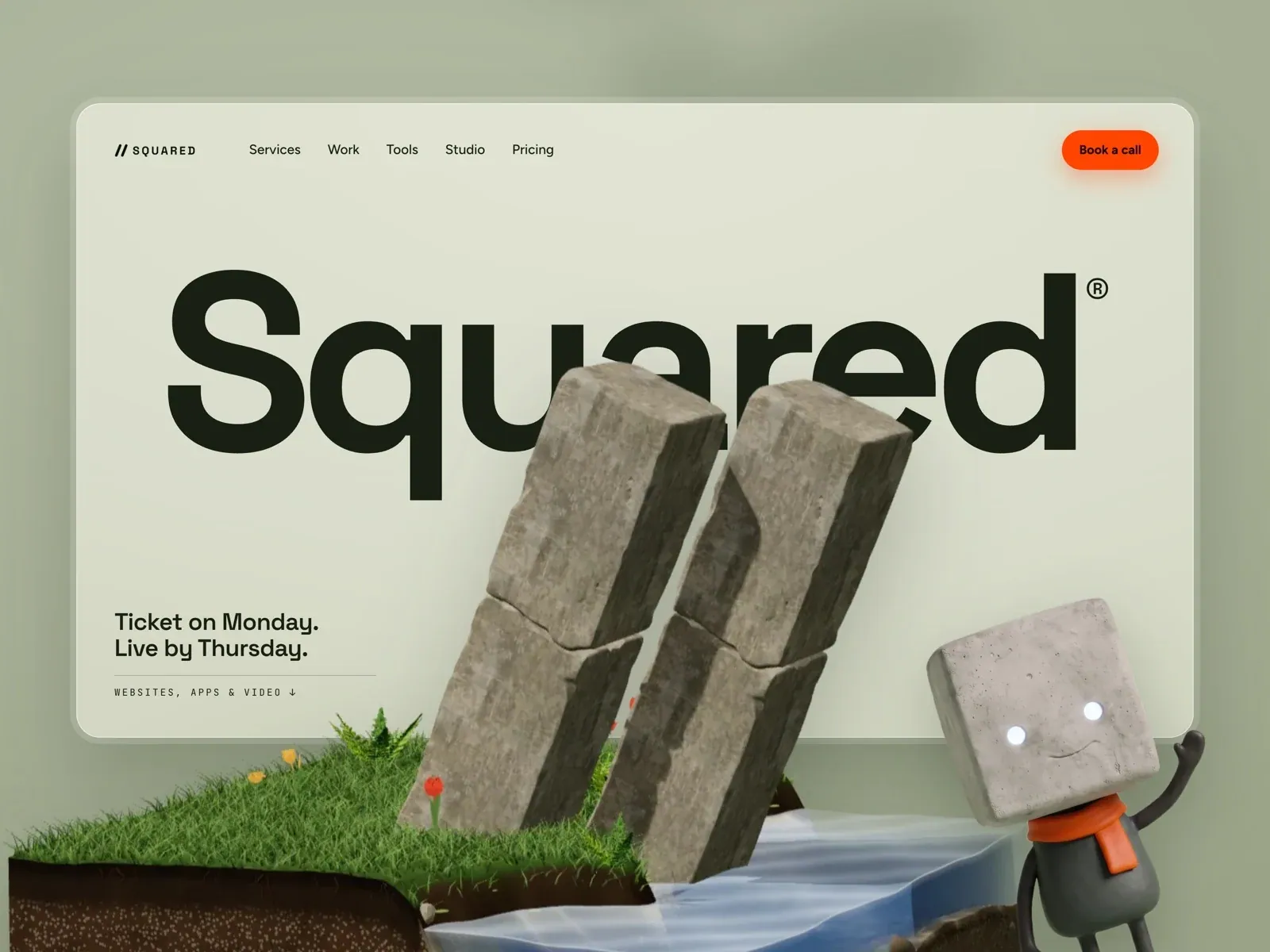
- Pale sage ground with a large inset rounded rectangle and faint border. Huge black wordmark spans upper-middle. Lower foreground shows a dimensional miniature scene of stacked stone-like forms, grass island, water, flowers, and a small character. Top navigation and orange call-to-action; short copy at lower-left.
- Type
- Very heavy large sans wordmark; small regular sans navigation; compact bold two-line statement and widely tracked small service label. Font and exact metrics not available from still.
- Color and surface
- Muted sage, near-black, natural green/brown, pale blue water, orange accent. Rounded panel edge; CTA pill has a soft warm glow. Rendered scene uses distinct stone, grass, and water materials.
- Components
- Oversized identity, small nav, orange Book a call pill, brief copy, and detailed toy-like landscape. This is a rendered scene, not a product-card grid.
What makes it work
- giant identity type
- miniature physical scene
- open pale surrounding field
On a new subjectPair a new large identity word with a bespoke miniature scene of the new subject, preserving scene depth and concise navigation while changing all objects and brand content.
Prompts
Create a transferable visual direction for {{website_name}} in {{industry}} for {{audience}}, presenting {{content}} and supporting {{functionality}}. Composition rule: Create a toy-scale scenic hero in which one oversized identity or lead sits behind a small staged environment in the foreground. Contain the scene within a softly rounded light panel and keep compact navigation and one action at the edge. Type character/hierarchy: Use a large bold sans identity, then a short supporting line and tiny spaced service/detail label. Palette and contrast: Use a soft quiet surrounding field, contrasting light panel, dark type and one vivid action accent; choose scenic colors for the target. Image/component hierarchy: Build original miniature props and environment that represent {{industry}} or {{content}}; do not copy source figures, grass, stone or branded wordmark. Visual estimate from the selected reference image, not a measured CSS value: Visual estimate: panel 88% width/78% height; lead spans ~75% panel width; scenic scene rises through lower third. Treat it as a flexible proportion. Variables: provide original identity, wording, imagery, hues and working actions for {{website_name}}, {{industry}}, {{audience}}, {{content}} and {{functionality}}. Source people, objects, products, exact artwork, logo shapes and text must never be required; select imagery specifically suited to the new subject. Do not infer named typefaces, technology, CSS values, effects or control behavior from a still. Continue the same scale and spacing logic into relevant lower content. Scale the large lead and scenic objects together; move support text and action below the scene so neither is clipped.
Implement a responsive page for {{website_name}} in {{industry}} for {{audience}}, with {{content}} and functional {{functionality}}. Desktop layout: Create a toy-scale scenic hero in which one oversized identity or lead sits behind a small staged environment in the foreground. Contain the scene within a softly rounded light panel and keep compact navigation and one action at the edge. Typography: Use a large bold sans identity, then a short supporting line and tiny spaced service/detail label. Surface contrast: Use a soft quiet surrounding field, contrasting light panel, dark type and one vivid action accent; choose scenic colors for the target. Image and component roles: Build original miniature props and environment that represent {{industry}} or {{content}}; do not copy source figures, grass, stone or branded wordmark. Visual estimate from the selected reference image, not a measured CSS value: Visual estimate: panel 88% width/78% height; lead spans ~75% panel width; scenic scene rises through lower third. Treat it as a flexible proportion. Variables: provide original identity, wording, imagery, hues and working actions for {{website_name}}, {{industry}}, {{audience}}, {{content}} and {{functionality}}. Source people, objects, products, exact artwork, logo shapes and text must never be required; select imagery specifically suited to the new subject. Do not infer named typefaces, technology, CSS values, effects or control behavior from a still. Continue the same scale and spacing logic into relevant lower content. Scale the large lead and scenic objects together; move support text and action below the scene so neither is clipped. Use semantic text, useful image descriptions, and meaningful control labels. Provide keyboard operation and visible focus for new controls. Do not implement cookie or consent overlays as part of the style; behavior shown in static reference controls remains unverified.


