
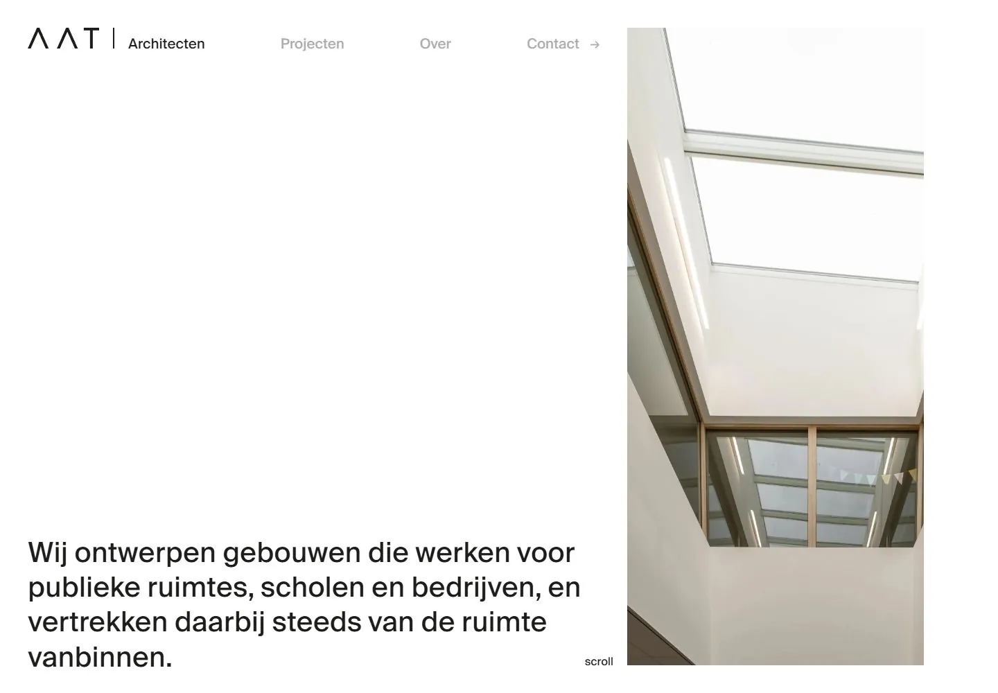
Live capture at 1440px, 2026-10-24
How it’s built
- Layout
- The bounded white page leaves most of its left area empty. Small identity and sparse navigation run at the top; one medium-sized sans introductory paragraph sits close to the lower-left edge. A tall portrait photograph occupies the right third from near top to bottom with narrow white margins; a tiny scroll label sits between text and image. Exterior architectural photograph is staging.
- Type
- Small clean sans navigation and medium regular sans paragraph, with no large standalone display headline. Exact font/metrics unknown.
- Color and surface
- Plain white field and black text, muted gray secondary links and pale neutral in-panel photography. Outer concrete does not establish a webpage surface.
- Components
- Minimal header, lower-left introductory paragraph, tall right image and tiny scroll cue.
What makes it work
- Dominant white negative space
- Small restrained top navigation
- Modest lower-left sans introduction
- Tall right image occupying a minority of width
On a new subjectFor a hospice resource service, use an open white introduction with small navigation, a concise low-left care-access paragraph and a tall calm original interior or garden photograph on the right. Keep the modest type and large blank field; replace architect branding and project copy.
Measured
Fonts loadedSuisse Intl
H140px / 400
Body text16px
Page background#ffffff
Text color#1d1d1b
Page height4,760px
Computed CSS at 1440px, 2026-10-24.
Live behavior
- Today
- A white field with very large open space, small dark identity and light-gray utility navigation. Desktop pairs a regular black sans statement near the lower left with a tall rectilinear architectural photograph at the right. There are no visible rounded card surfaces or decorative shadows in these states.
- Responsive
- Desktop uses40px outer text alignment and a22-track central grid; tablet and phone use24px margins and six central tracks. The statement moves above an inset photograph, and links become a Menu label. Statement samples change40px/50px to29.824px/37.28px to24px/30px. The phone photo element is269x342px at x81,y365.609; tablet584x432px at x144,y325.563. These element measurements need not equal all clipped painted pixels.
- Scroll
- At actual scrollY750, the statement occupies the upper left and a spacious projects heading/action row precedes two photographs of unequal width. Raw visible project image elements are approximately426.666px and893.354px wide with about40px between them. The initial header is not visibly present in this saved frame; no complete hide/show threshold or scroll trajectory is claimed.


