
Gallery screenshot, saved 2026-10-24
How it’s built
- Layout
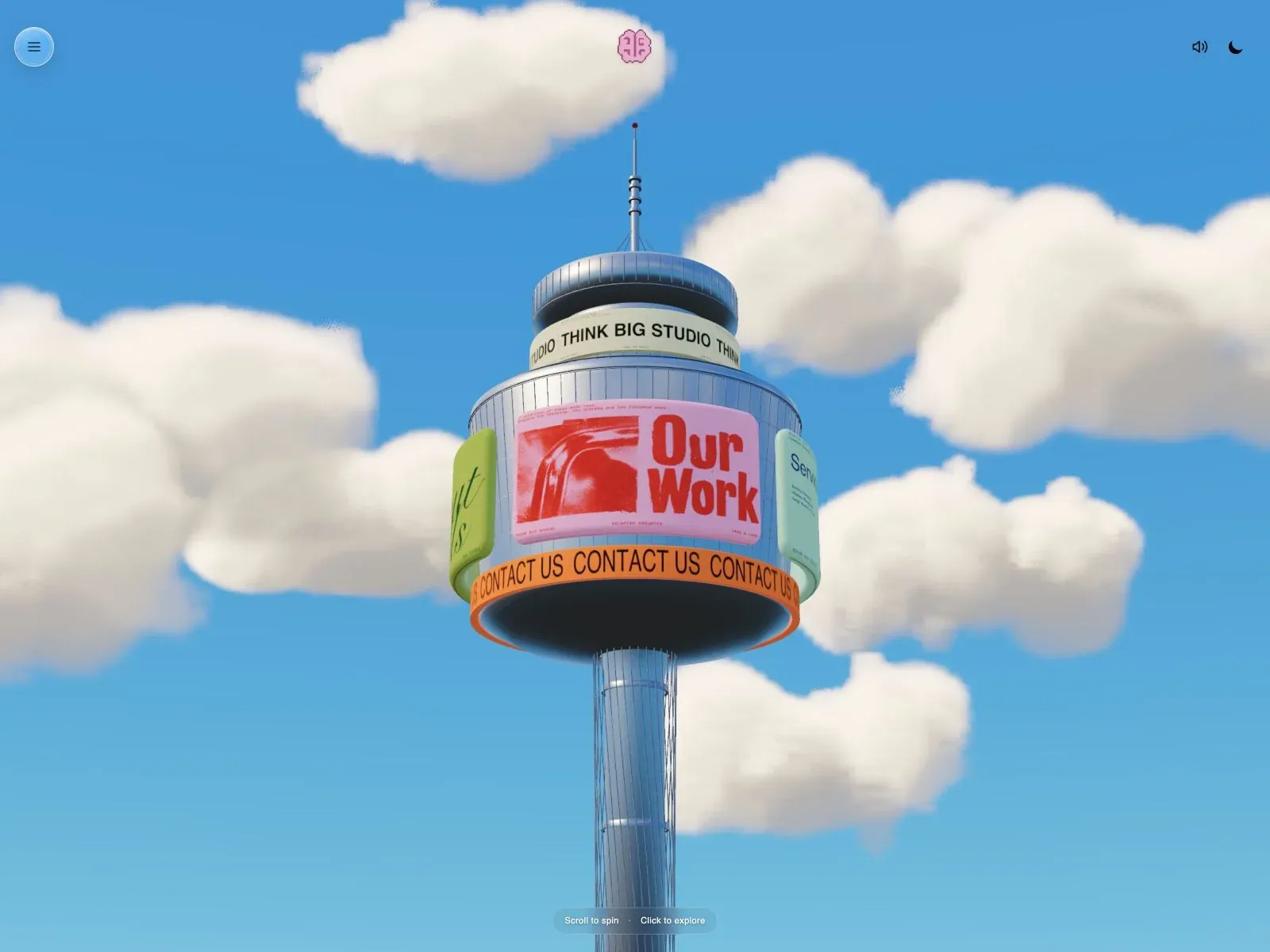
- Full-bleed blue sky and soft clouds surround a single vertical tower centered in the frame. Stacked colored sign-like bands carry labels and a large pink Our Work panel. Tiny menu top-left, small mark near top-center, sound/moon glyphs top-right, and instruction pill at bottom. Strong central axis and wide open sky.
- Type
- Small utilitarian uppercase labels wrap around scene bands; central panel has large red expressive lettering. Upper controls are tiny glyphs. Typeface and CSS metrics unknown.
- Color and surface
- Azure blue, creamy clouds, metallic gray tower, pink/red panel, mint/lime tabs, orange strip, dark underside. Softly shaded 3D materials; no standard UI card shadows.
- Components
- Central 3D tower with text-bearing bands, portfolio panel and side tabs, menu control, sound/dark-mode icons, and bottom hint. Scene itself is the hero rather than a standard content grid.
What makes it work
- single central modeled scene
- embedded content labels
- open atmospheric backdrop
On a new subjectBuild a new subject-specific miniature structure that carries its own key navigation/content, preserving a centered scene, open atmospheric field, and concise embedded labels.
Prompts
Create a transferable visual direction for {{website_name}} in {{industry}} for {{audience}}, presenting {{content}} and supporting {{functionality}}. Composition rule: Center one tall toy-scale scenic focal form against an expansive open atmospheric backdrop. Integrate concise information in a few horizontal bands across the focal form, with only tiny utilities at the edges. Type character/hierarchy: Use compact bold sans labels on the integrated bands; keep corner controls and any guidance text small but legible. Palette and contrast: Create clear contrast between an open sky-like field and the central structure; choose the structure's color and surrounding atmosphere for the new subject. Image/component hierarchy: Use original miniature architecture or a relevant subject-specific focal form; do not require a tower, cloudscape or exact sign artwork. Visual estimate from the selected reference image, not a measured CSS value: Visual estimate: tower about 28% width and nearly full height; sky fills rest; text bands in upper third. Treat it as a flexible proportion. Variables: provide original identity, wording, imagery, hues and working actions for {{website_name}}, {{industry}}, {{audience}}, {{content}} and {{functionality}}. Source people, objects, products, exact artwork, logo shapes and text must never be required; select imagery specifically suited to the new subject. Do not infer named typefaces, technology, CSS values, effects or control behavior from a still. Continue the same scale and spacing logic into relevant lower content. Fit the focal form within screen width, reduce band count or wrap labels, and present controls as clear buttons; any scrolling or interaction is a new proposal, not observed behavior.
Implement a responsive page for {{website_name}} in {{industry}} for {{audience}}, with {{content}} and functional {{functionality}}. Desktop layout: Center one tall toy-scale scenic focal form against an expansive open atmospheric backdrop. Integrate concise information in a few horizontal bands across the focal form, with only tiny utilities at the edges. Typography: Use compact bold sans labels on the integrated bands; keep corner controls and any guidance text small but legible. Surface contrast: Create clear contrast between an open sky-like field and the central structure; choose the structure's color and surrounding atmosphere for the new subject. Image and component roles: Use original miniature architecture or a relevant subject-specific focal form; do not require a tower, cloudscape or exact sign artwork. Visual estimate from the selected reference image, not a measured CSS value: Visual estimate: tower about 28% width and nearly full height; sky fills rest; text bands in upper third. Treat it as a flexible proportion. Variables: provide original identity, wording, imagery, hues and working actions for {{website_name}}, {{industry}}, {{audience}}, {{content}} and {{functionality}}. Source people, objects, products, exact artwork, logo shapes and text must never be required; select imagery specifically suited to the new subject. Do not infer named typefaces, technology, CSS values, effects or control behavior from a still. Continue the same scale and spacing logic into relevant lower content. Fit the focal form within screen width, reduce band count or wrap labels, and present controls as clear buttons; any scrolling or interaction is a new proposal, not observed behavior. Use semantic text, useful image descriptions, and meaningful control labels. Provide keyboard operation and visible focus for new controls. Do not implement cookie or consent overlays as part of the style; behavior shown in static reference controls remains unverified.
Live behavior
- Today
- The opening frame fills the viewport with a bright blue sky, soft clouds and a centered tower, its round upper section wrapped with brightly colored signs and an orange CONTACT US band. A small pink brain mark anchors the top center, with a circular menu icon at left and sound and moon icons at right. A translucent instruction pill sits at the bottom. The imagery has a dimensional rendered appearance; the screenshots alone do not identify the rendering technology.
- Responsive
- The tower remains centered at 1440×1000, 768×1024 and 390×844, filling more of the narrower frame with clouds and tower cropped by the viewport. Desktop and tablet show “Scroll to spin · Click to explore”; mobile shows “Swipe to spin · Tap to explore”. The icon controls remain visible in these sampled widths. This is a comparison of three viewports, not proof of exact breakpoints or working touch gestures.
- Scroll
- The state labeled desktop-scroll has measured actual scrollY 0 and document size 1440×1000, equal to its viewport. The visible sign facing forward differs from the preceding desktop still, but the timed frames also differ and the evidence does not isolate the effect of the attempted scroll. The on-screen instruction advertises scrolling to spin; this is not functional validation.


