
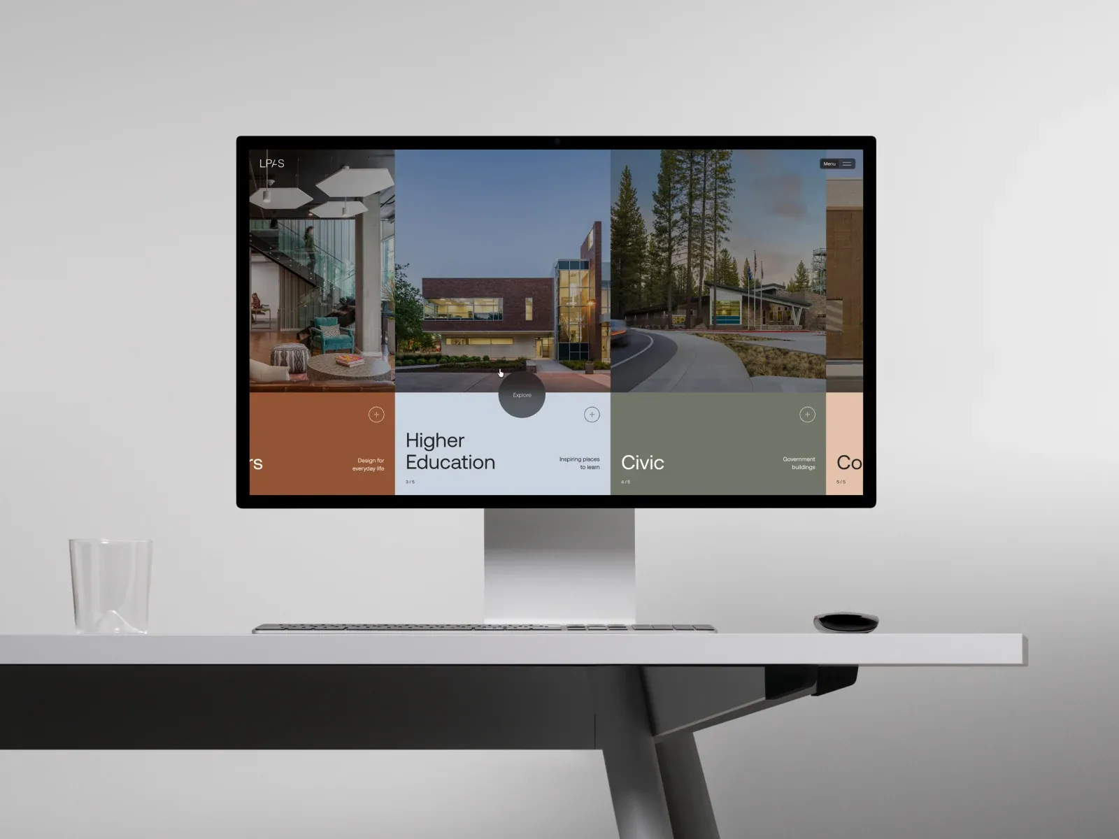
Gallery screenshot, saved 2026-10-24
How it’s built
- Layout
- Gallery image shows a desktop monitor on a pale studio desk. In-screen architecture portfolio: a horizontal panorama of buildings/interiors fills the upper half, with adjacent projects partly visible on both sides. Muted color blocks below carry project names, short descriptors and small sequence numbers; a circular Explore control overlaps the central boundary. Monitor, desk and studio are presentation framing.
- Type
- In-screen project titles use large simple sans-serif text; descriptors and sequence numbers are smaller. Exact face and metrics unavailable.
- Color and surface
- Pale outer studio scene. In-screen photos above rust, pale blue, olive-gray and peach caption blocks with dark text; black monitor border.
- Components
- In-screen image sequence, aligned colored information blocks, sequence counts and circular Explore control; monitor and desk outside the website composition.
What makes it work
- Horizontal project imagery
- Aligned image captions/info blocks
- Partial neighboring item visible
- Clear image-to-caption relation
On a new subjectPresent unrelated projects in a horizontal image-and-caption sequence with neighboring items partly visible. Replace the architecture and labels.
Live behavior
- Today
- LPAS opens with a darkened full-bleed architecture/interior photograph and a small LPAS wordmark at upper left. “Menu” sits in a dark rounded control at upper right; “Architecture + Interiors” and “A Market-Focused Approach” sit across the lower part of the image. The desktop t2 and hover captures add a large white process-driven studio headline over the photo. The measured scroll state shows a housing project feature with a large exterior image and category links.
- Responsive
- The measured desktop document is 1440×9563, tablet 768×8387 and phone 390×7972; the fresh reduced-motion phone is 8004px tall. Desktop uses a full-bleed photo with small overlaid labels and adds the large studio statement in later captures. Tablet shows a library interior with the statement below; phone stacks the statement over a darkened workspace image and places “Scroll to explore” below. The fresh reduced-motion phone instead shows a dark field with a dim list of process words. These samples do not establish breakpoints.
- Scroll
- The desktop-scroll state records actual scrollY=750 in a 1440×9563 document. It shows a housing-project panel with a large residential exterior photograph, category links including Affordable Housing and Student Housing, and “Housing” as the section title. The screenshot does not test project links or category controls.


