
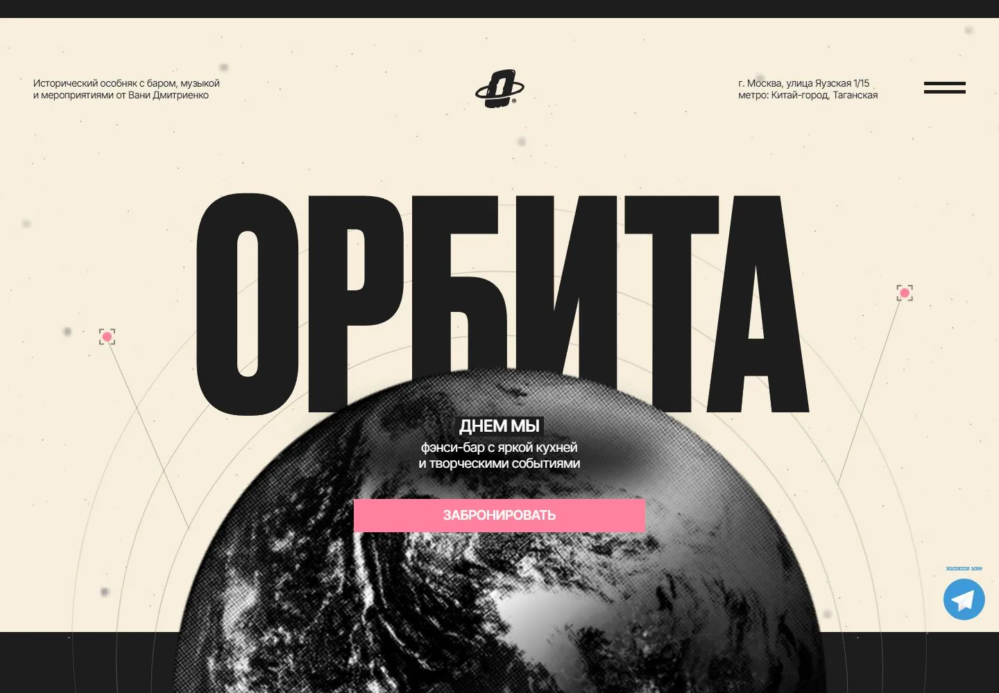
Live capture at 1440px, 2026-10-24
How it’s built
- Layout
- A composite gallery image combines a large cream desktop page on a star-speckled dark field with a phone mockup overlapping at right. Desktop design has a small Russian-language utility strip, a huge condensed ORBITA wordmark and rectangular menu panel at upper right; its lower half turns black behind a large halftone globe with orbit lines and oversized textured Russian words. The phone depicts a separate narrow mobile page with product imagery and dense type. Surrounding stars and phone placement may be presentation framing; desktop and phone are two separate depictions, not one responsive live capture.
- Type
- Desktop uses oversized condensed uppercase identity and rough textured display lettering; tiny Russian utility copy. Phone uses similarly dense condensed display type. No exact metrics.
- Color and surface
- Cream speckled upper desktop field and black lower field; black/gray halftone globe, pale cream and white type, pink action; phone screen is independently dark. Star field is outside the desktop page and uncertain framing.
- Components
- Desktop: identity, utility/menu panel, circular globe, orbit lines and large stacked words. Phone: separate mobile-page mockup with text and food/product images.
What makes it work
- Large desktop wordmark
- Strongly divided light/dark page zones
- Central halftone subject image
On a new subjectFor an unrelated subject, use a large identity above a dark field with a central halftone or similarly tonal subject image; keep the utility panel restrained. Treat mobile as a separate view unless verified and omit device framing.
Measured
Fonts loadedDrukCyr, Inter Tight
Body text16px
Page backgroundtransparent
Text color#000000
Page height16,633px
Computed CSS at 1440px, 2026-10-24.
Live behavior
- Today
- Dark star-speckled field with enormous condensed cream Cyrillic identity, thin orbital arcs and pink points surrounding a halftone earth. Small white corner details and centered emblem frame a white message and pink booking bar. Blue messaging widget is an overlay.
- Responsive
- Tablet and phone show a cream field with black identity, upper corner logo/menu and the same globe/pink action. Daytime copy differs from desktop nighttime state; width and capture time are confounded. Globe is cropped at narrow widths.
- Scroll
- Actual desktop scroll750 shows the large globe and elliptical tracks with a lower label; header and title leave frame. Scroll and time both change, so no motion trigger established.


