
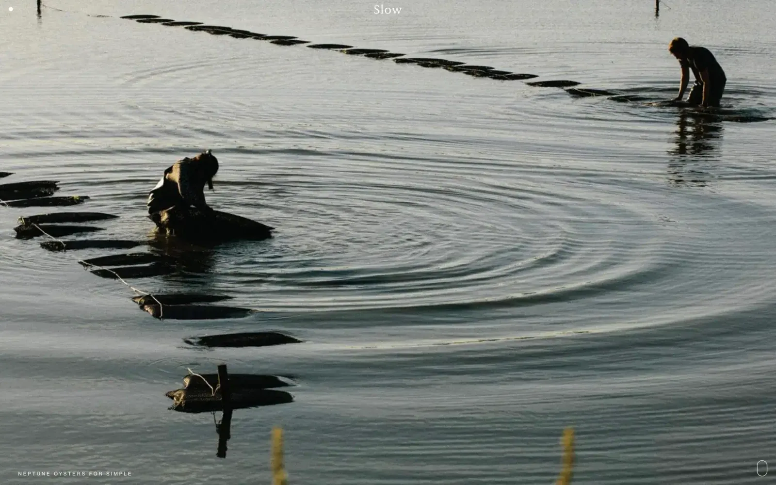
Screenshot from Httpster, saved 2026-10-24
How it’s built
- Layout
- A nearly full-frame muted water photograph shows two people among dark floating oyster structures; ripples fill the open central area. Tiny centered wordmark sits at top, with a small descriptor at bottom left and thin oval glyph at bottom right. Image rather than headline or panel carries the composition.
- Type
- Small white serif wordmark at top center; tiny tracked uppercase descriptor along lower left. Exact family and metrics unknown.
- Color and surface
- Water is pale gray-green with dark reflections and figures; sparse white text/icons. Full-bleed photograph, no visible panel, border or shadow.
- Components
- Small brand label, project/campaign descriptor, minimal oval corner mark; no prominent controls visible.
What makes it work
- Full-frame photograph
- Image carries primary meaning
- Minimal perimeter labels
On a new subjectLet one compelling photograph carry the opening view, adding only a small identifier and concise label. Substitute a subject-appropriate image and keep the image uncluttered.
Prompts
Create an original website image for {{website_name}} in {{industry}}, serving {{audience}}, presenting {{content}} and making {{functionality}} apparent.
INVARIANTS: Use one continuous wide environmental image with separated small focal subjects and a directional diagonal; tiny identity and lower-corner labels leave nearly all of the image open.
TYPOGRAPHY: A small fine serif identity can contrast with tiny tracked uppercase edge labels.
COLORS AND SURFACES: Quiet low-saturation photographic values with restrained pale labels; no decorative panels.
IMAGERY: Create an original calm physical setting whose scale and directional line matter more than its exact objects; water and people are variables.
VARIABLES: Supply original identity, writing, imagery, accent hues and tasks for {{website_name}}, {{industry}}, {{audience}}, {{content}} and {{functionality}}.
PROHIBITIONS: Do not copy source branding, wording, photographs or signature artwork. Do not turn privacy notices, submission frames or cut-off essential text into style rules. Avoid generic card stacks, extra decorative panels or an unrelated large hero heading when they erase the specified hierarchy.
CONTINUATION: Translate the same relative type scale, alignment and image treatment into the next real content section; give that section a clear purpose rather than duplicating the hero.
RESPONSIVE PROPOSAL: Crop or recompose to preserve spatial separation and the directional cue, keeping sparse labels within safe margins and avoiding a central promotional title. Render clear, readable original text and subject-appropriate controls with consistent spacing. These proportions are visual reproduction targets, not common measured CSS. The selected still does not establish source fonts, technology, motion, hover or responsive behavior. Preserve those evidence limits; this prompt remains unvalidated.
Build a functioning responsive website for {{website_name}} in {{industry}} for {{audience}}, using {{content}} and working {{functionality}}.
INVARIANTS: Use one continuous wide environmental image with separated small focal subjects and a directional diagonal; tiny identity and lower-corner labels leave nearly all of the image open.
TYPOGRAPHY: A small fine serif identity can contrast with tiny tracked uppercase edge labels.
COLORS AND SURFACES: Quiet low-saturation photographic values with restrained pale labels; no decorative panels.
IMAGERY: Create an original calm physical setting whose scale and directional line matter more than its exact objects; water and people are variables.
VARIABLES: Supply original identity, writing, imagery, accent hues and tasks for {{website_name}}, {{industry}}, {{audience}}, {{content}} and {{functionality}}.
PROHIBITIONS: Do not copy source branding, wording, photographs or signature artwork. Do not turn privacy notices, submission frames or cut-off essential text into style rules. Avoid generic card stacks, extra decorative panels or an unrelated large hero heading when they erase the specified hierarchy.
CONTINUATION: Carry the relative type scale, alignment and image treatment into appropriate content sections without repeating the hero or inventing irrelevant features.
RESPONSIVE PROPOSAL: Crop or recompose to preserve spatial separation and the directional cue, keeping sparse labels within safe margins and avoiding a central promotional title. Use semantic reading order, meaningful image descriptions, keyboard-operable controls and visible focus. Check display text bounds after the chosen fonts load at desktop and phone widths; keep complete essential text inside its container. Verify the actual requested actions rather than styling inert controls. Respect reduced-motion preferences if new motion is added. These proportions are visual reproduction targets, not common measured CSS. The selected still does not establish source fonts, technology, motion, hover or responsive behavior. Preserve those evidence limits; this prompt remains unvalidated.


