
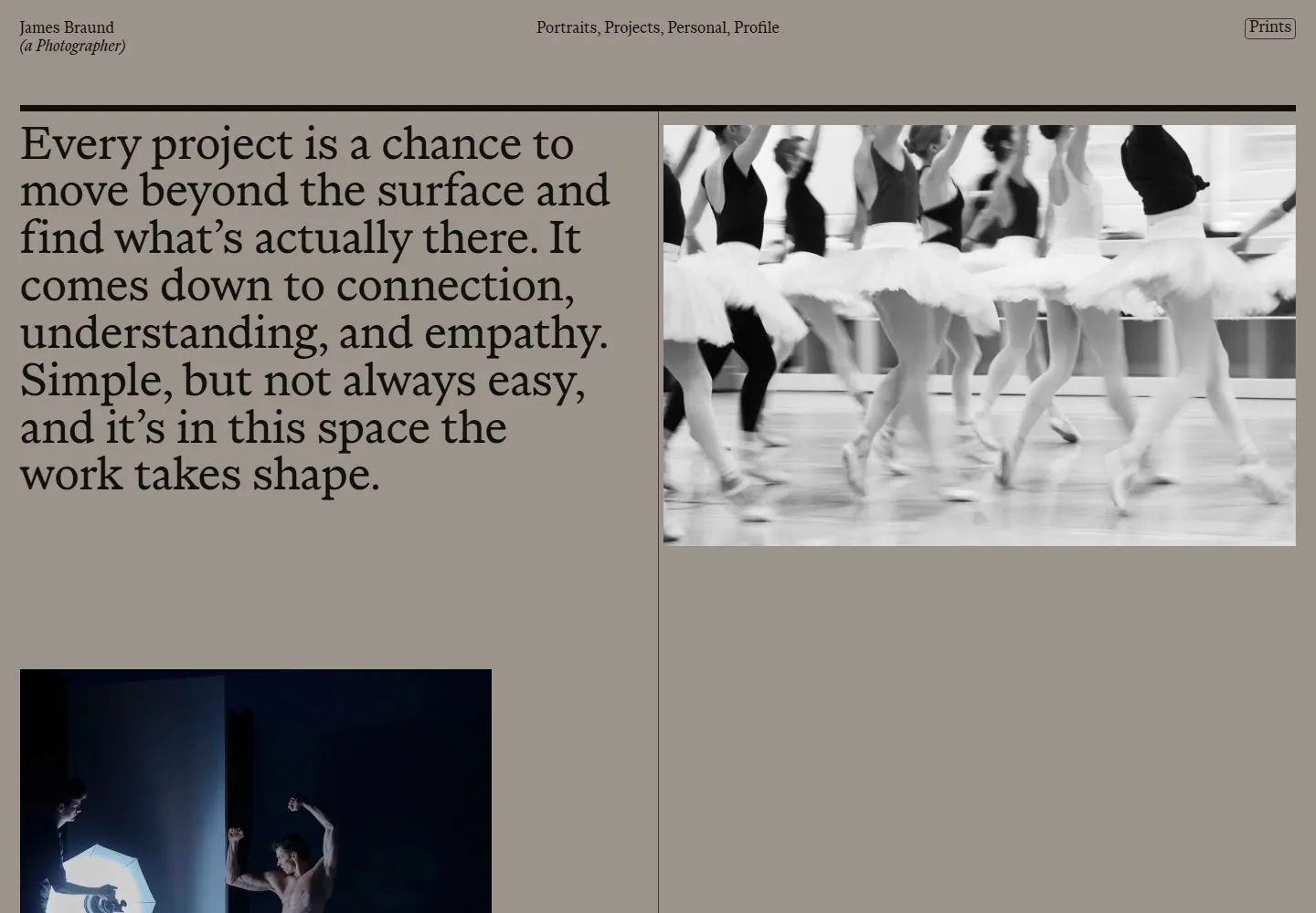
Live capture at 1440px, 2026-10-24
How it’s built
- Layout
- Warm taupe page with tiny name at upper left and two small links at upper right. A heavy horizontal rule introduces a two-column editorial body. Large multi-line statement dominates the left. The right begins with a numbered list and a large black-framed monochrome portrait below, partially cropped by the viewport. Fine vertical divider marks the column boundary.
- Type
- Dark brown high-contrast serif carries the oversized statement; small serif name, links, list and numbered entries form quieter levels. No exact font metrics established.
- Color and surface
- Flat warm beige/taupe ground, dark brown type and rule, black portrait background with grayscale face. No cards, gradients or shadows.
- Components
- Name/role lockup, photography/profile links, horizontal rule, oversized editorial statement, numbered index, vertical divider, portrait image.
What makes it work
- Large editorial statement
- Numbered index column
- Strong horizontal divider
- Prominent portrait/photo
On a new subjectChoose a concise editorial thesis, pair it with an indexed set of examples, and reserve a large image area. Replace portrait and commissions with content relevant to the new field.
Prompts
Create an original website image for {{website_name}} in {{industry}}, serving {{audience}}, presenting {{content}} and making {{functionality}} apparent.
INVARIANTS: Use a warm neutral field under a slim ruled identity rail; place a large multi-line statement in the left half, with a compact numbered list high right and one image lower right.
TYPOGRAPHY: Use a fine editorial serif for the statement and small factual sans/serif labels in the narrow list.
COLORS AND SURFACES: Warm taupe or another muted neutral with dark type and a monochrome image.
IMAGERY: Use one new monochrome image below the right-hand list; portraiture and the source service list are variables.
VARIABLES: Supply original identity, writing, imagery, accent hues and tasks for {{website_name}}, {{industry}}, {{audience}}, {{content}} and {{functionality}}.
PROHIBITIONS: Do not copy source branding, wording, photographs or signature artwork. Do not turn privacy notices, submission frames or cut-off essential text into style rules. Avoid generic card stacks, extra decorative panels or an unrelated large hero heading when they erase the specified hierarchy.
CONTINUATION: Translate the same relative type scale, alignment and image treatment into the next real content section; give that section a clear purpose rather than duplicating the hero.
RESPONSIVE PROPOSAL: Keep the statement first, then the factual list and image as a vertical sequence, retaining the fine rule and strong display/body scale difference. Render clear, readable original text and subject-appropriate controls with consistent spacing. These proportions are visual reproduction targets, not common measured CSS. The selected still does not establish source fonts, technology, motion, hover or responsive behavior. Preserve those evidence limits; this prompt remains unvalidated.
Build a functioning responsive website for {{website_name}} in {{industry}} for {{audience}}, using {{content}} and working {{functionality}}.
INVARIANTS: Use a warm neutral field under a slim ruled identity rail; place a large multi-line statement in the left half, with a compact numbered list high right and one image lower right.
TYPOGRAPHY: Use a fine editorial serif for the statement and small factual sans/serif labels in the narrow list.
COLORS AND SURFACES: Warm taupe or another muted neutral with dark type and a monochrome image.
IMAGERY: Use one new monochrome image below the right-hand list; portraiture and the source service list are variables.
VARIABLES: Supply original identity, writing, imagery, accent hues and tasks for {{website_name}}, {{industry}}, {{audience}}, {{content}} and {{functionality}}.
PROHIBITIONS: Do not copy source branding, wording, photographs or signature artwork. Do not turn privacy notices, submission frames or cut-off essential text into style rules. Avoid generic card stacks, extra decorative panels or an unrelated large hero heading when they erase the specified hierarchy.
CONTINUATION: Carry the relative type scale, alignment and image treatment into appropriate content sections without repeating the hero or inventing irrelevant features.
RESPONSIVE PROPOSAL: Keep the statement first, then the factual list and image as a vertical sequence, retaining the fine rule and strong display/body scale difference. Use semantic reading order, meaningful image descriptions, keyboard-operable controls and visible focus. Check display text bounds after the chosen fonts load at desktop and phone widths; keep complete essential text inside its container. Verify the actual requested actions rather than styling inert controls. Respect reduced-motion preferences if new motion is added. These proportions are visual reproduction targets, not common measured CSS. The selected still does not establish source fonts, technology, motion, hover or responsive behavior. Preserve those evidence limits; this prompt remains unvalidated.
Measured
Fonts loadedSerif, Serif Ital
H154px / 400 / -0.405px
Body text18px
Page background#8f8881
Text color#120f0f
Page height14,358px
Computed CSS at 1440px, 2026-10-24.
Live behavior
- Today
- The James Braund portfolio uses a warm taupe background, thin top navigation and an oversized dark serif statement at left, paired with a large monochrome ballet photograph at right. A further dark blue-toned image appears lower in the desktop frame. The selected gallery reference shows a distinct warm editorial/profile layout and is kept separate from the live capture.
- Responsive
- Desktop is 1440×1000 with a 14358px document; tablet is 768×1024 with a 7673px document; phone states are 390×844 with 9661px documents. The desktop and tablet states pair text with imagery in columns; phone images stack the statement and project photography. These examples do not establish breakpoint thresholds or the complete page sequence.
- Scroll
- The desktop-scroll state records scrollY=750 in a 14358px document and shows further portfolio imagery beneath the initial statement. This describes the saved scrolled frame only.


