
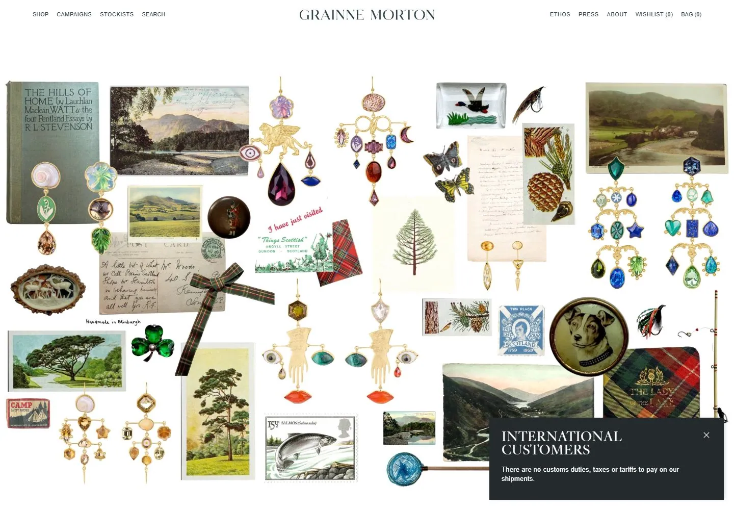
Live capture at 1440px, 2026-10-24
How it’s built
- Layout
- A thin peach navigation strip is divided by fine rules into left links, centered name, and right social/cart links. Beneath it, a clean vertical split pairs pale blue copy field at left with large close-cropped portrait at right. Four-line serif headline dominates left half; two short centered lines of supporting text sit beneath.
- Type
- Large refined dark teal serif statement; smaller sans support; small uppercase tracked navigation and centered serif brand. Exact font and metrics unknown.
- Color and surface
- Pale blue solid copy field, soft peach utility strip, dark teal text, and softly lit portrait with floral fabric and colorful jewelry. No cards or shadows.
- Components
- Segmented top nav, centered brand, social/cart links, large statement, short support line and portrait photograph.
What makes it work
- Portrait beside copy
- Large editorial statement
- Brief supporting text
- Shallow utility navigation
On a new subjectUse a close portrait or other subject image beside a concise editorial statement and short supporting line. Retain the quiet split and replace jewelry-specific imagery and copy.
Prompts
Create an original visual direction for {{website_name}} in {{industry}} for {{audience}}, presenting {{content}} and enabling {{functionality}}. Composition invariant: Split a wide hero into two balanced halves: concise headline and supporting copy on one side, a single large subject-relevant visual on the other. Put identity and compact utilities in a thin top rail; keep the copy clear of the image. Typography character and hierarchy: Use an expressive editorial serif for the main statement, a simple smaller sans for support and small uppercase utilities. Color/surface contrast: Use a restrained light color field for copy with dark high-contrast text; select its hue and image treatment for the target content. Image and component roles: Use one original subject-appropriate photograph or illustration rather than a person or jewelry portrait; keep the image full-height and visually calm. Visual estimate from the selected image, not a measured CSS value: Visual estimate: text and photo each about 50% width; hero nearly full height; header under 6%. Scale this balance to the actual content. Variables: replace all source identity, wording, products, people, artwork, palette details and actions with new material for {{website_name}}, {{industry}}, {{audience}}, {{content}} and {{functionality}}. Preserve only layout relationships and type hierarchy. No source asset or exact phrase is mandatory. Do not infer named fonts, framework, CSS, animations or tested interactions. Continue with sections that support the new content, using the same relative whitespace and clear grouping. Stack the copy before the visual, reduce heading scale, and collapse the top rail into a compact reachable header.
Implement a responsive page for {{website_name}} in {{industry}} for {{audience}}, presenting {{content}} and implementing {{functionality}}. Wide composition: Split a wide hero into two balanced halves: concise headline and supporting copy on one side, a single large subject-relevant visual on the other. Put identity and compact utilities in a thin top rail; keep the copy clear of the image. Type system: Use an expressive editorial serif for the main statement, a simple smaller sans for support and small uppercase utilities. Surface treatment: Use a restrained light color field for copy with dark high-contrast text; select its hue and image treatment for the target content. Media/components: Use one original subject-appropriate photograph or illustration rather than a person or jewelry portrait; keep the image full-height and visually calm. Visual estimate from the selected image, not a measured CSS value: Visual estimate: text and photo each about 50% width; hero nearly full height; header under 6%. Scale this balance to the actual content. Variables: replace all source identity, wording, products, people, artwork, palette details and actions with new material for {{website_name}}, {{industry}}, {{audience}}, {{content}} and {{functionality}}. Preserve only layout relationships and type hierarchy. No source asset or exact phrase is mandatory. Do not infer named fonts, framework, CSS, animations or tested interactions. Continue with sections that support the new content, using the same relative whitespace and clear grouping. Stack the copy before the visual, reduce heading scale, and collapse the top rail into a compact reachable header. Use semantic, selectable text and meaningful image descriptions. Keep controls clearly named, keyboard usable and visibly focused. Any requested action should work as new behavior; do not assert source behavior from this static image.
Measured
Fonts loaded__Atacama_e0976a
H230px / 400 / 3px
Body text17.2507px
Page background#ffffff
Text color#34474a
Page height6,076px
Computed CSS at 1440px, 2026-10-24.


