
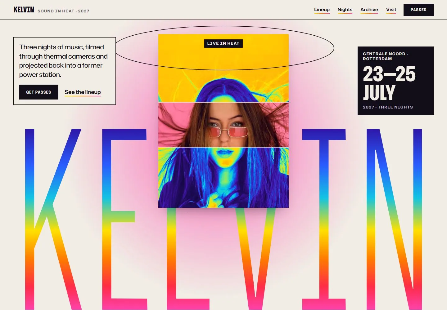
Live capture at 1440px, 2026-10-24
How it’s built
- Layout
- An off-white event page has a compact masthead/tagline at left and tightly grouped navigation/solid pass action at right. A central vertical portrait alternates thermal false-color sections with a natural-color strip, surrounded by a soft pink glow and a thin wide ellipse above. A thin-bordered introduction/action box sits left and a black date block right. Enormous narrow gradient letters fill the lower width behind the portrait.
- Type
- Extremely tall narrow uppercase lower identity, heavy condensed date numerals/words and compact monospaced-looking utility labels contrast with a regular sans paragraph. Exact font and measurements unknown.
- Color and surface
- Warm off-white field with near-black text and blocks, hot pink diffuse glow and vivid violet-to-cyan-to-yellow-to-red vertical letter gradients. Portrait uses thermal-like false colors and a normal photographic band.
- Components
- Compact header, bordered introduction with two actions, black date block, sliced portrait, thin elliptical outline, gradient oversized identity.
What makes it work
- Narrow central portrait alternating natural and false-color bands
- Extremely tall gradient identity behind the image
- Off-white field and diffuse accent glow
- Small bordered information/actions opposed by dark date block
On a new subjectFor an urban heat-awareness exhibition, layer an original resident portrait with natural and false-color bands above an enormous narrow gradient exhibition title. Retain the off-white field, restrained information/action box and dark schedule block; replace music-festival copy, dates and imagery.
Measured
Fonts loadedHubot Sans, Kalnia, Kelvin Narrow
H134px / 700
Body text17px
Page background#f1ede4
Text color#110d19
Page height18,246px
Computed CSS at 1440px, 2026-10-24.
Live behavior
- Today
- Off-white event page combines giant rainbow-gradient KELVIN letters, central thermal-colored portrait with pink glow, an outlined ellipse, small bordered information box and dark date panel. Navigation is compact.
- Responsive
- Tablet turns date panel into a horizontal strip; phone stacks information and date above a cropped two-line wordmark and portrait.


