
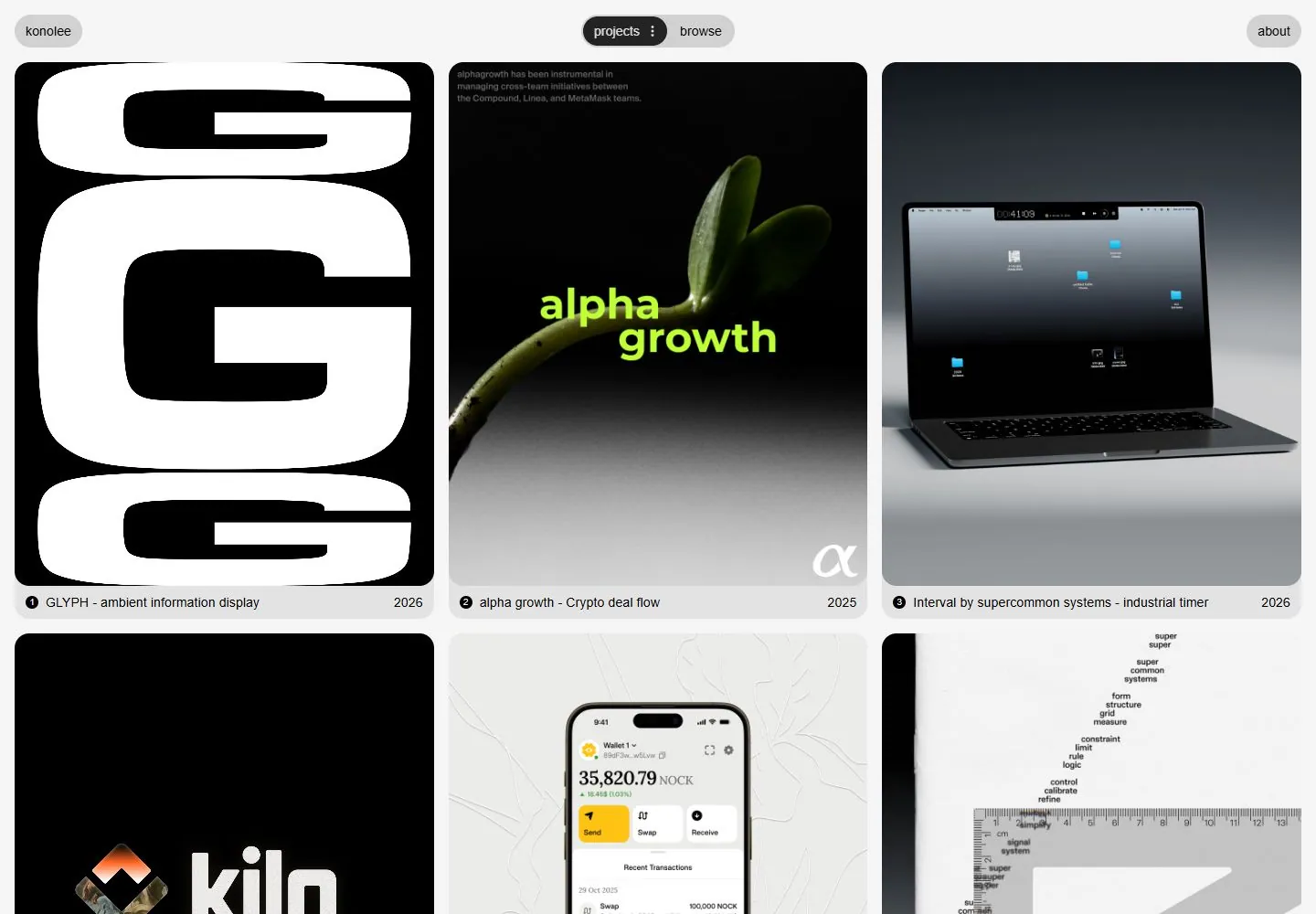
Live capture at 1440px, 2026-10-24
How it’s built
- Layout
- Light gray background with three equal vertical portfolio cards across the first row, each with rounded corners and narrow captions/year strips. Top navigation uses small rounded pills. First card is a huge white glyph on black; center is a dark plant-growth campaign with neon text; right shows a laptop on gray gradient. Next row begins below.
- Type
- Small lowercase pill navigation and compact captions; varied project graphics include very large display lettering and small embedded labels. No unified large site headline in this view.
- Color and surface
- Pale gray page, black/white tile, near-black-to-gray photo backgrounds, neon yellow-green text, rounded pale tile captions. Card surfaces have subtle borders/radii; imagery supplies texture.
- Components
- Brand pill, project/archive/about pills, equal-width project cards, numbered caption strips with titles/years and varied image treatments.
What makes it work
- Repeated bounded project tiles
- Consistent grid alignment
- Brief title/year captions
- Compact navigation
On a new subjectPresent unrelated examples as consistent sized cards in aligned rows, with short identification below each. Replace every subject-specific thumbnail and label.
Prompts
Create an original visual direction for {{website_name}} in {{industry}}, for {{audience}}, presenting {{content}} and supporting {{functionality}}. Composition invariant: Use a pale neutral portfolio/catalog surface with a quiet pill-like top control row above equal soft-cornered project tiles. Keep each large visual above a compact numbered or titled caption and short secondary detail. Typography: Use small neutral sans navigation and captions; let the selected work carry its own display character without making that source artwork mandatory. Palette and contrast: Keep the background and tiles light, text dark and contrast clear; allow selected examples to carry variable accent colors. Image and component hierarchy: Show three distinct new examples from {{content}} that fit {{industry}}; do not prescribe posters, plants, laptops or particular project imagery. Visual estimate from the supplied reference, not measured CSS: Visual estimate: 3 columns span nearly full width; card aspect near square/vertical; gutters slim; top nav shallow. Scale the relationships to the target content and viewport. Variables: replace source identity, wording, industry-specific objects, people, imagery, exact colors and controls with original material for {{website_name}}, {{industry}}, {{audience}}, {{content}} and {{functionality}}. Retain only the composition and hierarchy described above. No source logo, product, person, artwork or exact phrase is a required asset. Do not infer typeface, framework, CSS values, motion or tested behavior from a static image. Continue the visual system using relevant content sections, keeping the same relative spacing and contrast without adding generic cards or decoration where none are described. Reduce columns but retain the rounded tile rhythm, captions and numbered associations in reading order.
Implement a responsive page for {{website_name}} in {{industry}} for {{audience}}, with real {{content}} and working {{functionality}}. Wide-screen structure: Use a pale neutral portfolio/catalog surface with a quiet pill-like top control row above equal soft-cornered project tiles. Keep each large visual above a compact numbered or titled caption and short secondary detail. Type hierarchy: Use small neutral sans navigation and captions; let the selected work carry its own display character without making that source artwork mandatory. Surface treatment: Keep the background and tiles light, text dark and contrast clear; allow selected examples to carry variable accent colors. Component and image roles: Show three distinct new examples from {{content}} that fit {{industry}}; do not prescribe posters, plants, laptops or particular project imagery. Visual estimate from the supplied reference, not measured CSS: Visual estimate: 3 columns span nearly full width; card aspect near square/vertical; gutters slim; top nav shallow. Scale the relationships to the target content and viewport. Variables: replace source identity, wording, industry-specific objects, people, imagery, exact colors and controls with original material for {{website_name}}, {{industry}}, {{audience}}, {{content}} and {{functionality}}. Retain only the composition and hierarchy described above. No source logo, product, person, artwork or exact phrase is a required asset. Do not infer typeface, framework, CSS values, motion or tested behavior from a static image. Continue the visual system using relevant content sections, keeping the same relative spacing and contrast without adding generic cards or decoration where none are described. Reduce columns but retain the rounded tile rhythm, captions and numbered associations in reading order. Use semantic content and meaningful image descriptions. Keep each label with its image or list item, and make any new controls named, keyboard-operable and visibly focused. Implement requested functionality as new working behavior; the static reference does not verify source controls.
Measured
Body text13px
Page background#f5f5f5
Text color#000000
Page height1,944px
Computed CSS at 1440px, 2026-10-24.


