
Live capture at 1440px, 2026-10-24
How it’s built
- Layout
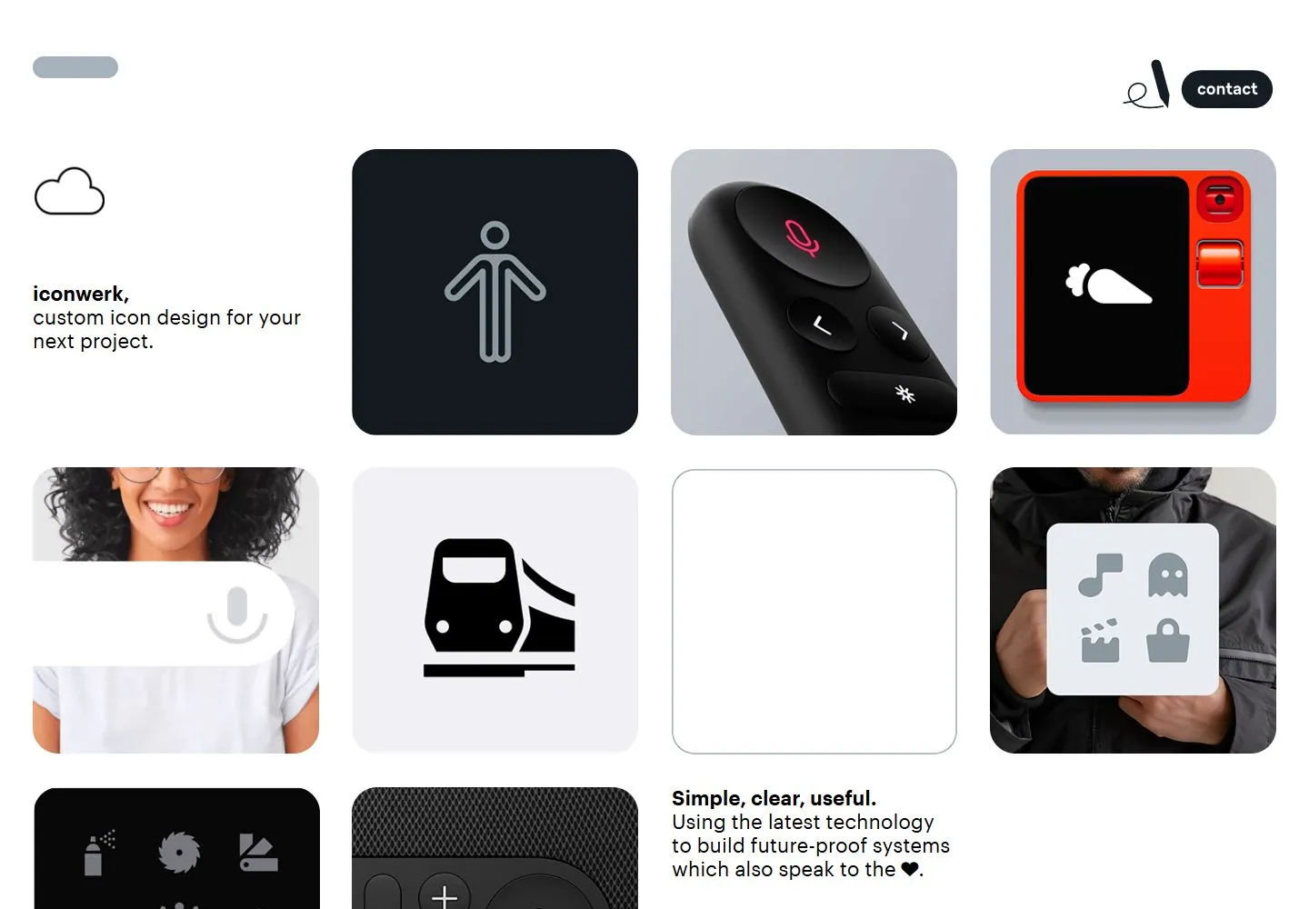
- White canvas with a masonry-like arrangement of large rounded rectangular samples. A compact black logo and two-line proposition occupy upper left; colorful icon tiles and product demonstrations fill staggered columns to the right and below. A separate explanatory copy block sits lower left. Tile sizes vary but align on a loose shared vertical rhythm.
- Type
- Black modern sans with bold service phrase and regular supporting lines; white or colored pictograms dominate samples. Small rounded chat bubble appears upper right. Exact typeface not inferred.
- Color and surface
- White ground, pale gray and charcoal sample cards, bright red and blue panels, wood texture and black areas; corners are rounded, shadows not prominent.
- Components
- Brand mark, introductory proposition, varied icon sample panels, accessibility symbol card, photo/product demonstration, one chat bubble, explanatory block.
What makes it work
- Varied sample panels
- Loose staggered alignment
- Open white margins
- Brief framing copy
On a new subjectBuild a varied set of contained examples that demonstrate a capability; keep their spacing rhythm and open margins. Replace every pictured icon/product with examples relevant to the new subject.
Prompts
Create an original visual direction for {{website_name}} in {{industry}}, for {{audience}}, presenting {{content}} and supporting {{functionality}}. Composition invariant: Compose an open white or pale canvas from a small intro anchor and an asymmetric mosaic of rounded tiles in several sizes. Let example tiles vary, with one small floating action at the edge and generous gutters maintaining separation. Typography: Use friendly clean sans for the intro, with one bold lead and smaller supporting copy; labels remain subordinate to tile content. Palette and contrast: Use a light ground with soft neutral tile surfaces and a limited number of stronger accents selected for {{industry}}. Image and component hierarchy: Populate tiles with new subject-appropriate visual examples, illustrations, records or images; do not require icon-design samples, portraits or specific products. Visual estimate from the supplied reference, not measured CSS: Visual estimate: mosaic around 70% frame; tile widths vary from narrow quarter to broad third; intro about 20% width. Scale the relationships to the target content and viewport. Variables: replace source identity, wording, industry-specific objects, people, imagery, exact colors and controls with original material for {{website_name}}, {{industry}}, {{audience}}, {{content}} and {{functionality}}. Retain only the composition and hierarchy described above. No source logo, product, person, artwork or exact phrase is a required asset. Do not infer typeface, framework, CSS values, motion or tested behavior from a static image. Continue the visual system using relevant content sections, keeping the same relative spacing and contrast without adding generic cards or decoration where none are described. Stack tiles in a varied but readable sequence, keeping intro first and floating action reachable without covering content.
Implement a responsive page for {{website_name}} in {{industry}} for {{audience}}, with real {{content}} and working {{functionality}}. Wide-screen structure: Compose an open white or pale canvas from a small intro anchor and an asymmetric mosaic of rounded tiles in several sizes. Let example tiles vary, with one small floating action at the edge and generous gutters maintaining separation. Type hierarchy: Use friendly clean sans for the intro, with one bold lead and smaller supporting copy; labels remain subordinate to tile content. Surface treatment: Use a light ground with soft neutral tile surfaces and a limited number of stronger accents selected for {{industry}}. Component and image roles: Populate tiles with new subject-appropriate visual examples, illustrations, records or images; do not require icon-design samples, portraits or specific products. Visual estimate from the supplied reference, not measured CSS: Visual estimate: mosaic around 70% frame; tile widths vary from narrow quarter to broad third; intro about 20% width. Scale the relationships to the target content and viewport. Variables: replace source identity, wording, industry-specific objects, people, imagery, exact colors and controls with original material for {{website_name}}, {{industry}}, {{audience}}, {{content}} and {{functionality}}. Retain only the composition and hierarchy described above. No source logo, product, person, artwork or exact phrase is a required asset. Do not infer typeface, framework, CSS values, motion or tested behavior from a static image. Continue the visual system using relevant content sections, keeping the same relative spacing and contrast without adding generic cards or decoration where none are described. Stack tiles in a varied but readable sequence, keeping intro first and floating action reachable without covering content. Use semantic content and meaningful image descriptions. Keep each label with its image or list item, and make any new controls named, keyboard-operable and visibly focused. Implement requested functionality as new working behavior; the static reference does not verify source controls.
Measured
Fonts loaded__Graphik_5, __iconwerkdings_5
Body text14px
Page backgroundtransparent
Text color#000000
Page height8,096px
Computed CSS at 1440px, 2026-10-24.
Live behavior
- Today
- The Iconwerk home capture uses a white background, compact “iconwerk” identity and contact control, with a short custom-icon design statement beside a dense mosaic of rounded image and icon tiles. The saved desktop image begins with a cloud-like line icon and a mixture of black, gray, red, orange and photographic tiles; a lower text block reads “Simple, clear, useful.” The separately selected gallery reference is another mosaic crop with different icons and tile arrangement.
- Responsive
- Desktop measures 1440×1000 with an 8411px document; tablet is 768×1024 with a 15395px document; ordinary and reduced-motion phone states are 390×844 with document heights of 11066px and 8427px. The phone capture stacks the statement and two-column tile grid; tablet uses wider multi-column tiles. These sampled widths do not establish breakpoint thresholds. The different document heights and icon states are recorded without assigning a cause.
- Scroll
- The desktop-scroll state measures actual scrollY=750 in an 8411px document and shows the “Simple, clear, useful.” statement alongside icon/product imagery. This is evidence for that saved position only.


