
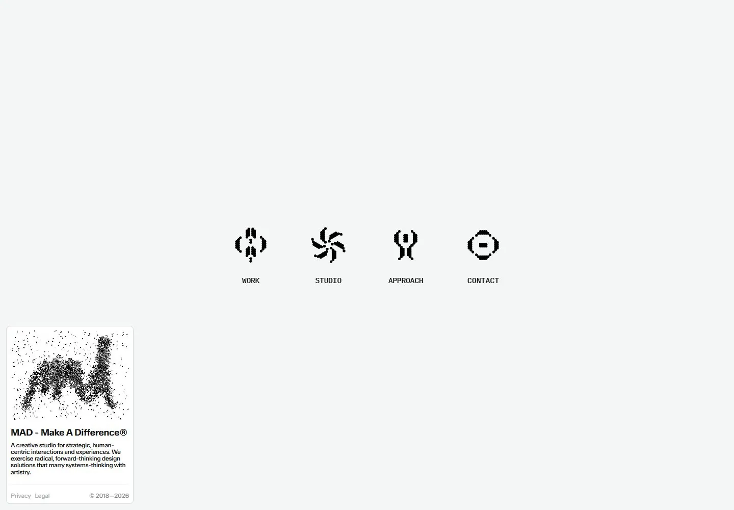
Live capture at 1440px, 2026-10-24
How it’s built
- Layout
- Four small black symbols and labels form an evenly spaced horizontal row near the center of a nearly empty pale field. A separate compact descriptive card occupies the lower-left corner.
- Type
- Small bold condensed-looking uppercase option labels, small sans card copy and a heavier short card heading.
- Color and surface
- Very pale gray field, black symbols/text, white rounded card with a faint edge; the card graphic is black on pale dotted artwork.
- Components
- Four pixel/dot-like symbols, one short label under each, and a lower-left identity card containing graphic, description and tiny footer links.
What makes it work
- A sparse pale navigation field with four small dot-like symbols and labels plus a detached lower-corner information card.
On a new subjectFor a neighborhood observatory, place four small dot-built celestial navigation symbols in a pale empty field and an observatory information card in a lower corner.
Measured
Fonts loadedABCWalterNeue, InputMono
H114px / 500 / -0.32px
Body text14px
Page backgroundtransparent
Text color#111313
Page height1,000px
Computed CSS at 1440px, 2026-10-24.
Live behavior
- Today
- MAD — Make A Difference® is captured as a mostly white page with four black pixel-like icons and labels for Work, Studio, Approach and Contact in a centered horizontal row. A small card at lower left contains a grainy MAD mark, the studio name, a short description, Privacy and Legal links, and a copyright line. Tablet keeps the horizontal icon row above the card; phone rearranges the four items into a two-by-two grid above a larger, nearly full-width card. The selected gallery reference shows a different black abstract mark inside the card, while the saved live evidence shows the grainy letter-like mark.
- Responsive
- Desktop measures 1440×1000 with a 1440×1000 document; desktop t0, t2 and the nominal scroll state all report y=0. Tablet is 768×1024 with a 768×1024 document. Phone and reduced-motion phone are 390×844 with 390×1084 documents. Desktop/tablet show four icons in one horizontal row; phone uses two rows of two. All states report zero sampled animation entries. These samples do not establish responsive breakpoints.
- Scroll
- The nominal desktop-scroll screenshot records actual scrollY 0 in a 1440×1000 document and appears materially identical to the opening desktop frame. It does not show a lower page section or establish scroll behavior.


