
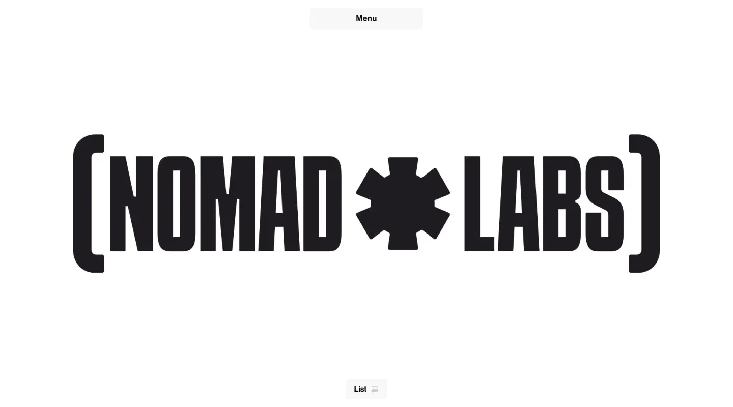
Screenshot from Minimal Gallery, saved 2026-10-24
How it’s built
- Layout
- White field with a huge condensed black bracketed identity centered vertically; a small pale menu button sits top center and a list control bottom center.
- Type
- Very heavy condensed uppercase identity with oversized brackets and central asterisk.
- Color and surface
- White field, near-black identity and very pale gray control surfaces.
- Components
- Menu button, bracketed identity and bottom list control.
What makes it work
- Centered bracketed condensed identity between two small controls.
On a new subjectFor a community astronomy archive, center a bracketed condensed name between small menu and list controls.
Live behavior
- Today
- The log reports HTTP 403, but saved screenshots show a white Nomad Labs branded screen rather than a conventional error page. Desktop shows a large dark condensed bracketed wordmark with a star-like symbol, a small centered Menu control at top and List at bottom. Tablet also shows a cropped project image at upper right; phone shows the compact wordmark and controls. The separate gallery reference depicts the same wordmark screen.
- Responsive
- Desktop 1440×1000, tablet 768×1024 and phone 390×844 documents match their viewports and all states report y=0. The wordmark scales down at narrow widths. Tablet alone shows a project image at capture; separate phases prevent attributing that difference solely to width.
- Scroll
- The desktop-scroll-labeled state remains y=0 in a viewport-height document. It does not establish a lower-page scroll position.


