
Live capture at 1440px, 2026-10-24
How it’s built
- Layout
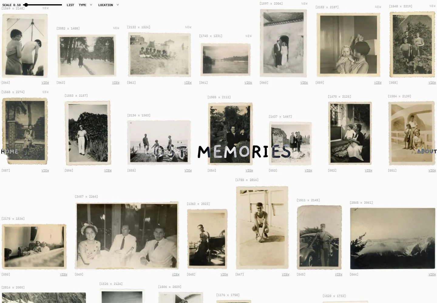
- Unequal old photographic prints form loosely aligned rows on a pale textured field. Tiny dimension-like labels sit above and index/view labels below; an irregular handwritten-looking title crosses the first row at mid-height.
- Type
- Black uneven handwritten-looking title and side links; tiny light-gray monospaced-looking dimensions/index labels and small technical-looking toolbar labels.
- Color and surface
- Pale paper-textured field, aged cream/grayscale prints with worn edges, black title and faint gray metadata.
- Components
- Top scale/filter controls, unequal print images, dimension-like labels, row captions and a large midline title with edge home/about links.
What makes it work
- An unequal aged-print catalog on pale paper with tiny technical-looking metadata and a handwritten-looking title crossing the images.
On a new subjectFor a community botanical-memory archive, arrange unequal scanned plant-note prints on pale paper, add tiny catalog dimensions and cross them with an uneven handwritten collection title.
Prompts
Create an original website image for {{website_name}} in {{industry}}, serving {{audience}}, presenting {{content}} and making {{functionality}} apparent.
INVARIANTS: Build a pale archival image field with irregular photo proportions and small metadata; place a shallow scale/filter strip above and a modest handwritten identity across an open interval.
TYPOGRAPHY: Use tiny factual labels against one irregular handwritten title; avoid a large polished display headline.
COLORS AND SURFACES: Low-saturation photographic material on a pale neutral ground with subtle dark labels.
IMAGERY: Use an original collection with a coherent archival material treatment; family photographs and aged-paper subjects are variables.
VARIABLES: Supply original identity, writing, imagery, accent hues and tasks for {{website_name}}, {{industry}}, {{audience}}, {{content}} and {{functionality}}.
PROHIBITIONS: Do not copy source branding, wording, photographs or signature artwork. Do not turn privacy notices, submission frames or cut-off essential text into style rules. Avoid generic card stacks, extra decorative panels or an unrelated large hero heading when they erase the specified hierarchy.
CONTINUATION: Translate the same relative type scale, alignment and image treatment into the next real content section; give that section a clear purpose rather than duplicating the hero.
RESPONSIVE PROPOSAL: Use fewer columns with readable metadata, move the handwritten identity into a clear gap, and retain the shallow archive controls in a reachable row. Render clear, readable original text and subject-appropriate controls with consistent spacing. These proportions are visual reproduction targets, not common measured CSS. The selected still does not establish source fonts, technology, motion, hover or responsive behavior. Preserve those evidence limits; this prompt remains unvalidated.
Build a functioning responsive website for {{website_name}} in {{industry}} for {{audience}}, using {{content}} and working {{functionality}}.
INVARIANTS: Build a pale archival image field with irregular photo proportions and small metadata; place a shallow scale/filter strip above and a modest handwritten identity across an open interval.
TYPOGRAPHY: Use tiny factual labels against one irregular handwritten title; avoid a large polished display headline.
COLORS AND SURFACES: Low-saturation photographic material on a pale neutral ground with subtle dark labels.
IMAGERY: Use an original collection with a coherent archival material treatment; family photographs and aged-paper subjects are variables.
VARIABLES: Supply original identity, writing, imagery, accent hues and tasks for {{website_name}}, {{industry}}, {{audience}}, {{content}} and {{functionality}}.
PROHIBITIONS: Do not copy source branding, wording, photographs or signature artwork. Do not turn privacy notices, submission frames or cut-off essential text into style rules. Avoid generic card stacks, extra decorative panels or an unrelated large hero heading when they erase the specified hierarchy.
CONTINUATION: Carry the relative type scale, alignment and image treatment into appropriate content sections without repeating the hero or inventing irrelevant features.
RESPONSIVE PROPOSAL: Use fewer columns with readable metadata, move the handwritten identity into a clear gap, and retain the shallow archive controls in a reachable row. Use semantic reading order, meaningful image descriptions, keyboard-operable controls and visible focus. Check display text bounds after the chosen fonts load at desktop and phone widths; keep complete essential text inside its container. Verify the actual requested actions rather than styling inert controls. Respect reduced-motion preferences if new motion is added. These proportions are visual reproduction targets, not common measured CSS. The selected still does not establish source fonts, technology, motion, hover or responsive behavior. Preserve those evidence limits; this prompt remains unvalidated.
Measured
Fonts loadedIBM Plex Mono
H172px / 600
Body text16px
Page backgroundtransparent
Text color#000000
Page height2,748px
Computed CSS at 1440px, 2026-10-24.
Live behavior
- Today
- Current live view is a white, long photo archive: many individual aged photographs are arranged in a dense but irregular grid, with small dimensions/status labels and VIEW links. The “LOST MEMORIES” title crosses the image field; HOME and ABOUT anchor the far edges. At 1440×1000, sampled document height is 2,748px. At 768×1024, a narrower multi-column image field continues; at 390×844, opening photos occupy two side-by-side positions and continue in an irregular staggered arrangement and title/navigation overlap the lower viewport region. A successful 750px desktop scroll shows later archive items and repeated title/nav elements. The t0 and t2 screenshots differ in image hash but appear visually near-identical at a glance; hover state visibly underlines HOME. Only that hover response is attributed to the recorded attempt.
- Responsive
- Observed at 1440×1000, 768×1024 and 390×844. Dense multi-column archive at desktop/tablet narrows to an irregular staggered arrangement with two side-by-side opening photo positions at 390px; title/navigation overlap image content at these captures. Further breakpoint behavior unknown.
- Scroll
- Successful desktop scroll is at scrollY=750 in 1440×1000; it reveals a later section of the photo archive with persistent top controls and another LOST MEMORIES title/nav overlay. Sampled document height is 2,748px. No links activated.


