
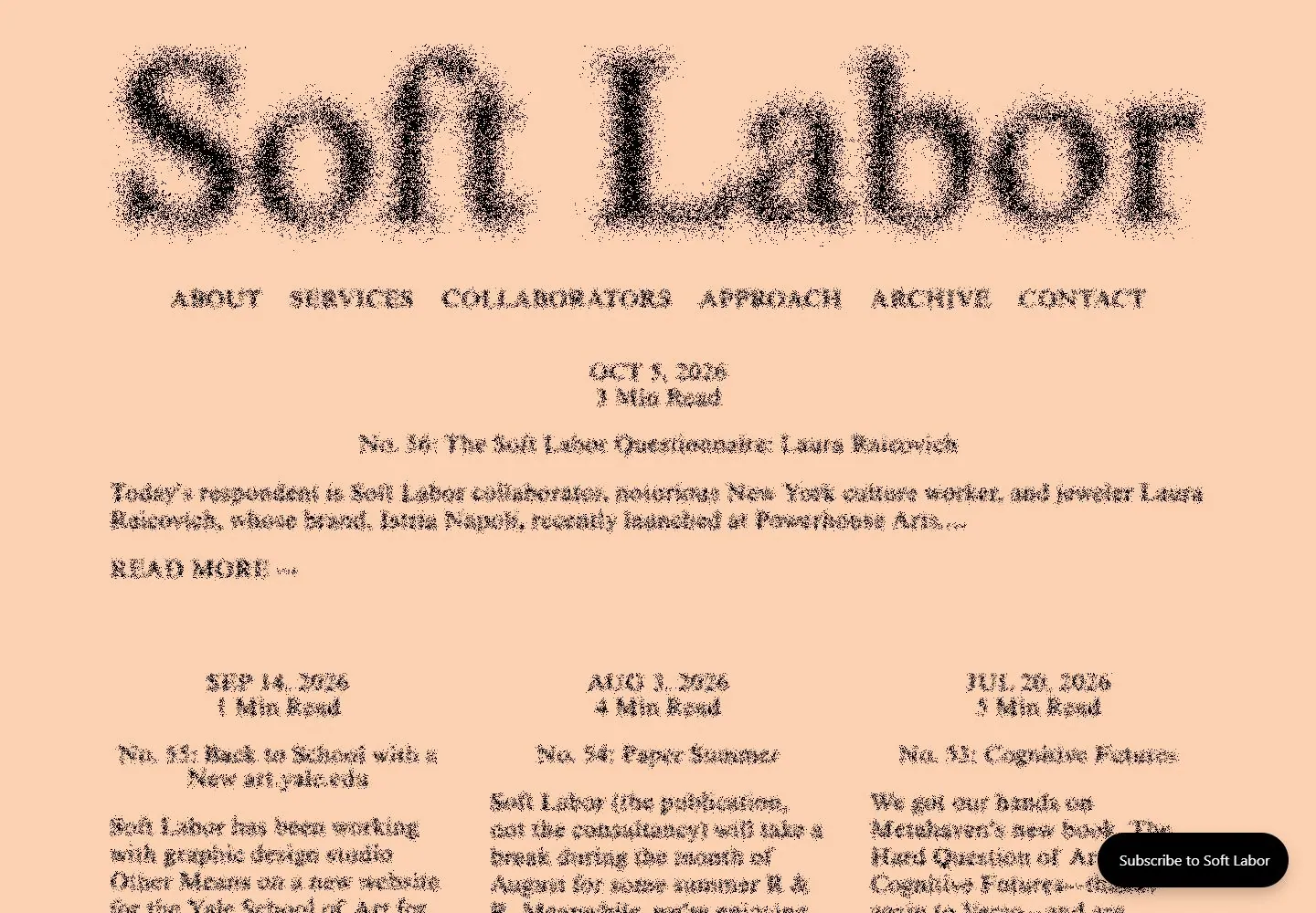
Live capture at 1440px, 2026-10-25
How it’s built
- Layout
- A peach page centers an enormous soft-edged black serif masthead above small uppercase navigation and dense editorial text; small lower article metadata begins below.
- Type
- Huge blurred or soft-edged black serif masthead, small uppercase serif navigation and compact serif body.
- Color and surface
- Peach field and black type.
- Components
- A huge soft-edged black serif masthead tops centered small navigation and editorial text on peach.
What makes it work
- Peach field
- Huge soft-edged black serif masthead
- Centered small uppercase navigation and compact editorial text
On a new subjectFor a public local-history journal, use a huge soft-edged black serif masthead over centered small uppercase navigation and compact editorial text on peach.
Prompts
Create a finished editorial homepage for {{website_name}}, an organization in {{industry}} addressing {{audience}}. Invariants: Use {{content}} to introduce the publication and make the actual {{functionality}} apparent through concise navigation and article actions. Composition invariant: an enormous identity wordform occupies the upper area on a single warm, pale ground; a much smaller navigation row sits directly beneath; a centered date/read-time and article title lead into a multi-column editorial stream. Visual estimate from the 1440x1000 capture: the upper wordmark spans about 80–85% of page width and the first article lead begins around the vertical midpoint. This is an estimate; matching live DOM measurement reports a 1206-by-263-pixel link box at x=114, y=48 and a 238.8-pixel computed font size, recorded in the linked measurements file. Typography invariant: large expressive lettering has a soft particulate edge, while navigation, metadata, and article text step down clearly in scale. Surface invariant: dark ink-like text on pale peach; no cards at the top. Keep the article grid readable and retain whitespace around the lead. Variables: replace identity, copy, hue, articles, labels, and action destinations for the new subject, preserving the same contrast and hierarchy. Prohibitions: no source mark, wording, article, or exact lettering. Do not claim the grain effect’s technique or any animation as observed. Responsive proposal: reduce and wrap the identity into deliberate lines, then stack the article columns while preserving navigation order and the strong type-to-metadata scale difference.
Implement an editorial homepage for {{website_name}} in {{industry}} for {{audience}}, populated with {{content}} and real {{functionality}}. Invariants: Preserve the observed layout relationships: one giant grain-edged identity above a quiet horizontal navigation; centered date and reading-time labels; a short centered story lead; then a readable multi-column article stream. In the selected screenshot the wordmark visually spans most of the width; the matching live DOM/computed-CSS capture at 1440x1000 measures its link rect as 1206x263 at x114/y48 and font size 238.8px. These are measurements of the current live DOM, not universal design targets; see research/evidence/div2-0003/measurements-desktop.json. Keep visual proportions marked as estimates and don't carry the capture dimensions unchanged to other viewports. Use the exact style relationship, but new identity text, copy, type choices, warm hue, article structure, and actions should suit {{website_name}}, {{industry}}, {{audience}}, {{content}}, and {{functionality}}. Preserve light-ground/dark-letter contrast and the oversized-to-small type ladder. Prohibitions: Do not copy source branding or text, claim the grain implementation, or imply reference motion/hover; those behaviors are untested. You may implement useful new interactions for {{functionality}}. Variables: replace publication identity, article topics, lettering, warm hue, and actions while retaining the oversized identity-to-metadata ladder. Responsive proposal: scale and line-break the identity, collapse columns in reading order, and keep controls reachable, semantic, keyboard-operable, visibly focused, and contrast-compliant. Keep a clear vertical offset between identity and navigation, enough quiet space before article metadata, and a centered lead of constrained measure; entry summaries should retain readable line length.
Measured
Fonts loadedTimes Seven
H224px / 400
Body text24px
Page background#ffffff
Text color#000000
Page height3,895px
Computed CSS at 1440px, 2026-10-25.
Live behavior
- Today
- A pale peach canvas presents an oversized, centered “Soft Labor” wordmark in a fine serif with a dark grain/noise texture, followed by a single horizontal row of widely spaced uppercase navigation. Below it, a centered date leads into a broad featured article with title and excerpt; smaller article listings begin in three evenly spaced columns. The page relies on typography, open space and a nearly monochrome ground rather than visible photography or card surfaces.
- Responsive
- At 1440px, the wordmark is declared at about 238.8px and the navigation is 24px in one horizontal row; the featured article spans about 1200px and the next entries form three 368px columns with 52px gaps. At 768px, the wordmark is 72px, navigation stacks vertically, and the article occupies a single 707px column. At 390px, the same stacked navigation and one-column sequence use 16px side margins and 359px article width. Those are three samples, not a full breakpoint map.
- Scroll
- The desktop scroll state records actual scrollY=750 in a 3895px document. The masthead and featured article have moved above the viewport; three article columns continue from near the top, followed by another row lower down. This is a real scroll comparison. Article links and the subscription control were not activated.


