
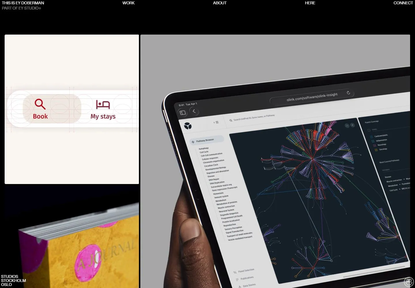
Live capture at 1440px, 2026-10-24
How it’s built
- Layout
- Black field; tiny distributed top labels, large white outlined smile mark left, huge colorful image right, cropped black-on-white image label lower left, small purple edge capsule.
- Type
- Tiny distributed white sans utilities; large graphic smile mark and bold embedded image lettering are visual assets.
- Color and surface
- Black ground, white outlined graphic, vivid colorful project image, cropped white panel and small purple capsule.
- Components
- Widely spaced top labels, large left graphic, huge right image, lower-left project panel and edge capsule.
What makes it work
- Asymmetric black stage balancing a large outlined circular graphic against a vivid oversized project image.
On a new subjectFor a community seed bank, balance a large white outlined germination symbol against a vivid oversized plant image on black, with tiny edge labels.
Measured
Fonts loadedGerstner-Programm
Body text20px
Page backgroundtransparent
Text color#ffffff
Page height6,073px
Computed CSS at 1440px, 2026-10-24.
Live behavior
- Today
- EY Doberman’s captured portfolio uses a black page with a sparse top navigation (“THIS IS EY DOBERMAN,” Work, About, Here, Connect) and a collage of large image panels separated by narrow black gutters. The desktop states show a red Scandic phone image, colorful printed matter, and dark teal science/network visualizations; the hovered frame shows a pale booking interface and columns of gene names. Tablet and phone present the work as larger stacked or tiled media, including a Scandic hotel campaign. The separate gallery reference is an art direction page with a large smile mark and a colorful editorial image, not a substitute for the varied live portfolio frames.
- Responsive
- The desktop document measures 1440×6073; tablet 768×3680; ordinary and reduced-motion phone 390×5165. Desktop uses a loose multi-column image grid, tablet rearranges those blocks into a narrower grid, and phone becomes a vertical sequence of large media panels. The captured phone frame shows “Scandic / Your friend in town” followed by film imagery; the reduced-motion phone instead shows the Scandic panel above gene-name columns. These widths do not establish breakpoint thresholds or a complete portfolio order.
- Scroll
- The desktop-scroll state records actual scrollY=750 in a 1440×6073 document. It shows a close-up printed image at left and multiple columns of gene names on a black field, with the Connect label still at the upper right. The screenshot does not establish sticky navigation or a general scroll interaction.


