
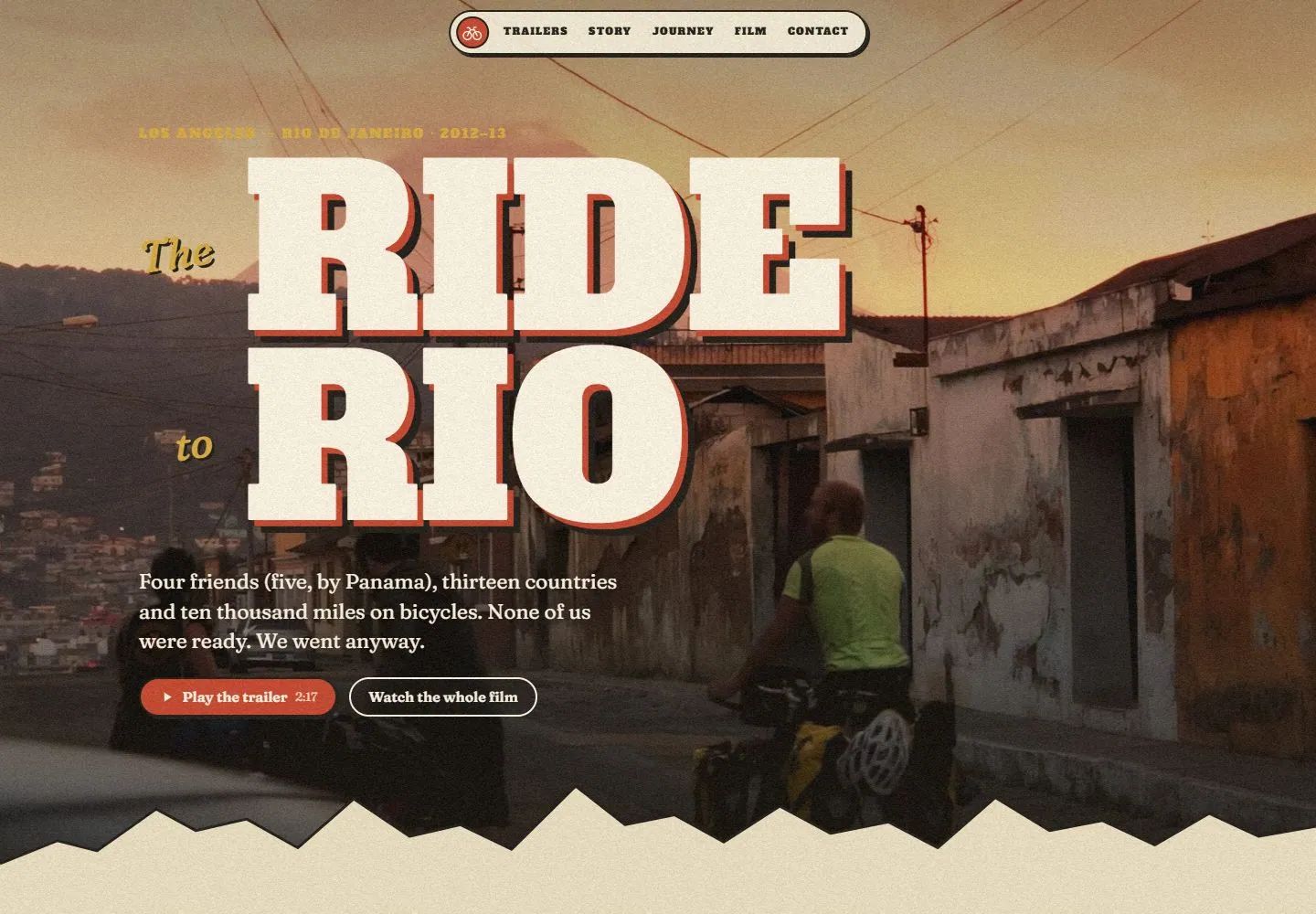
Live capture at 1440px, 2026-10-24
How it’s built
- Layout
- An illustrated terrain map fills the viewport with mountain hatching, rivers, vegetation zones and a cream faded paper perimeter. A thin route crosses the mountains to a red position dot and a cream outlined story bubble beside a round photographic pin. Country/stage labels line the left, small numeric badges and compass sit upper right, a minimap sits lower left, and a fine elevation-like profile spans the bottom. Drawn clouds and small picture markers add depth.
- Type
- Compact bold slab/serif-like stage labels, readable serif story title/body and small condensed badge text; no giant page headline. Exact fonts unknown.
- Color and surface
- Textured parchment, muted mustard mountains, green land, teal sea, thin dark hatching and white route edge; red progress accents and cream/black outlined story surfaces.
- Components
- Illustrated map/route, circular photo pin, outlined story bubble, stage list, progress badges, compass, minimap and lower profile trace.
What makes it work
- Textured illustrated terrain and faded paper edges
- Fine outlined route and photo-linked cream story bubble
- Compact print-like labels and dark outlined badges
- Thin lower profile/progress trace
On a new subjectFor a municipal watershed-restoration history, draw an original parchment-like catchment map with hatched terrain, a restoration route and circular site photographs connected to cream story bubbles. Retain small stage labels, progress badges and a lower profile trace; replace travel diary content with sourced civic history.
Measured
Fonts loadedAlfa Slab One, Caveat, Fraunces
H1242.4px / 400 / -2.424px
Body text20.48px
Page backgroundtransparent
Text color#1e1b16
Page height24,774px
Computed CSS at 1440px, 2026-10-24.
Live behavior
- Today
- Full-viewport landscape footage under a grain-like texture, enormous cream two-line slab-serif title with crisp red/dark offset treatment, smaller gold tilted italic words, gold metadata, serif paragraph and red/outlined pill actions. A small cream outlined navigation capsule floats at the top; an irregular cream section edge leads to framed media cards.
- Responsive
- The five navigation labels remain in a single row in all three widths; the phone row uses smaller text. Desktop title samples are242.4px/208.464px line-height, tablet144px/123.84px and phone89.7px/77.142px. Tablet and phone move the copy lower over more open landscape space. Phone action buttons stack at the same left edge instead of sharing a row. These saved widths establish examples, not an exact breakpoint rule.
- Scroll
- At actual scrollY750 the hero lower edge is followed by four media cards in one desktop row, then the opening of a large story heading. The row records four312px tracks with20.8px gap. Cards have2px dark borders,26px corners,4px hard offset shadows and small alternating rotations; serif labels and red year markers accompany the previews. The story heading is only partly within the viewport.


