
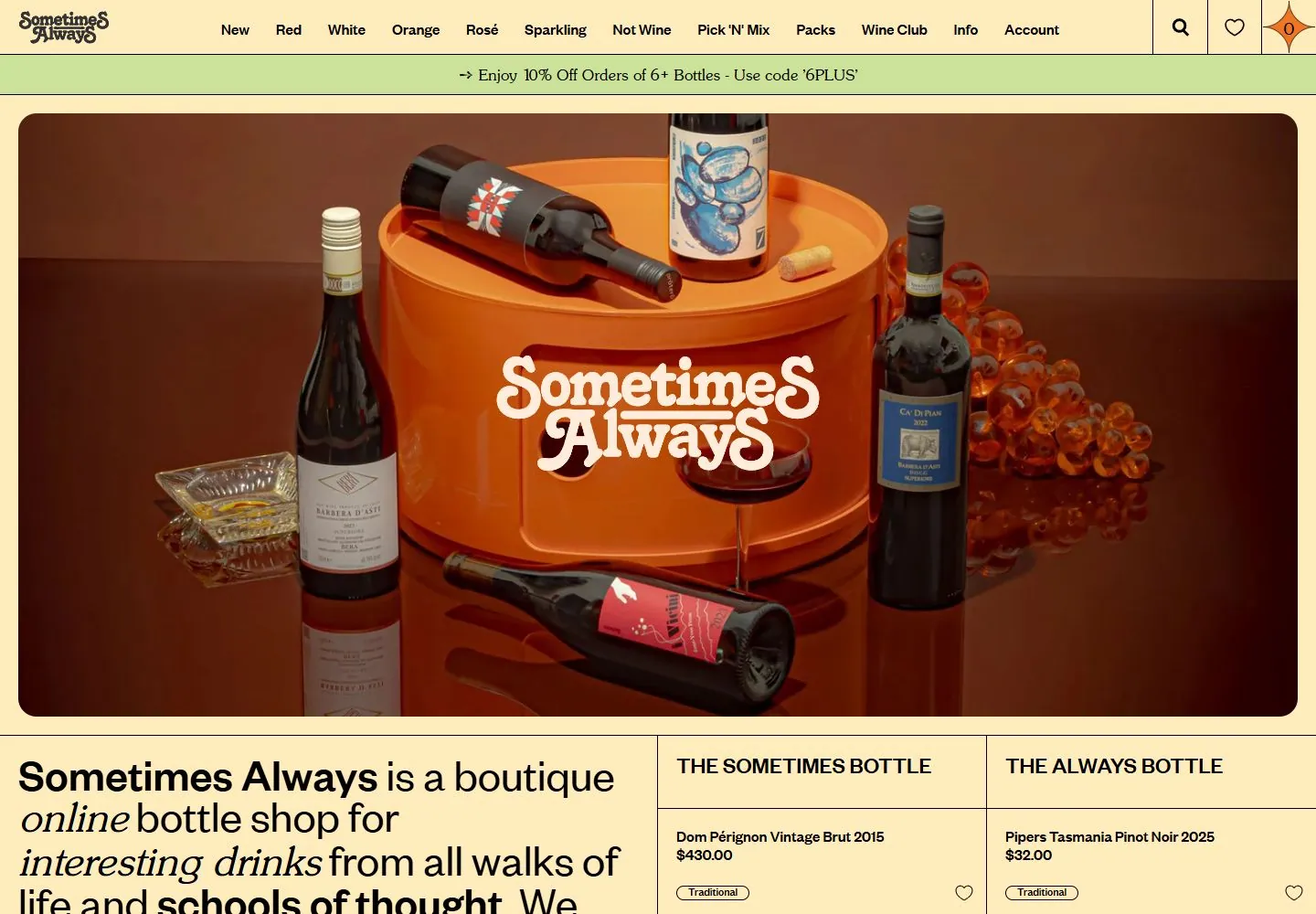
Live capture at 1440px, 2026-10-24
How it’s built
- Layout
- Pale butter-yellow page with a narrow top row of brand, many category links, search and decorative star; a separate thin shipping strip below. A large rounded-corner wine photograph fills most of the hero with orange brand lettering centered on bottles. Below, thin black rules separate a large intro paragraph at left from two product information columns at right; product imagery begins below the crop.
- Type
- Top navigation is small bold sans; hero brand wordmark is orange display lettering. Large lower-left paragraph uses large sans with bold and italic emphasis. Product column headings are uppercase sans, with compact names and price details below.
- Color and surface
- Pale yellow ground, black rules and type, warm bottle/photo greens and dark browns, orange logo accent. Hero image has a visibly rounded outer frame; no pronounced shadow.
- Components
- Dense category navigation, shipping message, rounded photographic hero with centered mark, large editorial introduction, two ruled product columns and small floating chat bubble.
What makes it work
- Photographic feature
- Clear separation between header and hero
- Structured text/product area below
- Visible rule-based column divisions
On a new subjectLead with one relevant framed subject image, then use a strong introductory block and a few clearly divided information columns. Replace wine content and colors.
Prompts
Create a visual direction for {{website_name}} in {{industry}} for {{audience}}, shaping {{content}} and supporting {{functionality}}.
COMPOSITION INVARIANTS: Use compact commerce navigation and a slim announcement band above one wide rounded lifestyle/product photograph. Place a short identity over the photograph, then begin a ruled multi-column description or product section below. Preserve the observed visual hierarchy and spacing relationships, not the source-specific object inventory.
TYPE: Keep navigation compact and bold; use expressive display lettering over the image and larger editorial copy below, with selective typographic contrast. Set a readable scale step between display text, supporting copy, captions, and utilities. Do not name a font family.
SURFACE AND COMPONENTS: Choose a warm pale surface, dark rules and a subject-appropriate accent. Let the photograph provide most of the tonal richness; the source yellow/orange/green combination is not required. Component roles: Utility/category nav, optional announcement, broad image with overlaid identity, lower description and a small set of ruled content/product columns. Keep controls visually distinct and subordinate to the main content.
IMAGE DIRECTION: Use original subject-relevant photography; bottles, wine, and the pictured scene are not required. Proportion estimate from the selected still: Visual estimate: top bands total about 10% height; photo fills about 67%; lower grid begins in final fifth. Treat it as an estimate, not fixed CSS geometry.
VARIABLES: Adapt names, details, image subjects, palette accents, and working actions to {{website_name}}, {{industry}}, {{audience}}, {{content}}, and {{functionality}}.
PROHIBITIONS: Use original copy and assets. Do not reproduce the source brand, exact wording, photographs, illustrations, products, people, or signature artwork; source-specific objects and motifs are optional only when they genuinely fit the new subject.
CONTINUATION: Continue with product or editorial details using the same image-first and fine-rule relationship.
RESPONSIVE PROPOSAL: Collapse category links into a menu, keep overlay text on a legible part of the image, and stack the lower cells in reading order. These are design proposals, not observed mobile behavior. The selected still does not establish source fonts, CSS, implementation technology, motion, or control behavior. Do not present any of those as observed. Implement requested {{functionality}} as working new behavior without implying source validation.
Implement a responsive page for {{website_name}} in {{industry}} for {{audience}}, presenting {{content}} and working {{functionality}}.
INVARIANTS: Use compact commerce navigation and a slim announcement band above one wide rounded lifestyle/product photograph. Place a short identity over the photograph, then begin a ruled multi-column description or product section below. Keep the same relative prominence and spacing without requiring the same source objects.
TYPE AND SURFACES: Keep navigation compact and bold; use expressive display lettering over the image and larger editorial copy below, with selective typographic contrast. Choose a warm pale surface, dark rules and a subject-appropriate accent. Let the photograph provide most of the tonal richness; the source yellow/orange/green combination is not required. Maintain clear display/body/utility scale, readable line lengths, and sufficient contrast. Components: Utility/category nav, optional announcement, broad image with overlaid identity, lower description and a small set of ruled content/product columns.
IMAGERY AND SCALE: Use original subject-relevant photography; bottles, wine, and the pictured scene are not required. Visual estimate only: Visual estimate: top bands total about 10% height; photo fills about 67%; lower grid begins in final fifth. Use flexible widths and content-led dimensions; do not copy this screenshot's coordinates as fixed values.
VARIABLES: Adapt names, details, image subjects, palette accents, and working actions to {{website_name}}, {{industry}}, {{audience}}, {{content}}, and {{functionality}}.
PROHIBITIONS: Use original copy and assets. Do not reproduce the source brand, exact wording, photographs, illustrations, products, people, or signature artwork; source-specific objects and motifs are optional only when they genuinely fit the new subject.
CONTINUATION: Continue with product or editorial details using the same image-first and fine-rule relationship.
RESPONSIVE PROPOSAL: Collapse category links into a menu, keep overlay text on a legible part of the image, and stack the lower cells in reading order. Use semantic content, keyboard-operable controls, visible focus, meaningful alt text, and no clipped content. The selected still does not establish source fonts, CSS, implementation technology, motion, or control behavior. Do not present any of those as observed. Implement requested {{functionality}} as working new behavior without implying source validation.
Measured
Fonts loadedFoundersGrotesk-Medium, FoundersGrotesk-Regular, SunsetSerial-Light, Font Awesome 5 Pro, Open Sans
H225px / 400
Body text20px
Page backgroundtransparent
Text color#000000
Page height4,837px
Computed CSS at 1440px, 2026-10-24.


