
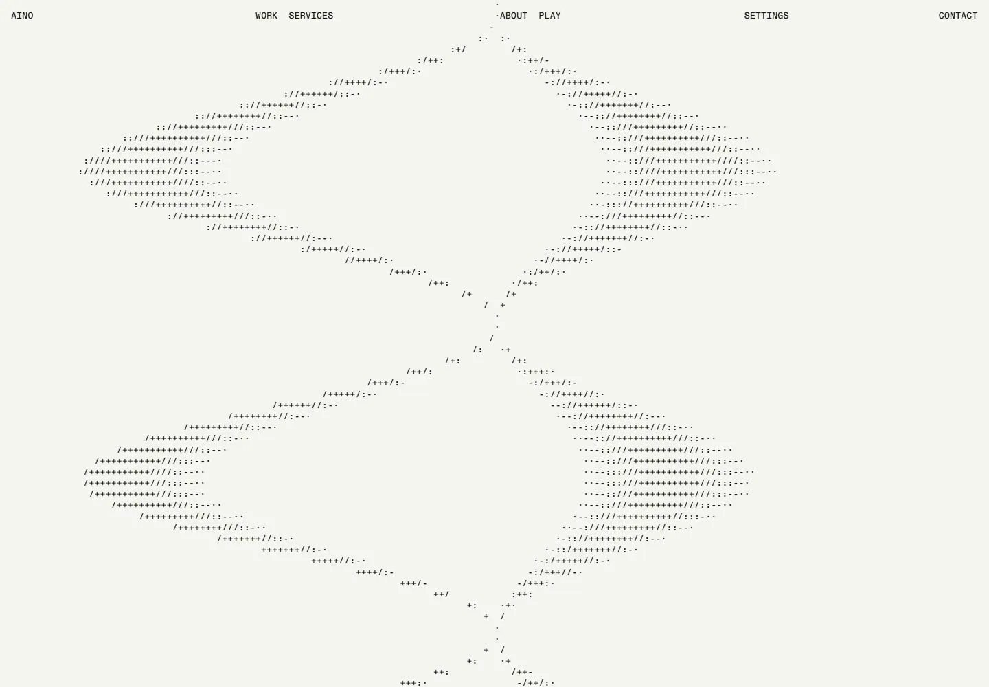
Live capture at 1440px, 2026-10-24
How it’s built
- Layout
- Within the bounded black panel, tiny white labels run along the top; dense fixed-width characters form a broad abstract image on the left while sparse dotted rows surround a narrower character-built form on the right. Glyphs fragment near the bottom within the panel. The pale surround and exterior glyphs have uncertain page membership.
- Type
- Monospaced-looking uppercase micro-labels and dense fixed-width character forms, with fragmented glyphs near the panel bottom. Exact font unknown.
- Color and surface
- Black panel with white fixed-width glyphs and labels; pale exterior has uncertain page membership.
- Components
- Black character-art panel, compact top labels, contrasting density zones and fragmented in-panel glyphs.
What makes it work
- Black field with dense fixed-width character imagery
- Contrasting sparse dotted character form
- Fragmented glyphs within the lower panel
- Tiny top-edge labels
On a new subjectFor a public botanical garden exhibit, use a black panel with dense fixed-width characters forming a plant silhouette beside a sparser dotted specimen form. Fragment glyphs within the lower panel and keep labels tiny; do not assume exterior framing or animation.
Measured
Fonts loadedmono, abc, abcplus
H312.5831px / 500 / 0.54px
Body text12.5831px
Page backgroundtransparent
Text color#181818
Page height6,723px
Computed CSS at 1440px, 2026-10-24.
Live behavior
- Today
- Current Aino ordinary states show black fixed-width character-built imagery across a pale near-white viewport, with extremely small distributed header links. The character pattern changes from a narrow vertical form to broad lobed shapes and overlaps header regions. This is a different palette/composition from the selected black gallery panel. The separate reduced-motion mobile frame exposes a quiet vertical project list with large documentary product/fashion imagery, tiny captions and the same restrained header.
- Responsive
- At1440px the header distributes identity, Work/Services, About/Play, Settings and Contact across the width. At768px and390px it reduces to identity, Contact and Menu; the tablet frame contains overlapping character/header marks that limit readability. Narrow ordinary views keep the character field as a tall central column. Reduced-motion mobile instead shows nearly full-width rectangular project images and small labels below; preference and initialization differ, so do not identify that as a breakpoint-only transformation.
- Scroll
- Actual desktop scroll reaches750px in a6723px document, while the captured viewport still shows the evolving character field with fixed header and a clipped CLIC-like cue low right. DOM sampling lists additional project/narrative headings, but they are not visibly painted through the character field in this screenshot and cannot be claimed as an observed section reveal. No click/tap to continue was performed.


