
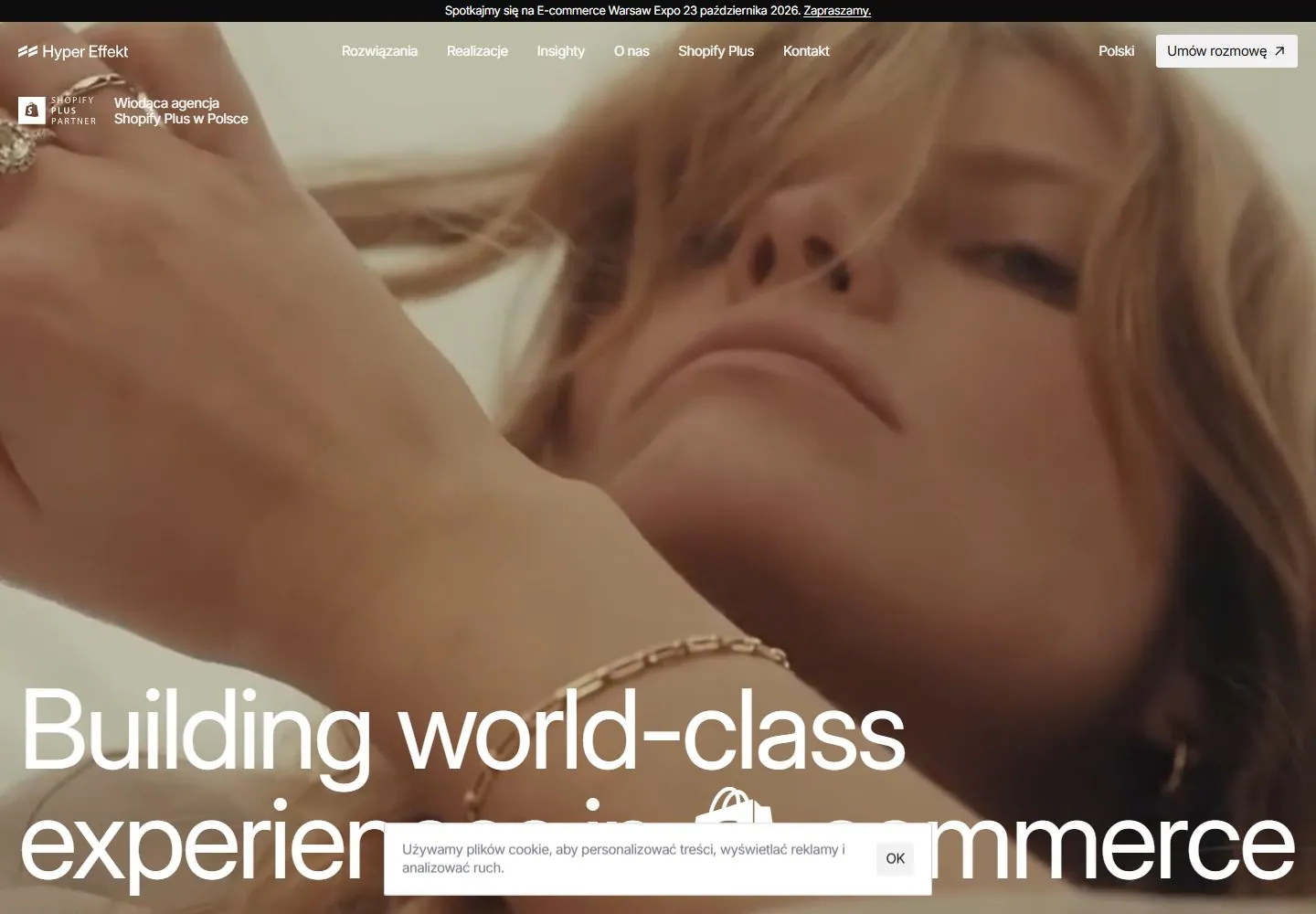
Live capture at 1440px, 2026-10-24
How it’s built
- Layout
- Full-bleed bright retail photograph; tiny white upper navigation/descriptor, very large regular two-line lower white statement with embedded shopping-bag mark.
- Type
- Very large light regular white sans statement over two low lines; tiny white navigation and a small two-line descriptor.
- Color and surface
- Bright full-frame retail photograph with white overlay type and a pale rectangular header action.
- Components
- Small identity, horizontal navigation, tiny upper-left descriptor, pale action and oversized low statement with a brand-specific pictogram.
What makes it work
- Very large light white lower statement and compact upper utilities over full-frame documentary photography.
On a new subjectFor a community music program, use a bright rehearsal photograph with compact upper utilities and a very large light white invitation across the lower third.
Measured
Fonts loadedshopify Regular, Inter Display, Inter
H115px / 400 / -0.495px
Body text12px
Page backgroundtransparent
Text color#000000
Page height8,798px
Computed CSS at 1440px, 2026-10-24.
Live behavior
- Today
- Hyper Effekt opens with a narrow black announcement strip, a translucent navigation row over full-screen video, a Shopify Plus partner mark and Polish agency descriptor at upper left, and a large white “Building world-class experiences in Shopify commerce” headline across the bottom. A cookie notice with an “OK” button overlays the lower center. Desktop t0, t2, and hover show different background video frames, including a green/white graphic, a product bottle, and two people walking near water. At actual desktop scrollY 750, a white company section appears with the Polish heading “Wnosimy świeżość do świata e-commerce,” body copy, and a contact control. Tablet and phone show the same video-led headline with a compact Menu label and cookie notice.
- Responsive
- Desktop is 1440×1000 with a 1440×8798 document; desktop-scroll is at actual y=750. Tablet is 768×1024 with a 768×10301 document. Phone and reduced-motion phone are 390×844 with 390×8869 documents. Desktop states sample two animation entries; tablet and both phone states sample zero. On tablet and phone, the large headline wraps into multiple lines over the video and the navigation collapses to “Menu.” These samples do not establish breakpoints or explain changing video frames.
- Scroll
- The desktop-scroll frame is measured at actual scrollY 750 in a 1440×8798 document. It shows the large headline’s lower line at the top, followed by a white company section with the Polish heading, two columns of copy, and a contact control; the cookie notice remains visible. This one frame does not establish sticky behavior or the scrolling mechanism.


