
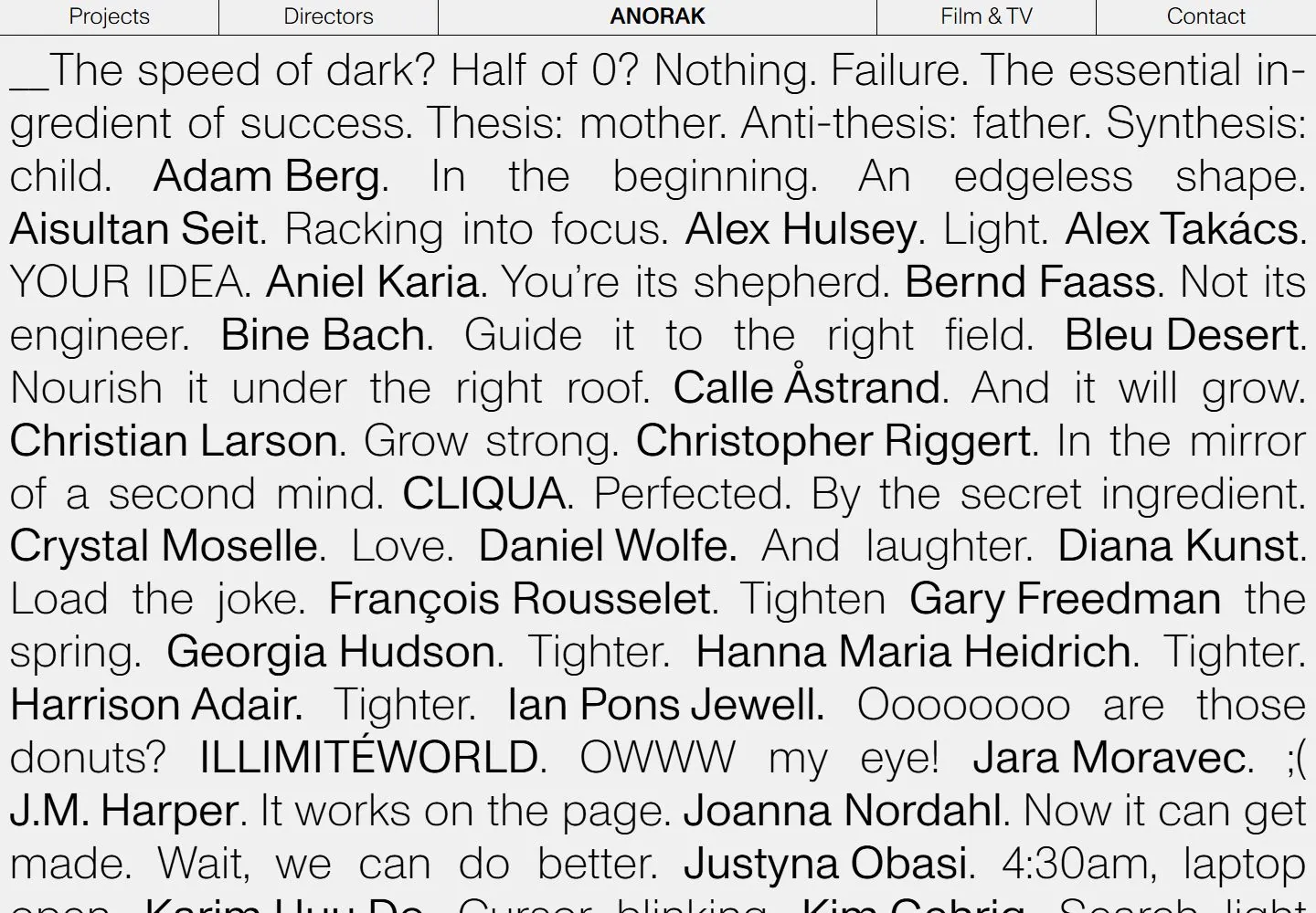
Live capture at 1440px, 2026-10-25
How it’s built
- Layout
- A pale gray page is filled with dense black sans prose and names in varied weights beneath a thin ruled navigation row.
- Type
- Large regular sans prose interspersed with bold names; compact top nav.
- Color and surface
- Pale gray and black text with fine rules.
- Components
- Dense text in mixed regular and bold sans weights fills the field under a ruled navigation row.
What makes it work
- Pale field
- Dense regular and bold sans prose
- Thin ruled top navigation
On a new subjectFor a public literary archive, intersperse bold author names in dense regular sans prose on a pale field beneath a thin ruled navigation row.
Prompts
Create a text-driven landing page for {{website_name}} in {{industry}} for {{audience}}, shaping {{content}} and making {{functionality}} clear. Invariants: Preserve a compact full-width navigation band divided into approximately five outlined cells, followed by an immense uninterrupted wall of text on a pale neutral field. Visual estimate: the header is only about 4% of the 1440x1000 frame; the remaining area is filled with very large lines that flow across most of the screen width. Some names or phrases appear heavier within lighter, thin lettering, creating hierarchy in the prose itself. The matching live DOM/CSS measurement places each top cell around 239px wide and the cell boxes are 38px high and the outer nav box is 39px high at this viewport; body text computed size is 25.2px. See research/evidence/div2-0024/measurements-desktop.json. These are exact values for the selected live DOM, not universal dimensions. Palette relationship: near-black text/rules on a light gray-white surface; no cards or image in this live opening. Variables: new navigation labels, prose fragments, emphases, and subject-appropriate type/color choices for {{website_name}}, {{industry}}, {{audience}}, {{content}}, and {{functionality}}, while preserving segmented nav and type-wall hierarchy. Prohibitions: no Anorak identity, source prose, names, order, or exact text; gallery imagery is a separate view. Do not claim text animation or scrolling effects were observed. Responsive proposal: stack or wrap nav cells and reduce line measure/type size enough to preserve legibility while text remains dominant.
Implement a responsive text-led page for {{website_name}} in {{industry}} for {{audience}}, presenting {{content}} and working {{functionality}}. Invariants: Use a thin outlined navigation row divided into roughly five cells, then a single broad text field with very large flowing copy and a few stronger phrases embedded in lighter text. Matching live DOM/computed CSS at 1440x1000 measures each top cell around 239px wide by 38px high and the outer nav box at 39px high; body text computes to 25.2px. See research/evidence/div2-0024/measurements-desktop.json. These numbers describe the current live capture; scale to content and viewport rather than treating them as fixed style constants. Maintain light ground, dark type, fine rules, and no card/photo hero in the opening. Use original words and labels for {{website_name}}, {{industry}}, {{audience}}, and {{content}}. The gallery still is not evidence for this current text view. Source motion, hover, and scroll-driven changes were not tested; don't report them as observed. Implement useful controls for {{functionality}} as new behavior if appropriate. Variables: replace prose, identity, links, emphasis, palette, and controls while preserving the segmented header and uninterrupted text field. Prohibitions: do not copy source identity or prose, and do not claim gallery, motion, hover, or scroll behavior as observed. Responsive proposal: wrap navigation into reachable links, reduce text size and line width, preserve intentional flow, and prevent unreadable clipping. Keep text semantic/selectable, with landmarks, keyboard access, visible focus, and sufficient contrast. Use generous leading relative to the very large text, let short phrases and names alternate in weight, and keep navigation cells balanced while the centered identity gains distinction through placement.
Measured
Fonts loadedABCMonumentGrotesk
Body text25.2px
Page background#f0f0f0
Text color#000000
Page height1,000px
Computed CSS at 1440px, 2026-10-25.
Live behavior
- Today
- The 1440x1000 first view is an off-white field filled edge to edge by oversized, thin black sans-serif prose with selected names appearing heavier. A narrow top navigation is divided into five bordered cells, with ANORAK bold and centered. The saved desktop image ends mid-copy; it does not show the full page. Tablet retains the top five-cell navigation; phone places the identity above the text and splits four links into two bottom rows.
- Responsive
- At 1440px the sentence-like text runs across nearly the full width beneath a five-cell horizontal navigation. At 768px the same content wraps into a narrow single column beneath the header. At 390px the content remains dense and small, with navigation split into two bordered rows at the viewport bottom. Only these widths are captured; no general reflow or accessibility conclusion follows.
- Scroll
- The desktop-scroll label records actual scrollY0 and document height1000. It repeats the first viewport rather than demonstrating later text or a scroll response; no sticky or scrolling behavior is claimed.


